Personalizing Your Photoshop Panel Layout
Steve Schoeffel, Former Designer
Article Category:
Posted on
I’m always fascinated by the way other designers choose to set up their workspace. Since most of us spend a great deal of our time each day in Photoshop, finding a personalized and efficient panel layout makes total sense. Over time, my Photoshop panel arrangement has evolved. I’ve tried to make it reflect the tools I use most frequently while keeping the amount of chrome to a manageable size. Ease of use and sanity are two other general goals. Fortunately, the 27″ cinema display has room to spare so I don’t have much issue going with two columns. I do, however, have a different laptop workspace that minimizes the horizontal space being used.
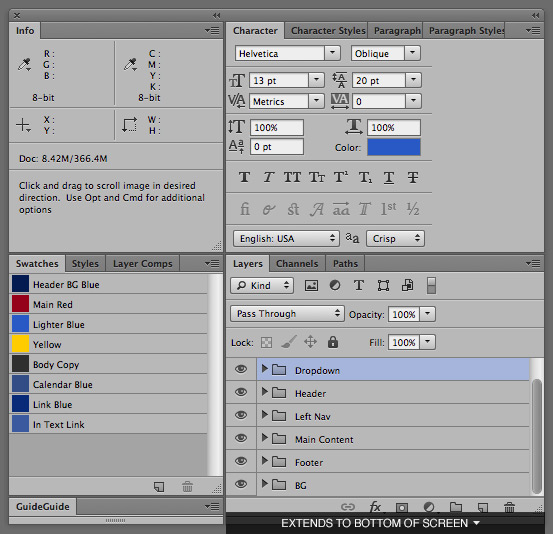
Although the snapped image (above) is pretty straightforward, here is a quick explanation of why my panels are the way they are.
Starting in the top left, I keep the Info panel open mostly for measurements. The CS6 update to the marquee tool (shows the height and width in a tooltip) is awesome but once you actually make the selection, you lose the measurement details. I’ve found keeping this panel open saves me the trouble of making the selection again.
In the the lower left, I have Swatches in the Small List mode. I like the ability to label the colors, though I wish you could drag and drop them to rearrange the order like you can with the Layer Comps. I have Styles and Layer Comps in this section as well, although I find that I don’t use Styles that much. I typically will switch over to Layer Comps to either test different design layouts/styles, check out hover states, or to fix up the PSD for handoff to our front-end developers. At the very bottom of this section, I have GuideGuide in its collapsed state.
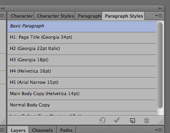
In the top right, I keep all of my typographic panels grouped together. I default to the Character palette as I use that the most frequently. On my most recent project, I tried using the Paragraph Styles for my header and body copy styles. It seemed to work pretty well and is something I will probably continue to do. Like the Swatch panel, though, it’d be nice to be able to drag and drop these to reorder them.
Finally, in the bottom right, I have the Layers palette which I always have pulled down to the bottom of the screen (for the example image, I pulled the bottom up to save space). I find that maximizing the height of this panel helps me scan all the groups and layers with more ease; I accomplish this just by minimizing the amount of panels on top of it.
So that’s pretty much it for me. I’ve noticed that a number of other designers at Viget also keep their History panel open while working. I’ve never really used History too much myself so I don't have it in my setup.
What about you? What panels would you add or take away? Got your own setup to show?