New Takes on the Ol’ Comment Section
Steve Schoeffel, Former Designer
Article Category:
Posted on
Comment sections are almost all essentially the same. Very rarely do you see someone come up with a novel approach. Medium, however, has very thoughtfully done just this and it’s great. When I was reading this article the other month, I saw that the author had also posted it into Branch for further discussion. I thought it was interesting to see these two discussions go on in parallel. It made me realize that both sites, Medium and Branch, are presenting new ways to discuss and comment online. It made me wonder if anyone else is doing anything interesting related to comments. I found a few.
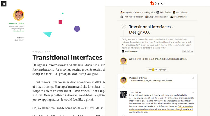
Medium
Medium allows commenting on each paragraph so there can be mini-discussions based on particular points. This way the comments are more contextual. It’s an innovative approach that just makes sense. In order to add a comment (only if you’re signed in), you just hover over the paragraph and click on the comment icon that appears in the right sidebar. You can also highlight specific text and add your comment that way. Comments are hidden by default so this means you have to manually toggle them open to view them. Because of this, it’s smart that Medium provides a way to link to a specific comment on the page which will take you to that location and then slide open the sidebar column.

Given this approach, one of the implications is that there aren’t any comments at the bottom. My take: awesome – the bottom of the page is clean! And now it can be used for elegantly previewing the next article, as Medium does (see above). The one thing that’s potentially missing here is the sense of overall reactions to the argument or idea of an article. The bottom of the page does seem like a logical place for this but then you risk confusing the user by having comments in both places. Maybe it would work to add some sort of dedicated space at the end of the article but still hidden in the right sidebar where the other comments are?
Branch
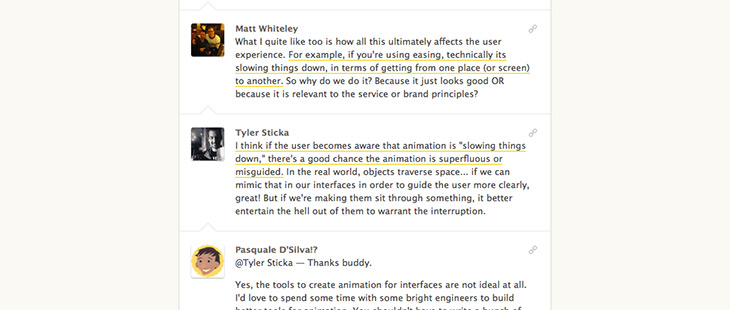
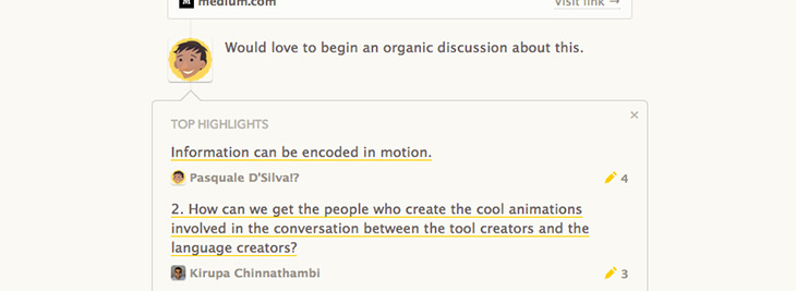
Branch is a slightly different concept because the commenting is the content; it’s a forum for discussion. It’s essentially one long threaded comment. Despite this difference, I think we can still glean some good ideas from what they’re doing. For instance, they have a Top Highlights feature for summarizing strong points (bubbled to the very top of the thread and expandable on click). These are user-curated and implemented in the form of anchor links that take you to that particular place in the conversation. Branch’s discussion thread functions in linear fashion like a normal conversation would. Each comment is added to the bottom. There isn’t opportunity for sub-threads or going back up to reply to older comments.
One of the distinctive features of Branch is that you can only comment once you have been invited and added to the conversation. The person who initiates the conversation adds people to begin with and then can add additional people along the way (possibly others in the conversation can add people as well?). Otherwise, you can’t join, but you can read along. In this way, the conversations are more intentional but also more limited. It seems like a reasonable feature add-on would be a button that notifies the conversation initiator that you’d like to join. You can obviously do this by other means but this action is so germane to the site’s primary activity that it seems like it would be worth considering.
The Verge
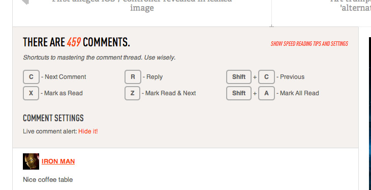
The Verge’s comment section has keyboard shortcuts for power users. Now this is a pretty cool idea. It seems especially appropriate given that The Verge has a strong base of dedicated users who are actively involved and are generally more tech savvy. Also, popular posts can have well over 1,000 comments – so the feature isn’t totally unwarranted. My one gripe is the fact that these shortcuts only work if you’re signed in… but they don’t tell you that! So for most people coming to the site, the shortcuts just appear broken! Definitely a cool concept. I’d be curious to know whether people use this feature at all. It’s integrated into all three of Vox Media’s sites (including Polygon and SB Nation).
Cognition Blog
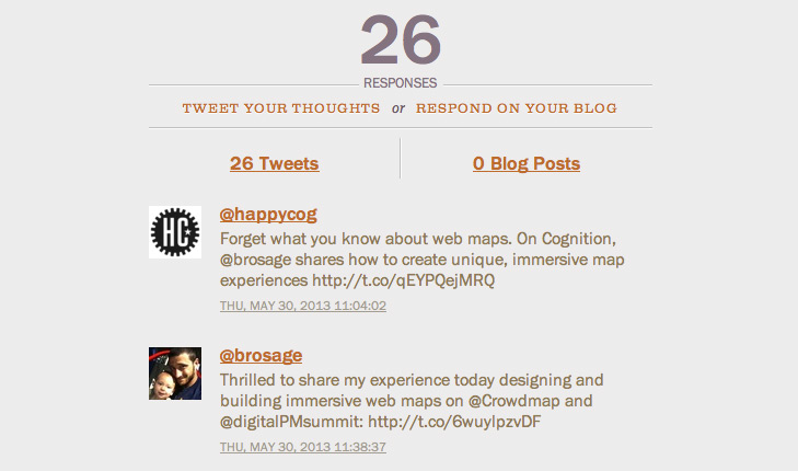
The Cognition blog doesn’t have any traditional comments* but allows for Twitter and blog responses. Some people are averse to traditional commenting sections and props to the folks at Happy Cog for trying out something unique. This is certainly the least trafficked of the examples here so in a way, they can get away with it. After all, you really don’t have to have comments at all if you don’t want to. There’s a potential bonus in this case that by pushing people to respond via Twitter or their own blog, you’re widening the impact and visibility of the original post. At the same time, it feels a bit selective in that you have to tweet or blog to respond and you may not want to do either… in which case you don’t… and the discussion that might’ve happened doesn’t. And also, Twitter is definitely not the best place for a discussion. Perhaps the thought was that these responses would instead be more isolated reactions and thus the section at the bottom more an area for consolidating these. It’s an interesting concept that seems to have upsides and downsides.
[*Update: As of 6/19, it appears the Cognition blog has switched to Disqus! Funny timing.]
Gawker Network
Gizmodo and Lifehacker (and other Gawker network sites) get a brief mention because their comments are laid out in two columns with more of a tile approach. Replies to these comments are just appended to that comment’s tile and the result seems to be a less linear presentation. To me, it tends to feel a little disorganized but it is slightly different than your typical comment thread. They also offer photo annotations that appear when you hover over the image. This concept is more contextual like the Medium comments but I worry that they become more of a nuisance than anything else.
Disqus
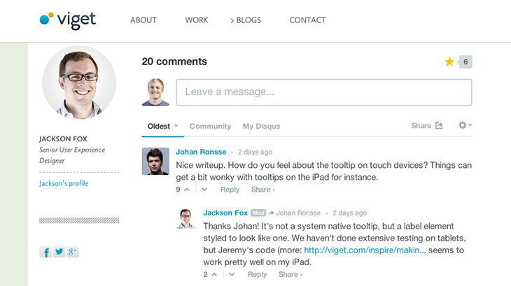
If you’re going to go standard, you may as well do it nicely. Disqus has a number of solid features (upvoting, filtering, a community tab etc.), is easy to implement and has a clean visual style. It’s what we’re using on this blog. There are a few other similar services too but from what I've seen, Disqus seems like it's the best.
Pushing Further
A theme that seems to run through these examples is one that is relevant to the way most decisions should be made when building a site – that is, implement what is most useful and appropriate to the users of your site. There isn’t necessarily one solution that is automatically the best. Nor is the most barebones solution always the answer, even though almost everyone does it. Hopefully we continue to see more sites emerge that creatively reimagine the commenting experience and push online discussions further in the process.