Misinterpreting Minimalism
Minh Tran, Former Senior Designer
Article Category:
Posted on
As of late, I've noticed there are quite a few websites popping up that are designed in a minimalist aesthetic. I believe designing in this style requires more attention to typography and grid systems to be effective. Unfortunately, this is not the case with many examples I've seen. I find there are too many concepts, ideas and products in this world that would benefit from a stronger visual aesthetic. With poorly executed minimalism, designers lose the chance of communicating a visual message. My concern is similar to a post of Owen's a little while back and how some people are overly inspired by visual trends, which leads to the demise of content and creativity.
I will admit that I am on a journey towards living my life in a minimalistic manner, which leads me to believe that there is a lot of commonalities between minimalism in art, lifestyle, and design.
A generalized definition of minimalism could be when something, an object or idea, is stripped down to its essential elements. In minimalistic art in the 1960s, furniture and objects were stripped down to the elements that made them structurally sound. These were parts which defined the furniture and was translated into different objects and structure oriented art. Living minimalistically is similar in the ideas of focusing on the elements that are what define us and re-evaluating what is important. Our job as designers is the same. Our job is to craft, refine, and communicate the message of our clients through design, regardless if it is in a minimalist or maximalist style. There should be no erroneous design elements that take away from the focus of your project or message.
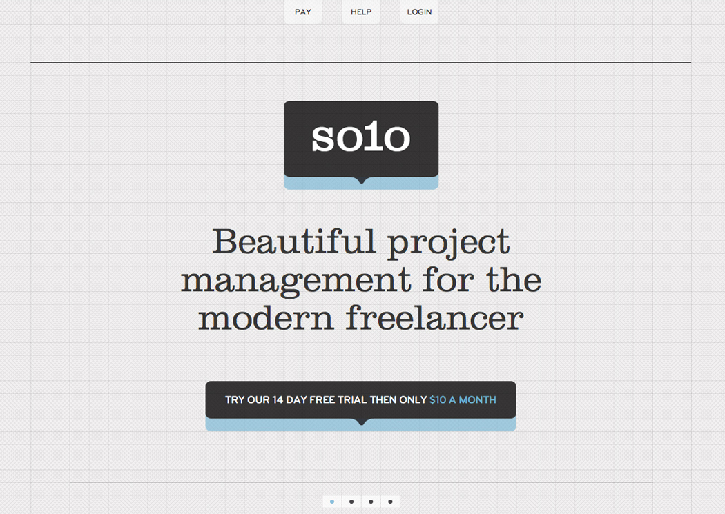
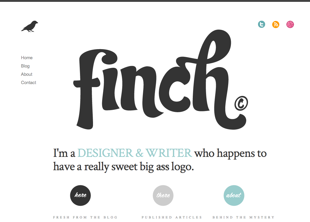
Some strong examples of minimal designs utilizing strong typography and grid systems:

Content reigns with any website, and minimalism is an effective way of highlighting it. The caveat with minimalism is to remember that there are less design elements for a reason. We should treat grids or typography with extra care and not simply craft a design for the sake of making it look "clean" or "modern."

