Making Infield Form Labels Suck Less

Let me start off by saying you really shouldn’t put form labels—or even placeholder text—inside of form fields if you want to be safe. But we can’t always play it safe. Sometimes putting labels inside of form fields is the best option we’ve got. Jeremy Fields, Steve Schoeffel, and I found ourselves making that decision on a recent project, and we set out to make the best of a tricky usability situation.
Why Shouldn’t I Put Labels Inside Of Form Fields?
There are a number of usability issues with putting labels inside of form fields especially if they’re not implemented well. From a usability perspective, we see:
- Text inside the field can get mixed with user input if it’s not removed from the field.
- It turns out that many users won’t enter text into a field, if they see text inside of it.
- The purpose of the field is obscured when the label is removed, forcing the user to rely on short-term memory to remember what they need to enter.
If—like we did—you’ve found that infield form labels are your best option given the project requirements, there are some ways to mitigate these usability issues. UX Movement has a good checklist:
- Group related fields (e.g. addresses, credit card information)
- Clearly differentiate labels from user input
- Provide good visual feedback
We made sure to address each of these, but weren’t completely happy with the result. In particular, we thought we could do more to help users recall the purpose of each field once the field was active and text was being entered.
Fixing Infield Form Label Visibility
The simplest solution to the problem of disappearing form labels is to make sure they don’t actually disappear once the form field is active. But if you’re going to keep the field labels around, you need to figure out where to put them. We played with several approaches, weighing the pros and cons of each.
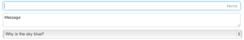
Labels slide outside of the fields
Pros:
- Labels are visually consistent inside and outside of the form field.
Cons:
- Only really works when you can move labels in a direction where they won’t end up inside another form field. This generally limits you to moving the labels to the left or right of the form field.
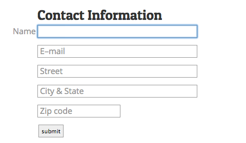
Example:
Labels appear next to fields as tooltips
Pros:
- Reuses a common design pattern (tooltips) to present form labels so that labels are visually distinct from other form elements.
Cons:
- Can obscure adjacent form fields and other form elements depending on where you place the tooltip. Keeping the tooltips small can minimize this problem.
A note on positioning your field label: If your solution relies on moving the field label outside of the input, make sure there’s somewhere for it to go. On small screens a solution that moves labels to the left or right could end up positioning the label outside the browser’s viewport.
Example:
Swap label position from left to right (or right to left)
Pros:
- Keeps the label inside the field and doesn’t obscure any other form fields or form elements.
Cons:
- While it avoids other form elements, the label can get in the way of user input. In particular, there’s nowhere for the label to go in a short field (e.g. ZIP code) without overlapping user input.
Example:
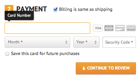
Our Solution
We ended up using the tooltip approach, placing labels above their input once the input has focus. We liked this approach because the active input labels are clearly distinct from other form elements, and the same approach can be used when the design scales down to smaller screens. We’d prefer not to obscure the form elements above the active input, but this approach is all about compromises.