Introducing POLITICO’s 2016 Election Coverage
Curt Arledge, Former Director of UX Strategy
Article Categories:
Posted on
We helped POLITICO enhance their 2016 election coverage with a sports-based concept.
Politics has a lot in common with sports. Highly skilled professionals duke it out in regular electoral contests. Political parties command an irrational amount of team loyalty. The complexity of the rules and the volatility of the human element create huge demand for prediction, commentary, and analysis. Even President Obama recently compared politics to football.
But as many political news junkies (myself included) will tell you, no sport can match the high-stakes drama of an American presidential election. As Hunter S. Thompson once wrote, “The difference between winning the Super Bowl and winning the White House is the difference between a goldfish and a vault full of gold bars.”
Naturally, then, when POLITICO approached us with a sports-based concept for enhancing their 2016 election coverage, we were all in. The basic design challenge: to better leverage the massive traffic spikes on POLITICO.com during political “stadium moments” like debates, primaries, party conventions, and election night by showing the right type and volume of content at the right moment of the narrative arc – think pre-game, gametime, and post-game coverage.
The solution had to meet a number of requirements: responsive design, harmony with the existing site aesthetic, and compelling new opportunities for advertisers. The project scope also expanded to include a revamp of POLITICO’s 2016 Elections platform for maps, results, and other election dataviz. The rapidly approaching early primaries necessitated working at the breakneck pace of one of the most prolific newsrooms in the country, making our work on POLITICO.com one of the most fast-paced, consequential, and exciting design projects in recent memory at Viget.
Making the stadium moment explicit
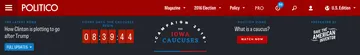
The first pillar of our design approach was to send a clear signal about POLITICO’s role as a hub for political stadium moments, POLITICO’s name for high-profile political events. The design needed to signal that POLITICO had “switched on” its focused coverage with event-specific branding that would be visible on every page of the website and on every screen, without interfering with the flow on non-election editorial.
Our solution was a special utility header that plays an informational and functional role. This persistent, branded header helps direct readers to the newest, most relevant content and provides new ways to tell the story with countdowns, breaking news alerts, and bits of editorial.
Supporting the narrative arc
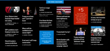
A key challenge of this project was envisioning a UI that brings together all of POLITICO’s wide ranging content – breaking news, blog posts, magazine stories, social media, polls, quotes, election data, video, and more – and presents it in a way that’s appropriate to the moment. A huge spike in the volume and diversity of published content, and readers’ sustained hunger for the latest take, called for new approaches to the homepage layout. What’s more, this layout needed to be able to evolve as an event progresses from pre-game (predictions, polls, long-form stories, explainers) to gametime (breaking news, social media, election results) to post-game (analysis and looking ahead).
Through a number of working sessions with editorial staff, we gained an understanding of POLITICO’s editorial landscape and presented a new homepage section that met their content needs. Different enough to attract attention, rich enough to satisfy highly engaged readers, flexible enough to accommodate the right kind of content at the right moment, and fitting seamlessly into POLITICO’s existing homepage, this new section was an elegant solution to a unique content challenge.
A deep dive into election data
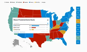
Our work with POLITICO also included an update of their election results data platform, last trafficked extensively for the 2014 midterm elections. Our update for 2016 incorporated a new navigation, new hub pages for candidates and states, an across-the-board visual refresh, and the inclusion of presidential election pages.
Digging into the complex idiosyncrasies of state-by-state electoral process to inform our designs was a fun, if slightly maddening refresher of civics class. Designing for possible future states, like runoffs, a major third-party candidacy, and states flipping to the opposing party, was an amusing exercise in political prediction. Some additional elements, like a delegate tracker and balance of power diagrams, will only appear as election season progresses.
An improved election coverage experience
We are proud to have worked closely with POLITICO to design a platform for groundbreaking political journalism at a singularly important national moment. We’re looking forward to seeing our designs turn into real editorial content and fill up with real results from what is sure to be an exciting and entertaining election year.
Check out our work on POLITICO.com to see the design in action, or learn more in our POLITICO case study.