Inspiration From Pretty Moving Pictures: Catch Me If You Can

One of my biggest sources for inspiration is film. Be it the cinematography, set design, costumes, awesome opening or closing titles, editing, colors, even great packaging and posters can be a huge inspiration. I've watched some truly mediocre movies, even bought them, if they were stylin' enough. So I thought I'd try a (hopefully) series of posts, highlighting some of my favorite design and style in movies.
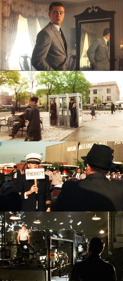
I have to start with Catch Me if You Can, the 2002 Steven Spielberg film starring Leonardo DiCaprio and Tom Hanks. It tells the true-life story of a young man who, while still a teenager, conned his way though being a Pan Am pilot, a doctor, and a lawyer in the early 1960s. It's a really fun, mostly lighthearted movie. It also revels in its period setting; it's so fabulously '60s. Let's take a look and bask in its retro hip style:
Of course, I have to mention the opening title sequence. Great opening titles or greatest opening titles? They're a really fun way of illustrating the story though simple, but stunning, imagery. Eight years after the movie came out, and I still obsess over this sequence.
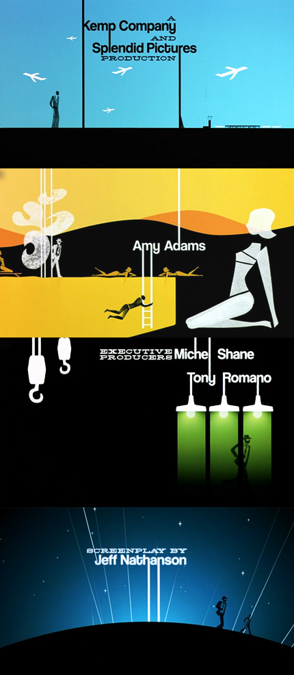
See the full opening titles here at Kuntzel + Deygas's official site.
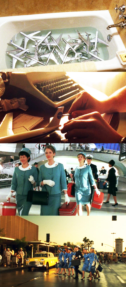
The crisp, vivid color palette of the film is beautiful. The punctuations of brightly colored costumes! The bold car colors!
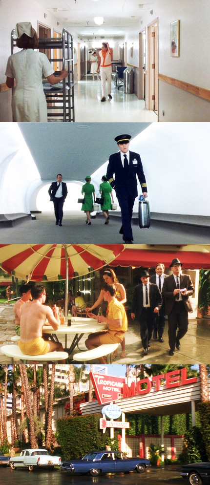
My favorite aspect of Catch Me If You Can is the glamourous take on air travel. The planes, airports, Pan Am, the stewardess and pilot costumes all look so chic and snazzy. The travel bags alone are drool-worthy.
Angles, perspective, and lighting are dramatic touches used subtly in the film that add interest and atmosphere.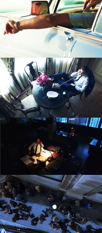
Get back to web design!
All this bright style and fun energy can be translated to web design. I've thrown together some fictitious examples to illustrate just a couple ways you could pull from the movie and apply it to the web:
The type treatments from the opening titles add some snazziness to a callout area:
That sharply angled, bright orange sweater Leo's rocking in one of the images above becomes a unique headline:
The bright colors and lighting applied to a form give it some pop:

(All images from Catch Me If You Can belong to Dreamworks.)