3 Tactics for Improving Wireframe Presentations
Todd Moy, Former Senior User Experience Designer
Article Categories:
Posted on
"That should have been brought up when we looked at wireframes"
Whenever I hear remarks like this, I usually feel it's not the client's comprehension that's at fault – but how the materials were presented. As UXDs, our job is to communicate and if the message isn't coming across, then that's our problem. And let's face it: most people never come across a wireframe or any of our other arcane documents. There's a learning curve that we need to manage.
Launching right from a cover slide into the grit of wireframes will rarely go as well as expected. As we flip through the screens and point out this and that, clients are trying to provide intelligent feedback while grasping blindly for context.
Below are three visual tactics I've used to help smooth this process and get good feedback. These aren't a replacement for honing your presentation skills, but they can be good accompaniments.
Tactic 1: Tell a Story
Maybe it's me, but it feels unnatural to critique a design outside the context of a user's goal. So, it makes sense to use a storytelling approach to present them.
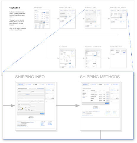
I like to frame a set of screens in the context of a scenario. These state the motivation for the action, the conditions present, and the desired goal.
Given this scene to turn over in their head, I find people can better evaluate the wireframes since they can role play through the interaction. Typically, less time is spent debating subjective details and more time is spent discussing how well it accomplishes a goal. As a secondary benefit, you can reuse the personas and scenarios you developed earlier, demonstrating how that work influenced this.
Visually, I use a flow diagram that uses screen thumbnails instead of generic boxes. The "small multiples" help tease out the state changes within an interaction. When hyperlinked to the corresponding wireframes, the flow becomes a visual table of contents.

Tactic 2: Take them Behind-the-Scenes
One of the hardest things to convey is the system within the design. Decisions like layout conventions and design patterns are made at a macro level that spans screens. Typically, these are some of the first decisions to be made. They form the foundation on which other design considerations are built.
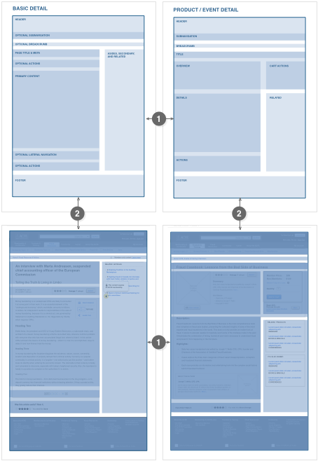
When I start designing screens, I create greyboxes. These blockish areas trade detail in favor of establishing content, relationships, and pathways. As I work through the screens, these blocks help me understand how pages should relate and where similar things can be generalized. This outline-of-sorts happens before doing any detail-level wireframes.
What I've found is that greyboxes are also a great welcome mat for a wireframe discussion. Lacking detail makes it easier to introduce the framework that underpins the pages. In particular, I discuss:
- The intent of the page
- What the underlying system is
- Why content is organized in this way
- What other pages share similar patterns
By giving this behind-the-scenes preview before showing the full design, often clients better understand the why behind the design. They can share the designer's intent and consider how local changes may have global repercussions.
The diagram below shows the sequence for presenting these. In (1) I would draw attention to the similarities and differences between these peer pages. After that, I would spend time discussing each - occasionally toggling a translucent layer (2) to illuminate the hidden structure.

Tactic 3: Show your Work
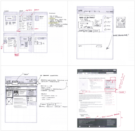
I'm a sucker for sketches – the messier the better. While some clients probably don't share this love, I've found many appreciate seeing the thinking that goes into the design.
Design can seem like a mystical art. While it is usually meanders, branches, expands and winnows, the progress is often the result of deliberate, rational decisions. Showing this evolution – what designs died and which ones survived – helps substantiate the final result. It shows you have explored options, not just executed on the first whim. Sketches also highlight the design constraints, the near-solutions, and where compromises needed to be accepted.
In practice, these are best shown early – before the final wireframe presentation, even. Occasionally, I'll include them in the presentation to show why other variants were less effective.

Other tips:
So those are just three strategies for easing your audience into a wireframe presentation. Aside from those visual tactics, I'd be remiss not to mention these tips which have served me well:
- Start small. It's hard to digest 10 - 15 wireframes in one sitting. When we try to accomplish too much, we risk fatiguing the audience and stifling feedback. That tends to have the effect of delaying the discovery of problems until design or development. Scale back the review. No one really wants longer meetings.
- Dribbble ideas. Taking a cue from the site Dribbble, consider floating over bits of wireframes early in the process. Your work doesn't have to be complete. Just getting feedback on small pieces of the interface can slowly acquaint your client to the design, making for a less risky reveal. As a bonus, they get to participate and take ownership of the design.
- Coach your clients. Ever get comments about visual design in a wireframe review? Rather than slapping your clients on the wrist and exhorting how "wireframes aren't design," provide them with points to ponder. Here's a list to get you started.
How about you?
Certainly these aren't the only tactics out there. What techniques do you use to make wireframe reviews go smoothly?