How to Bring Digital to a Physical Facility in 4 Steps
Dave Schools, Former Digital Strategist
Article Categories:
Posted on
The story of how a 300-acre facility created their first mobile app
On the go? Listen to the podcast discussion here:
Digital and physical integration is red hot right now, most notably from Amazon’s announcement of their flagship Amazon Go digital grocery store concept.
For the organizations that want to do something similar — introduce a digital component or interface to their physical space — how do you do it? This is the question we’re going to address below.
It’s important to note that designing for a physical space is different from designing websites and mobile apps. A lot of the rules in digital don’t address the nuances involved when designing for specific physical spaces.
As you’ll learn from the story below, it starts with user research, which allows you to design software to best fit your physical space. Below, we walk through four phases of research, prototyping, interviews, and data collection.
What’s the story?
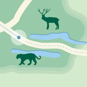
The venerable 300-acre Bronx Zoo was having issues with park navigation. The Bronx Zoo staff wanted to figure out how to help people physically make their way around the park in a more efficient way.
A Viget team led by Kevin Vigneault, Product Design Director at Viget, headed up to New York to begin the project.
Kevin and the team wanted to explore whether digital technology, specifically in this case a mobile application, could supplement what the zoo was doing in the park and perhaps augment the current setup.
Right off the bat, they noticed the facility's standard signage and print maps, but these fell short.
For example, if a restaurant was closing, if an animal was off-exhibit, or if they needed to close a particular ride because of a lightning storm, the staff couldn’t run around the park quick enough to change all the signage or constantly blare announcements on the PA system.
“We wanted to create a digital map to solve the wayfinding problem, but we also wanted to figure out how the live data could integrate with their operations team,” said Kevin.
The system needed to integrate with the operations team such that they could know these things in real time and then use the mobile application to broadcast helpful information out to patrons.
Phase 1: Intercept Interviews
Starting out, the team of three UX designers went up to the park to conduct intercept interviews with 25-30 visitors.
Kevin said, “Our goal was to get an understanding of what they were doing in the park for the day, how they went about their planning, how they were already using their phone and the printed materials in the park.”
How to do an intercept interview
To gather the information, one team member took notes as another UX designer talked to a visitor.
Each intercept interview loosely followed a short script and lasted 5-10 minutes. The questions centered around how people planned and found their way around the park.
(Kevin doesn’t recommend audio recordings because the wind and noise of the outdoors made it difficult to record. So they relied heavily on notes. He does recommend having a staff member of the facility on site when talking with visitors to maintain a professional atmosphere.)
Phase 2: Prototyping
Once you have the raw data from the interviews, it’s time to build real working software. “If you can help it, working software is always better than static screens for a prototype,” Kevin advised.
The team built a browser-based web application using Ruby on Rails. On the front-end, they mocked up interfaces and images in HTML to begin putting together the user interface.
At the same time, Viget engineers wired up basic data on the backend so that while the prototype testing was going on, the Bronx Zoo guest relations team could receive data from representative sessions.
Why web browser over native app
A web browser helped with speed of development. Because the Viget team was quicker and more comfortable working in Ruby on Rails, Javascript, and other web technologies than native iOS and Android, they didn’t have to go through the headache of distributing it through the App Store or Play Store, or other mobile app testing tools.
Kevint recalled how easy it was to tell folks, “You can just pull out your phone and go to this URL.”
“Considering how frequently we were pushing fixes and updates to the server, it made it a lot easier to get something up quickly and manage changes,” said Kevin. “We didn’t have to worry about pushing all that down to the user’s phone in a native app.”
Phase 3: Prototype testing
About a month later, the team returned to the park with a live prototype to do a second round of testing. The team talked with eight groups, totaling 15-20 people, over a 90-minute time period, and observed how they used the prototype on their own phones.
Visitors used the prototype app to do what they would usually do — go around the park, eat lunch, and visit exhibits.
Kevin and his team used another loose script to try to understand what features were most valuable, such as the digital map and the shuttle schedule, and what functions were used most.
At the end of the day, the team noticed the app was really — as much as it was about providing added value — more about protecting against the downside of frustrating situations.
“You don’t want to go to an exhibit just to find that it’s closed or find the animals not on exhibit, or go to a restaurant to find out it’s closed by the time you get there. So it was about helping people manage their time more efficiently.”
Phase 4: Roll out and data collection
After polishing the prototype into a professional app with a clean user interface, the team prepared for launch.
“After five or six weeks, we had something that was actually launchable,” said Vigneault. “It was fully functioning even though it did a limited set of things.”
The app went live in June and has been operating ever since. View app here: https://app.bronxzoo.com/
What data was collected and what insights were learned?
Every day, the Bronx Zoo managed the back-end while visitors pulled up the app to get maps and information they needed for their trip.
Using Google Analytics, the team could see where people were spending their time in the app and what they were interacting with, as well as target certain features to see how they’d be used.
In addition to the app analytics, Kevin and his team had collected around 150 emails and followed up with a short survey. This generated richer data around what they were finding useful about the app, what was useless, and what problems they encountered. The team used this feedback to put together a list of what to focus on in future iterations.
Other than a zoo, what other facilities or spaces could use this approach?
Any large space where users spend considerable time could benefit from a user-research based approach to digital application development.
“We weren’t dealing with a retail location or something where it’s only a few hundred square feet,” said Kevin. “We were dealing with a few hundred acres.”
He recommended any sort of campus environment, large shopping center, stadium, or college campus.
For example, a university could use a digital application for prospective students as they tour the university or for current students to learn how to get from class to class every semester.
The biggest takeaway
Kevin said the biggest lesson the team learned about bringing a digital application into a physical facility was to address the practical needs first.
While there’s a time and a place to focus on bell-and-whistles ideas (early on, the team discussed features like audio tours, supplemental video content, games, and badges). But when you really dig into the user research, the practical stuff becomes most important.
“The point of going to the zoo is not to pull out your phone and stare at a screen all day.”
As much as they wanted to do some of the more fun content and experiential stuff in the app, what the team realized is that the zoo itself is awesome, said Kevin.
The goal of the app was to be on the side, to serve the practical, important role of making sure visitors have a good experience at the park but not trying to be the experience itself.
Focus on the things that might sound boring but serve very practical needs.
Then, maybe at some point in the future you might come back and layer on the fancier stuff. However, if you start with the fun-to-design features, you’ll find yourself in a position where the app itself is not providing much value and it can get ignored.