@font-face, Realistically
Doug Avery, Former Senior Developer
Article Category:
Posted on
I don't need an intro paragraph to tell you it's been a pretty great year for @font-face. Tons of foundries have unveiled webfont versions of their typefaces, and several services are reliably providing on-demand fonts (some even for free). Safari is even on its way to supporting .woff files, which is a big step forward for the modern browser.
@font-face is a boon for designers, who can finally use the type they want the way they want — kind of. As a noted crusher of dreams, it is my duty to lay out some @font-face issues that designers should think about when they’re planning.
Licensing
Just because a foundry has a "webfont available!" badge on a font doesn’t mean you’ll like their terms. Some foundries have limitations on pageviews, others don’t provide the complete stack of files, and others disallow subsetting (or even using) the original font files. Of the terms I’ve seen, FontSpring’s seem the fairest and most flexible, but make sure you take look at the license before showing a comp with the font in it.
Even free fonts might have licensing issues: for example, a few stray fonts we’ve seen on FontSquirrel actually have licenses forbidding type embedding, which is an unpleasant thing to discover after a client’s already signed off on a comp. (This isn’t a knock on FontSquirrel, but on us: it’s our job to know the license on a resource, backwards and forwards, before using it on client work.)
Serving
Some foundries only allow webfont embedding through a third-party service like TypeKit. While these services often contain great features you want (configurable subsetting, easy drop-in, great browser support, etc), they can also add delays to the displaying of type. When you’re sending the user a font, they’ll already experience SOME delay while the font loads, but this seems acceptable (and the FOUT-prevention alternatives, like hiding the page until the fonts load, are pretty annoying). However, once the font is loaded, it should be cached — subsequent pageviews will ideally render the font immediately.
This isn’t always the case with third-party services, and you might experience the same load delay on every pageview due to the delay before the JavaScript loads your font file. Putting the script first in the header can help, but that’s gross, right? It’s a small consideration, but one to take into account when choosing type &emdash; serving type directly has been speedier and more reliable for me.
Aesthetics
In Photoshop, your type’s gonna look good — you picked a special anti-alias for it, tracked it a little bit, and got it looking just the way you want it. It might be a shock to see it on the web, where anti-aliasing is largely beyond your control and there are none of the nice kerning pairs you had in PS. All web type has these issues (especially light-on-dark type), but it tends to be especially pronounced with @font-face type, much of which wasn’t rigorously testing for web use like the old standards were, which can lead to some difficult rendering across platform and browser.
For instance, check out TypeKit's excellent Adobe Text Pro starts to render weirdly under certain conditions:
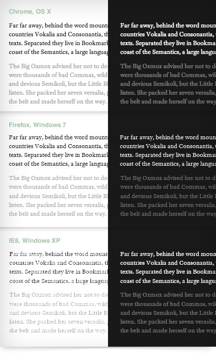
The issue seems a little more pronounced when you’re using some poorly-hinted type on a dark background (as I found out in this example from a recent project):
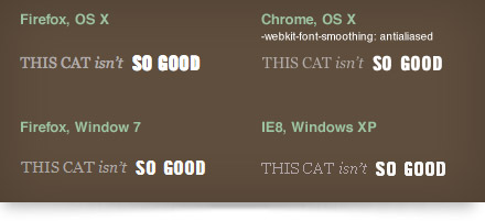
It’s something to consider when designing — the smaller, lighter, and finer your type is, the more trouble it might have on different platforms. As a final example, check out the differences between how Proxima Nova renders on MyFonts.com in Chrome, OS X and IE7, XP:
Legibility
Beyond simple beauty, the previous example show that less carefully-hinted type can make already-subtle text become nearly illegible in some situations. Again, just consider this as your type shrinks and contrast decreases.
Glyphs & Styles
Another consideration is which glyphs and sub-styles you’ll actually need in a design. Some webfonts come with tons of foreign and old-english glyphs, which you won’t need if you’re just using the type for uppercase headline. Depending on your license, FontSquirrel’s converter should be able to help you subset and remove unneccessary glyphs. Typekit and other services also include options for subsetting.
Styles are another consideration — unlike Photoshop, a browser won't simply bulk up or tilt type when you set it to bold or italic, so if you don't have files specified for these styles, you'll see the text fall back to the next font in your stack. The trick is to weigh this against loading additional files just to fix a few snippets of type — I tend to set these default unless I know a site will be using an alternate style heavily. Font files (especially IE's EOTs) can get pretty big, and including bold/ital/oblique can boost filesize considerably.
File Size
Which brings us to file size. A single TTF file from PT Sans, when run through the FontSquirrel generator with hinting and full character sets, can result in a 233kb SVG file and a 111kb TTF. Obviously, you would only want this level of detail for body text on a site with a lot of content and special characters — turning settings to "optimal" slashes those sizes to 70 and 53kb, which is still pretty considerable if you plan on having other weights or typefaces.
Wrapping Up
The expanded support for @font-face is awesome, but it isn’t a magic design bullet just yet. When you start designing for this feature, make sure you consider some of the variables in play — licenses, alternates, legilibility, bad rendering, pageload, filesize — so you don’t get surprised when you’re further along in the process.