Fluid Breakout Layout with CSS Grid


Using CSS Grid, we can define a universal fluid layout that handles multiple 'breakout' elements.
So you're building a site and you've got a nice containing element around your content — but wait! Not all the content is the same width! That nice, neat tube of content is not so much a straight tube as a pile of different sized bricks.
It's a common layout problem, but how do we account for these 'breakout' widths in the layout? There's a couple ways we could go about it:
- Encapsulate each component and set widths and margins. (Works fine if you have full control but can be fiddly).
- Force the component out of the containing element with negative margins. (Works fine if there's only a little deviation).
- Use CSS Grid to build a fluid universal grid! (😎).
That last one is what we'll be exploring: how to use CSS Grid definitions to allow for consistent component sizing across all breakpoints — no media queries required!
This is a technique that's based on Ryan Mulligan's 'Layout Breakouts' which is based on Josh Comeau's 'Full-Bleed Layout' and is especially useful when creating a fully fluid layout. This also pairs well with fluid type techniques resulting in layouts that TRULY scale with the viewport size.
Setting Up the Grid #
Here's the layout we're going to be building:
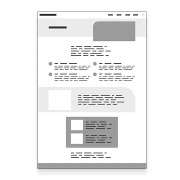
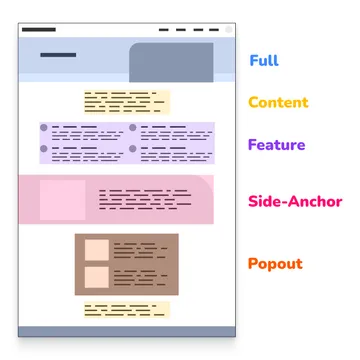
If we break apart the design, we've got 4 possible widths for components:
- Full-Width
- Feature
- Popout
- Content
We've also go some special side-anchored elements that 'stick' to one of the screen edges but also honor the other element widths. We'll come back to these later on.
Now that we've categorized the widths, lets start drawing column edges and defining areas:
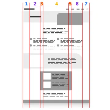
- Left margin / Full-Width
- Left Feature
- Left Popout
- Center Content
- Right Popout
- Right Feature
- Right margin / Full-Width
That's a lot of columns!
Yet on mobile, we only need 3 columns, just left margin (1), center content (4), and right margin (7). We want some of these intermediate columns to disappear!
Fortunately, CSS Grid gives us some powerful tools to create the measurements needed—yes, even for the disappearing columns! We won't even have to write any media queries for this one. We can make just ONE definition that works at all sizes.
We'll store our measurements as CSS variables for easy use later on:
:root {
  --gap: clamp(1rem, 4vw, 2rem);
  --full: minmax(var(--gap), 1fr);
  --feature: minmax(0, 12vw);
  --popout: minmax(0, 2rem);
  --content: min(clamp(30rem, 52vw, 60rem), 100% - var(--gap) * 2);
}
Let's break these down.
--gap: clamp(1rem, 4vw, 2rem);
gap will be our side margin, allowing it to stretch up to 2rem at max, with a preferred width of 4vw, but never going below 1rem.
--full: minmax(var(--gap), 1fr);
We're going to use the minmax() function for these next three measurements to say: "If there's room in the CSS Grid, you can expand out to here but then don't go smaller than the minimum".
The full area is going to expand from left edge to right edge (remember we have to split the areas to allow for the other columns) and will double as our margin, so we'll pop in our gap value as our minimum and tell it that it can expand up to 1fr, or basically as much space as the rest of the grid will allow it.
--feature: minmax(0, 12vw);
--popout: minmax(0, 2rem);
The feature and popout both have a minimum value of 0. This is what powers our disappearing columns! As other areas of the grid expand, these will collapse when there's no longer any room for them, essentially taking up no space.
--content: min(clamp(30rem, 52vw, 60rem), 100% - var(--gap) * 2);
And then finally, our content area is our most complex measurement. It's saying, take the minimum value of either:
- A fluid measurement that can be 30-60rem (with the help of
clamp()) - OR full width minus our gap value (but doubled for both left and right values).
These measurements can be changed to fit the needs of your layout. Specifically the feature and popout maximum values and the first content value. For example, our use of vw for the feature means it will fluidly expand out as the screen grows whereas the popout will remain only 2rem larger on each side than the content column.
Now we can assemble these measurements in a CSS grid column definition. We'll name our column edges with [custom-ident] and use the -start and -end endings to help make assignment easier later on.
.grid-breakout {
display: grid;
grid-template-columns: [full-start] var(--full)
[feature-start] var(--feature)
[popout-start] var(--popout)
[content-start] var(--content) [content-end]
var(--popout) [popout-end]
var(--feature) [feature-end]
var(--full) [full-end];
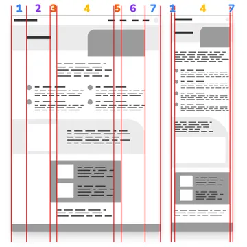
}The definition is complex, but if we visualize the start and end lines of our columns as well as the measurements, it looks like this:
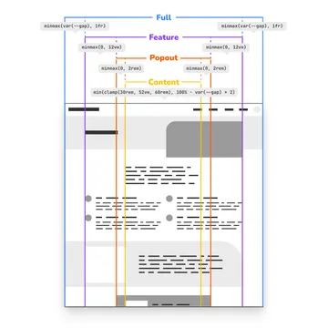
You can see we have our middle content column, our disappearing feature and popout columns, and finally our full columns that double as our margin.
To finish off the definitions, we need to create column assignments. Because we named our columns with custom identifiers and specified the start and stop lines, we don't have to fiddle with grid numbers. We can assign them directly like:
.full {
  grid-column: full;
}

.feature {
  grid-column: feature;
}

.popout {
  grid-column: popout;
}

.content {
  grid-column: content;
}
And if we want to create a default assignment for elements in the grid (which is especially useful if you don't have full control over the markup) you can create one like this:
.grid-breakout > * {
  grid-column: content;
}
Now you can attach any of these classes to components in your grid and have them snap to the width you want.
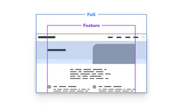
Watch the screen capture below as the grid scales down. You can see the feature and popout columns disappearing as everything transitions to a mobile width, and then expands back up.
You can see a demo of the base setup here:
Nesting Grids #
Now let's go back to our header element. You can see that though the header is full-width, we actually want its inner content to honor the feature width.
Fortunately, because of the flexible nature of this grid definition, we can repeat the definition and then continue using the same column names on the inner structure. Because our grid only goes one layer deep we're free to replicate as much as we need or even break out and use different layout methods for the component interiors.
<main class="grid-breakout">
  <section class="full grid-breakout">
     <div class="feature">
        <!-- inner content -->
     </div>
  </section>
</main>
You can see it in action here:
Anchoring Left and Right #
Remember those side-anchored components? This is where we need to get a little tricky to line everything up.
Going back to our diagram, we want an element to span MOST of the way across the page, but end at the opposite feature edge. We can reuse our column definitions for the first part.
.feature-left {
  grid-template-columns: full-start / feature-end;
}
Great! That gives us exactly what we want... except for when we try to nest the grids.
Our original grid definition assumes that our content, while different widths, is centered in the window. We have to rethink our inner grid definition a little bit.
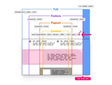
We're shaving off one end of the grid, specifically a full definition. So two things need to happen:
- We need to adjust our
contentwidth to now account for only having onegap. - We need our new grid end to stop at the edge of the
featurecolumn.
We can achieve this with a new measurement and a new grid definition:
:root {
  /* previous definitions... */
  --content-inset: min(clamp(30rem, 52vw, 60rem), 100% - var(--gap));
}

.grid-breakout-feature-left {
  display: grid;
  grid-template-columns:
    [full-start] var(--full)
    [feature-start] var(--feature)
    [popout-start] var(--popout)
    [content-start] var(--content-inset) [content-end]
    var(--popout) [popout-end]
    var(--feature) [feature-end full-end];
}
We've replaced the inner content measurement with the new value and combined the feature and full ends with the final line of the template column definition:
[feature-end full-end]
This will allow redefinition inside the new side-anchored component. You will notice that you'll need to supply your own padding for the inner as they no longer have that final margin to prevent it from reaching the new grid edge.
<main class="grid-breakout">
  <section class="feature-left grid-breakout-feature-left">
    <div class="feature">
      <!-- inner content -->
    </div>
  </section>
</main>
If you want to reverse this to be anchored to the right, you can flip the grid definition, moving the double start to the top like:
.grid-breakout-feature-right {
  display: grid;
  grid-template-columns:
    [full-start feature-start] var(--feature)
    [popout-start] var(--popout)
    [content-start] var(--content-inset) [content-end]
    var(--popout) [popout-end]
    var(--feature) [feature-end]
    var(--full) [full-end];
}
You can see a demo of the side-anchored component here:
But What About Tailwind! #
We love using Tailwind at Viget as a Team Accelerator™, and it's straightforward to implement these measurements and definitions in your Tailwind config.
/** @type {import('tailwindcss').Config} */
import plugin from "tailwindcss/plugin";

export default {
  // the rest of your other definitions
  theme: {
    // the rest of your theme definitions
    extend: {
      gridColumn: {
        content: "content",
        popout: "popout",
        feature: "feature",
        full: "full",
        "feature-left": "full-start / feature-end",
      },
      gridTemplateColumns: {
        breakout: `[full-start] var(--full)
            [feature-start] var(--feature)
            [popout-start] var(--popout)
            [content-start] var(--content) [content-end]
            var(--popout) [popout-end]
            var(--feature) [feature-end]
            var(--full) [full-end]`,
        "breakout-feature-left": `[full-start] var(--full)
            [feature-start] var(--feature)
            [popout-start] var(--popout)
            [content-start] var(--content-inset) [content-end]
            var(--popout) [popout-end]
            var(--feature) [feature-end full-end];`,
      },
    },
  },
  plugins: [
    plugin(function ({ addBase }) {
      addBase({
        ":root": {
          // grid sizing variables
          "--gap": "clamp(1rem, 4vw, 2rem)",
          "--full": "minmax(var(--gap), 1fr)",
          "--content": "min(clamp(30rem, 52vw, 60rem), 100% - var(--gap) * 2)",
          "--popout": "minmax(0, 2rem)",
          "--feature": "minmax(0, 12vw)",
          "--content-inset": "min(clamp(30rem, 52vw, 60rem), 100% - var(--gap))",
        },
        // force unspecified content blocks into 'content' grid
        ".grid-cols-breakout > *": {
          "grid-column": "content",
        },
      });
    }),
  ],
};
Everything is effectively the same, but you'll call your grid classes like grid-cols-breakout to set the grid, and your columns like col-feature per Tailwind naming conventions.
Forwards to a Fluid Future! #
And there you have it! A media-query-less fluid breakout layout defined with CSS grid!
While the setup is more complicated at first glance, I've found that the more fluid your layout rules are, the FEWER rules you have to write overall! Especially when paired with fluid type, dynamic viewport units, and all the amazing features that are landing in CSS — it's truly a fluid future!