Creating a Film Grain Effect with CSS3
Doug Avery, Former Senior Developer
Article Category:
Posted on
We were thrilled to work with the Wildlife Conservation Society on 96elephants.org. The site tells the story of ivory poaching through maps, infographics, and photos, urging users to take action on the behalf of elephants.
The site turned out beautifully, partly thanks to the stunning high-res images that Viget and WCS were able to assemble. Even though the timeline was short, I wanted to do a little something extra to bring the photos to life, so I added a minor touch you might not even notice - some animated film grain. This effect is done quite simply, with some CSS and a single image. Here's how:
Create the image
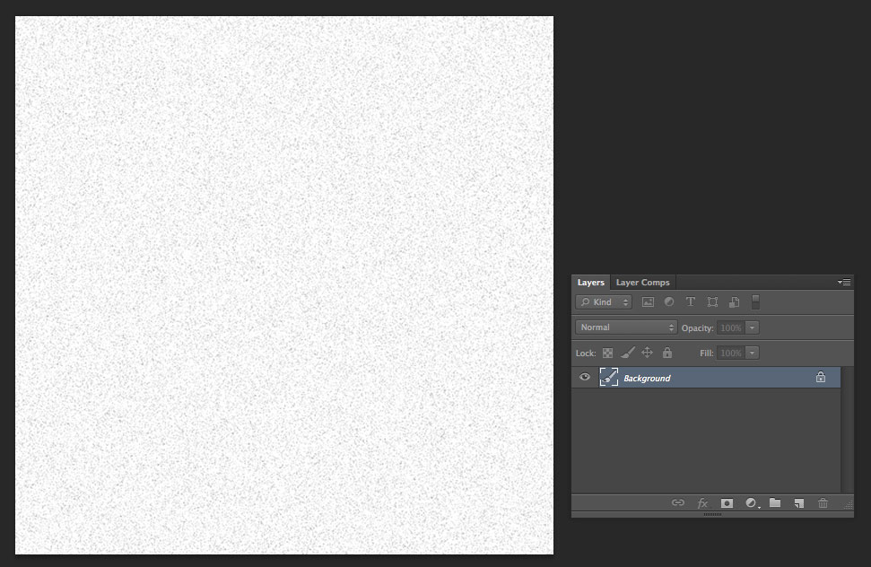
Let’s start by generating some grayscale noise in Photoshop.
- Create a white canvas. For this example, I'm using a 500x500 canvas, but you can actually go much smaller without a noticable difference.
- Add noise by selecting Filter > Noise > Add Noise (make sure you check 'monochrome')
- Your noise will look a little sharp, since it's still individual pixels. To make it 'clumpier', you can increase the image size by about 15%
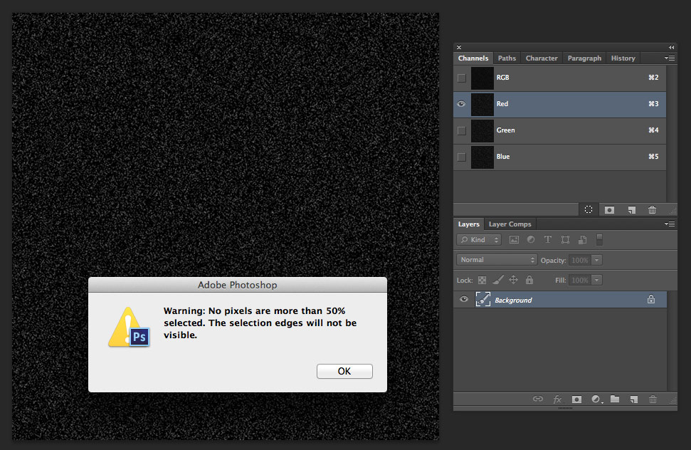
Next, create a selection area from the noise:
- Invert the noise with CMD-i (all shortcuts listed are for Mac). This will turn the dark spots light, which will allow you to select them.
- Go to Channels and select an individual color (it doesn’t matter which one)
- Click the ‘Load channel as selection’ button at the bottom of the panel
Now that you have a selection, you need to make two layers: a light and a dark one. Having both will keep your image from being too dim or washed out, and gives you more control over the effect.
- Create a new layer (make sure you still have your selection) and fill it with black (hit d, then OPT-delete)
- Create another new layer and fill it with white (hit d, then x, then OPT-delete
- Rotate the white layer 90 degrees, to randomize the noise
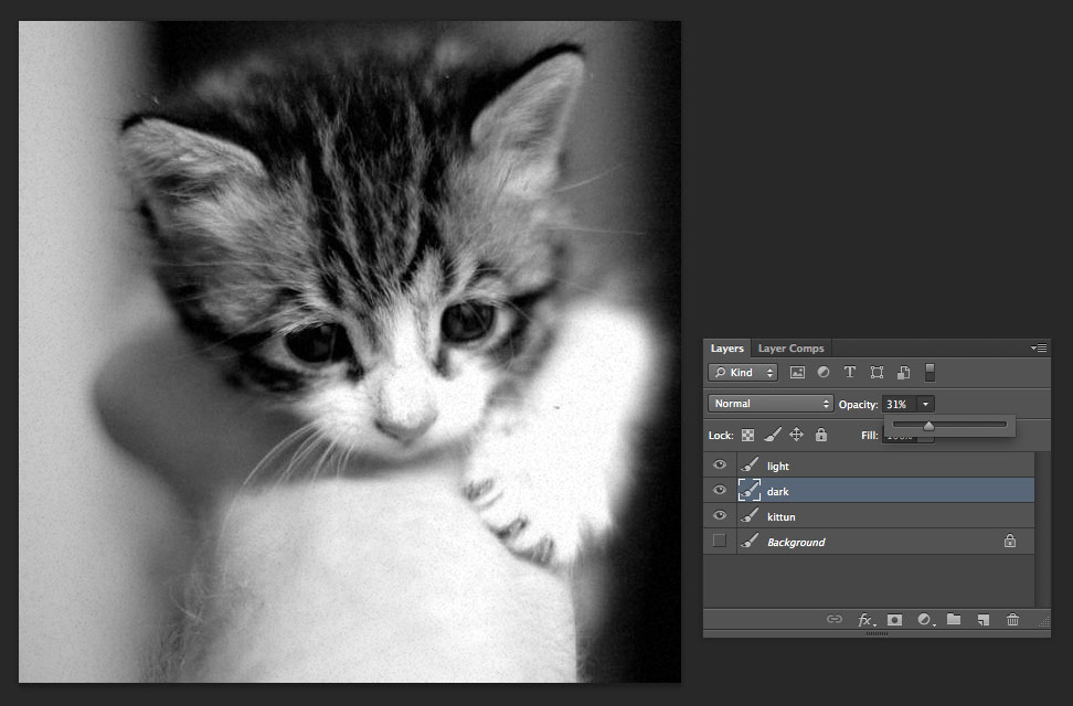
Now, you have two noisy layers - one light, one dark. Place a photograph beneath them to test them - you’ll need to adjust the opacity of both layers to find the effect that works for you. Remember to use the 'Normal' blending mode for both.
Once you’re happy with the opacity, delete all layers except the light and dark noise. Now you’re ready to...
Save and optimize
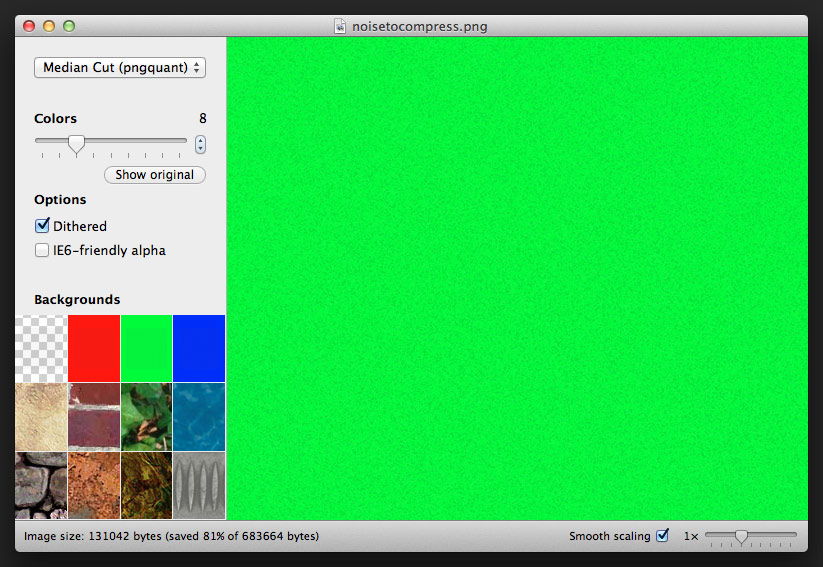
Go to File > Save For Web, and save the image as a PNG-24 with transparency.
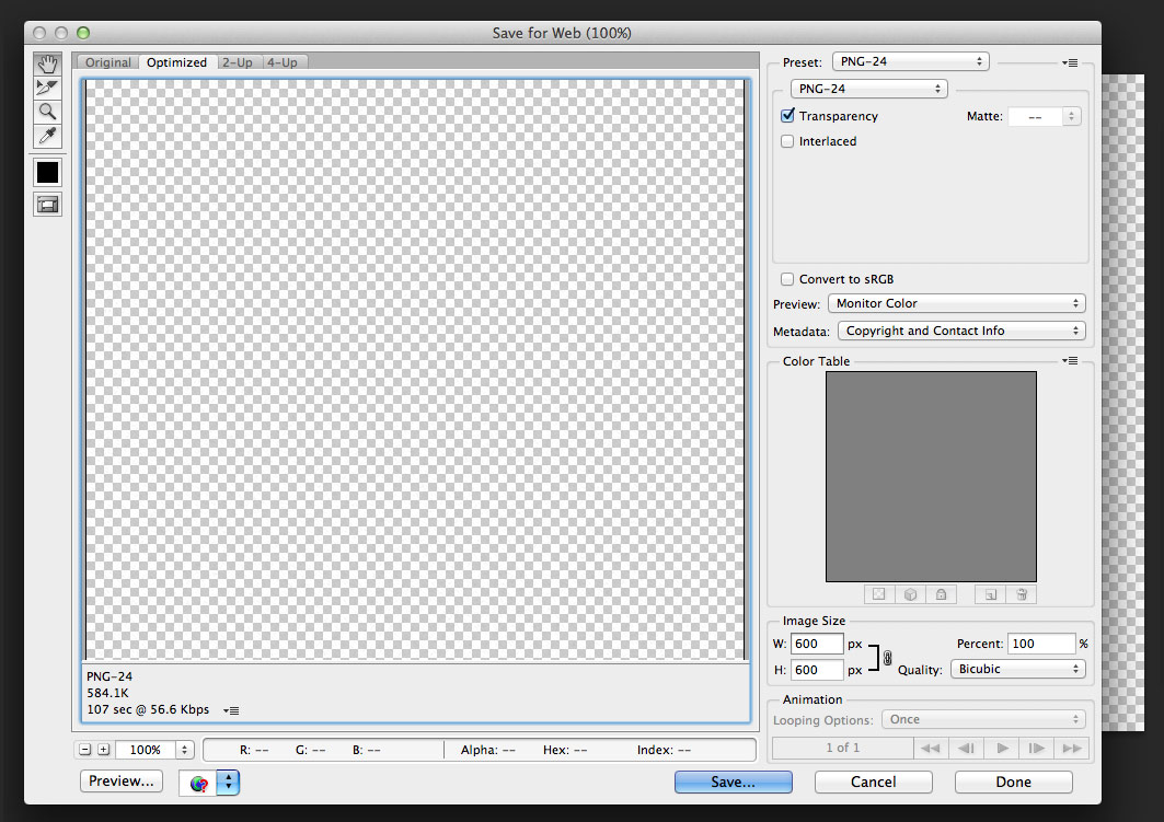
You’ll notice that the resulting file is huge, but that’s because it’s using 24-bit to only show a handful of colors. Let’s optimize it:
- Open ImageAlpha, and open your noise image in it.
- You should be able turn the colors way down, even to 16. Test the results over the built-in photographs to make sure that too much detail isn’t being lost.
- File > Save As — your image should be considerably smaller.
Mixins
Before you jump into CSS, you’ll probably want to make sure you have some mixins that cut the tedious repetition of vendor-specific keyframes and animations. In the example, I just made some quick ones, but it’s easier to just grab a gem like the Compass Animation one. Since I'm already using Sass in these examples, I'm going to make the final effect a mixin as well.
The keyframes
Because your noise looks so random, and because it’s going to be moving so quickly, you don’t need anything too sophisticated here. You can get away with just taking the noise and translating it from place to place.
 +keyframes('grain')
 0%, 100%
 +transform(translate(0, 0))
 10%
 +transform(translate(-5%, -10%))
 20%
 +transform(translate(-15%, 5%))
 30%
 +transform(translate(7%, -25%))
 40%
 +transform(translate(21%, 25%))
 50%
 +transform(translate(-25%, 10%))
 60%
 +transform(translate(15%, 0%))
 70%
 +transform(translate(0%, 15%))
 80%
 +transform(translate(25%, 35%))
 90%
 +transform(translate(-10%, 10%))
It’s important to use translate, as opposed to position or background-position, because translate doesn’t cause repaints. Doing the same effect with background-position actually made my fans spin when I tried it - it’s significantly slower than translate.
The final mixin
The last piece of the puzzle is a mixin that you can include on any element that wraps an image or has an image background (why a @mixin and not an @extend? Mixins tend to create smaller code, once gzipped, than extends do, and they’re more flexible than @extends).
 =grain
 // all elements with noise need overflow hidden, or else the noise
 // bleeds out of the element and totally messes stuff up
 overflow: hidden

 // if you're using this a lot, here's where you would add
 // some extra logic regarding z-index. For example, adding...
 //
 // > *
 // z-index: 2
 //
 // ...will ensure that your :after elem slips *under* other elements
 // however, on a larger site, you'll want even tighter control over how
 // :after and your other contained elements behave

 &:after
 // using steps() prevents the animation from transitioning
 // from position to position - this is good, you want the
 // animation to be jerky
 //
 // you can speed up and slow down the animation
 // by adjusting the duration
 +animation(grain 5s steps(10) infinite)

 background: url(http://cl.ly/image/2m2R0A3m1b3x/noise.png)
 content: ''
 display: block

 // we make the element extra-large so we can shuffle
 // it around without exposing the edges
 height: 300%
 left: -100%
 position: absolute
 top: -100%
 width: 300%
And that’s it! Here’s that example again. It’s a pretty gimmicky effect, but it shows off how much you can accomplish with keyframes and pseudo-elements. If you’ve done anything similar, or have your own ideas, let me know in the comments.