Dissecting a Design: Viget SpotsYou

We recently built SpotsYou, a tool those of us at Viget can use to get rewarded for hitting the gym. Go read Kevin’s breakdown of what it is and why it exists. Okay, back? Cool. Even though Viget SpotsYou was created as an internal app, we were really excited about it and wanted to make it as cool, attractive, and fun to use as possible. I wanted to share a bit about how the design came together.
Style Boards
Vigets stay active in very different ways. We have gym rats, crossfitters, yogis, and everything in between. I started by exploring directions inspired by both ends of the spectrum. Part inspiration board, part scratch sheet of random elements, these style boards weren’t polished, but they helped us as we were deciding how SpotsYou would communicate and the voice it would take on.
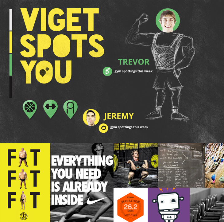
Weight lifting! CrossFit! Competition! Go hard or go home!
Yoga! Fun runs! Taking time to take care of yourself! Pink!
For Busy Vigets
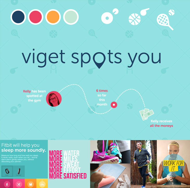
Any app for an active lifestyle needs to be quick and easy to scan. People want to get in, get out, and get back to being active! So we wanted SpotsYou to be as visual as possible, with the most important information immediately accessible. There were two important pieces of information that became the primary goals for SpotsYou: first, as a user, all you really need to know is how close you are to reaching your gym visit quota for the month. The wheel of progress leaves little room for doubt:
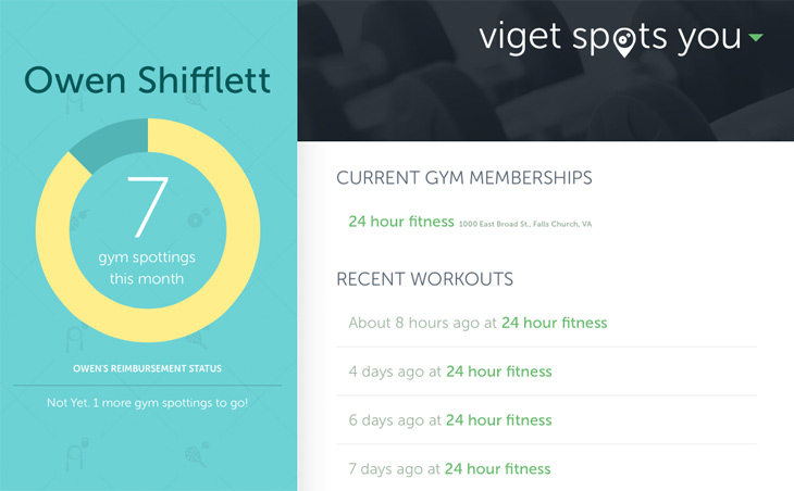
One more, man!
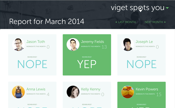
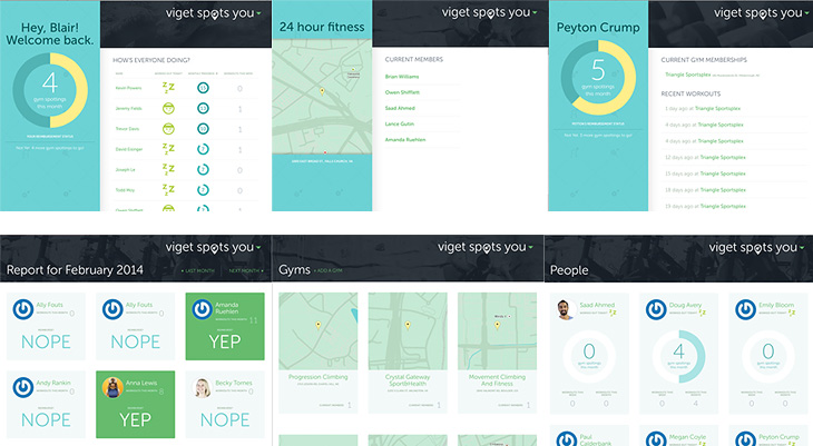
And second, when reimbursement time rolls around, bosses need to see who met the quota quickly and easily -- no squinting over tiny charts or tables:
Flexibility
An app for people who are out and about, hitting the gym, etc. needs to work on any device. The design responds down beautifully to mobile size, thanks to Jeremy.
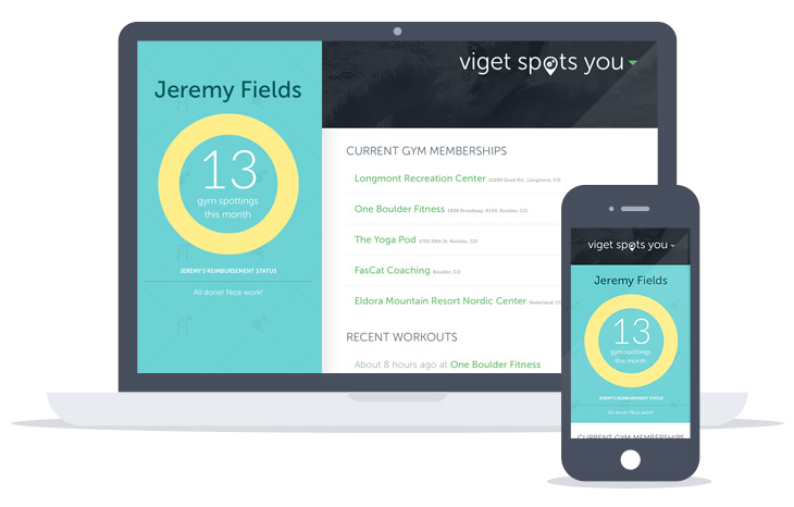
A simple, consistent system made up of only two templates, detail and list view, keep the app from getting unwieldy. The heavy use of icons, blocks of color, and other visuals like maps and graphic representation of numbers makes everything easy to scan. And the blocky templates make responding down a smooth transition.
Other Visualizations
Besides the wheel of progress, we kept it visual by using images and icons instead of text where possible. For example instead of simply saying "yes" or "no" to indicate if someone has worked out today, we used icons:
![]()
As we worked on developing the icons, we realized a tricky aspect of fitness apps is how to handle encouragement and reinforcement. Do you send notifications when people don’t work out? Do you point out when they’re working out less? Working out more? At their SXSW Interactive 2013 panel, the creators of the running app Zombies, Run! explained that one of their goals had been to give only positive encouragement, so people never felt nagged or down on themselves; they never felt any negative emotions associated with running. Whether you run slow or fast, four times a week or once a month, Zombies Run! will never berate you or imply that you’re doing anything less than an amazing job.
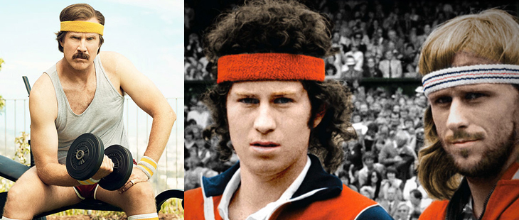
So with all that thought in the periphery, how does one visually represent “Worked out today” and “Didn’t work out today” without being too discouraging? The knee-jerk icons that come to mind, a fit figure and fat one, a muscley arm and a wimpy one, felt mean. Eventually I settled on this pair: some ZZZs for sleeping/resting instead of working out, which didn’t seem so bad (rest days are part of a good workout regimen, after all!) and to indicate working out, this little guy with a sweatband and a look of badassery and accomplishment on his face. As we all know, sweatbands and triumphant grimaces are the ultimate sign of destroying your workout. Just refer to the following evidence:
The Homepage
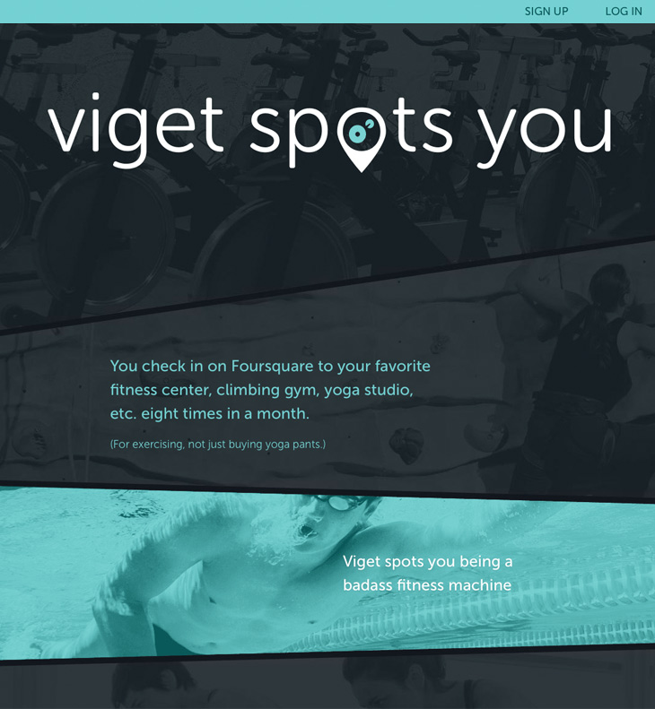
The app itself is mostly light and blue with darker touches. Outside the app, the homepage turns the aesthetic inside out, with dark imagery and light touches. The visual language is consistent between the app and the homepage, but this flip keeps them distinct and uses the style in the best possible way for each implementation. Big and photographic for the “marketing” page, clean and usable for the app. Rather than settle on one kind of fitness imagery, photos are used to show the variety of workouts and places you can go that SpotsYou recognizes. The photos within the app randomly rotate between the same set, so you’re never seeing only one kind of exercise.
Lessons Learned
- Just as nice-looking workout clothes make you happier to exercise, a warm, pleasant app and positive reinforcement makes tracking your fitness a little less painful.
- Visuals are faster to scan than text or numbers. And there's nearly always a way to make an element a little more visual, if you have the time and freedom, given the project.
- Some people at Viget work out a lot. Like... a lot.