Conf-essions of a Developer: The Biggest Takeaways from Config 2023
Eric Fuhrmann, Former Senior UI Developer
Article Categories:
Posted on
Config 2023 went big with its first in-person conference in several years. As a developer who relies on Figma extensively in my daily workflow, I'd like to share some of my initial impressions of the newly announced features.
Straight away, I'm really excited by what I saw at the conference. For those who missed it, I highly recommend checking out the keynote as it's well-paced and packed with tons of new and exciting features which are available NOW in Figma! From the lens of a developer, my immediate reaction was that many of these changes will have a significant impact on the way we interact and work with Figma.
Min / Max Values #
The first change which has some rather big implications for developers is that designers can now define min and max values for height and width. Why is this important? Well, this is a big step forward to better help facilitate responsive design/development. Developers often set thresholds that content needs to abide by since we're developing for a wide variety of screen sizes, whereas designers oftentimes only focus on the specific size of the frame they are designing for. This change means that designers can now make considerations for the minimum and maximum size certain content should scale to. This also makes it easier to see how content should flow, which leads to the next big change.
Auto Layout Wrap #
Auto layout now supports wrap! What is wrap? It isn't Figma's take on Spotify Wrapped. Wrap is when content in a row can no longer fit inside of its container and needs to move down to a new row to prevent overflow. Since designers can specify the minimum and maximum sizes of components, Figma can now dynamically auto-wrap content to a new row based on the given space. This brings Figma's auto layout feature to near parity with Flexbox; I think it will really help expedite both the design and development process. This change will give the designer the necessary tools to make considerations for responsiveness. Previously, a developer usually had to make an educated guess.

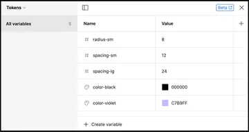
Local Variables #
Another really big addition that stood out to me is the use of local variables. Figma specifically highlighted their benefits in respect to prototyping, but through the lens of a developer this might be the closest we've come to having a native “design tokens”-like experience. Figma mentioned the ability to ping a REST API to sync variables between design and development, streamlining naming conventions and values used between both teams. But it's hard to tell how well this will work. I'm not sure just yet how versatile it will be, but the foundation seems to be there for something really impactful. Maybe someday we'll be able to sync a Tailwind config file to Figma variables and have them interact with each other? I don't know, but this is a promising change in the right direction.
Ready for development tag #
First, the mode is initiated by tagging a section ready for dev. That change in and of itself is pretty big, as it natively offers a way of tracking what screens should be developed, and which ones are scratch or works in progress. But it goes beyond that – there's now a dev toggle that changes the entire view to better suit developers. It removes noise in the layers panel by removing any content outside of the scope of sections that are flagged as ready for development, and it enables a timestamp of the last time a change occurred.
Comparing changes #
Going deeper, this also allows us to now get a working diff log of changes made between iterations, as well as a visual Diff View by clicking on the new compare changes option within the interface. This interface will bring up a side-by-side comparison of the screens and actually show which specific layers within the component have been changed and what those changes are.
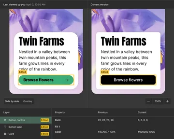
This is huge. Gone is the ambiguity of trying to figure out which screen is the most recent and identifying what minor tweaks have been made. This will also make it significantly easier for product managers to comb through design iterations and track those changes back to development, which segues nicely into the next section.
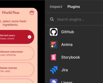
Developer specific plugin integration #
There are a lot of possibilities here, so for now I'll only be scratching the surface. Two of the new developer-focused plugins are Jira and GitHub integration directly into Figma. In my testing so far, the Jira plugin is far more feature-rich, allowing for creating and linking tickets directly within Figma. GitHub, on the other hand, seems to only allow linking existing issues or PRs to a specific component, allowing users to see the ticket details in Figma but nothing beyond that. It's still early days though, and one can only assume that these plugins will continue to evolve and expand.
The plugins currently available also go beyond just integrating tools into Figma. We can now run plugins that allow us to extract code in various languages, going so far as to build complete React components with associated type parameters based on the already defined Figma variants. Some plugins even allow you to jump directly into a code sandbox to play with the component directly out of Figma. Wild.
VS Code Extension #
Just when you think there can't be any more tooling improvements, Figma hits us with their impressive new VS Code extension which lets you leverage the Figma developer view from directly within VS Code. This works incredibly well and, though it offers just about all of the pertinent information a developer would need to work on a screen, I was disappointed to see that there was no diff log or compare changes view. For those features, you'll have to pop back over to the actual Figma application, which is only a minor grievance.

Component playground #
The last change I'd like to touch on is the new component playground view for components. This view pulls up an interactive modal which shows you all of the different props possible for that specific component. My immediate reaction was that this is basically Figma's take on a Storybook-like experience where a user can play with all of the possible options a component offers. This will save us from having to hunt down the original component in the file and enable us to play with the element without impacting any of the design. Before, I would routinely need to duplicate the element off to the side and play with the different props to see everything that was included. The only thing I would have liked to see here is a code view that shows you the actual styles within that variant. Until then, I feel like I'll still need to duplicate some iterations of the component in order to extract things like color or spacing out, but it’s still a nice feature to have in its current state.

That just about wraps up all of my initial impressions from the presentation. I look forward to playing with these new features more soon and seeing what other creative ways people leverage them. The future continues to look bright for Figma, and I'm really excited to see them starting to put more power into the hands of developers who rely on Figma files to get the job done.