Design Share: Now With 100% More Website

Our very own event series, Design Share, now has a website of its own. We needed somewhere to advertise upcoming events in the series, as well as archive videos and photos from the past two Design Share events.
Over the summer I've been chipping away at the project with Tumblr. This was a great chance to try out Tumblr and see what it could do since a site for Design Share needed to be simple, as well as easy for anyone to use and update, but it needed to still handle lots of videos and photos.
While building Design Share's site I learned that there are some benefits to using Tumblr and a couple snags.
Some of the good stuff:
- It's very easy to customize your layout. Tumblr has dozens of templates set up that you can use as they are, tweak a bit, or just use as a base to make something entirely unique.
- Tumblr uses an in-browser editor that simultaneously shows you a preview of your page. This keeps setup simple since you aren't dealing with FTP. The preview page also conveniently lets you see your edits as you make them, without permanently saving them. So you can completely goof up your code without doing any permanent damage.
- It's easy to use, especially for posting multimedia. Right at the top of your Tumblr dashboard you pick what kind of media post you're about to make, then simply pick if you want to embed something, like a YouTube video or a photo from Flickr, or upload it straight to Tumblr.
- Dynamic and more complicated elements are just as easy to install. Code for a Flickr badge or Twitter feed is already in Tumblr's templates, just plug in your username. A favicon can be uploaded and set up without even touching any code.
- You have total control over your sidebar content, making it anything you want. This is a huge advantage over other simple, free services like Twitter. The sidebar content is also separate from the main page of code. This'll come in handy next time someone needs to update details for Design Share's next event and they don't want to wade through a whole page of code.
Some of the less than good stuff:
- Tumblr automatically puts its own code on your page. What makes this a bad thing is their code does not validate to W3C standards. Between Tumblr and Vimeo (our host for our past event videos) the Design Share site has thirteen unfixable errors. The errors are nothing major, but it's annoying.
- One of the most frustrating aspects of using Tumblr: no simple hosting for your layout images. if you're customizing your layout, you probably have images you've made that you need to upload somewhere. You can always upload them to your own server or a free photohost like Photobucket. But Tumblr, as much as it prides itself on being easy to customize, doesn't have a simple way to host your custom graphics. You can trick it into doing so, but it's a hassle and takes some finagling; here's a step-by-step tutorial on the processs. But even if you go through all that, your image has to be less than 500px wide or Tumblr will resize it.
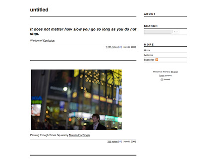
Overall however, Tumblr proved to be simple and convenient to use. I took full advantage of its customizing abilities and started my design for the Design Share page with one of Tumblr's templates. I picked the plainest template I could find that had the basic frame that I wanted:
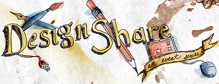
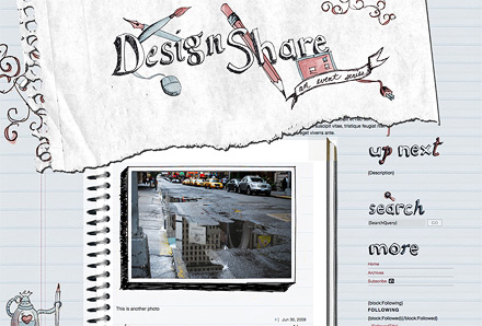
We wanted Design Share's concept to be simple and sketchy; think of a room full of designers at an event taking notes, but also doodling. I doodled all the graphics, from the header to the goofy little robots in the background, scanned them in, and cleaned and colored them in Photoshop. Then working with the in-browser editor straight on top of the template, I changed the basic elements around and added my own sketchy headers. The layout at this point looked like this:
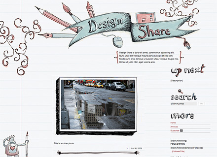
Pretty plain and flat. Seeing these results convinced me to take what I had into my own text editor and really try to push the customization. Slowly it evolved into this:
with a bit more dimension. I also started to play with layering elements using CSS and got to this point:
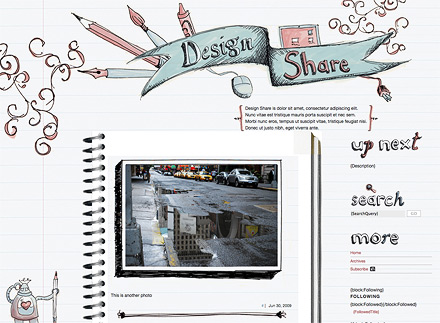
Okay, so it was getting closer. In the end, the final design got more detailed and more mangled looking, with coffee rings and a yellowing sketchbook:
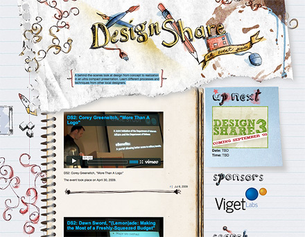
There's a lot more dimension, color, and detail in the page now, while still keeping it sketchy and low tech-looking. While the process was a bit roundabout, and I wouldn't advise anyone who wants an original design to start solely with a template, it got there in the end.
Check out the final product for youself at: designshare.org
Or start experimenting with a Tumblr of your own.