Collaborative Information Architecture at Scale
Brandon Dorn, Former Senior Product Designer
Article Categories:
Posted on
Designing an information architecture with input from multiple stakeholder groups can feel like a NASA-level effort. Below are thoughts on how to keep things organized while working systematically.
At least half of the work of design is not design, because design isn’t just "making things"—it’s making things with other people, many of whom usually aren’t designers. This is true any time you’re working with others from a domain outside of your own. Communicating ideas, marshaling stakeholder consensus, soliciting and incorporating feedback, and redefining problems that weren’t fully known at the start are all the non-design work of design, what we might generally call "facilitation."
Facilitation involves helping people make decisions in an unfamiliar context, which means it is a kind of translation. Translation is hard. It requires us to explain our work in plain language to help others give meaningful input. This is challenging when designing visual things, like application interfaces or editorial websites. But it is even harder when dealing with conceptual things, like information taxonomies and navigation structures. And when having to facilitate decision-making across multiple groups of stakeholders? It’s enough to make anyone want to go rogue and avoid seeking input entirely, or, more commonly, only gesture at meaningful facilitation without actually involving others in the process. But this is the real work, and it’s how the best work is done.
Here I describe an approach for defining new information architectures for large organizational websites managed by many stakeholder groups. There is nothing novel about this process, there is no trick to it, and it doesn't guarantee a successful IA. But it has helped me get a handle on projects that deal with content at a scale that tests the limits of comprehension—when working on websites with thousands of pages, for example. Not all of what I describe may be relevant to the work you do, but hopefully you will find elements to bring into your projects.
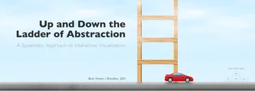
My thinking on the topic has been influenced by Bret Victor’s essays about tools for understanding, particularly his essay “Up and Down the Ladder of Abstraction.” He begins with a question we’ve all experienced when working with more information than we can take in at once: “How can we design systems when we don't fully know what we're dealing with?” Victor goes on to talk about how we make sense of complex data sets, and why information tools should allow us to easily move between abstract representations of discrete data—the categories we use to make sense of things—and the discrete data themselves. You’d be hard-pressed to find better thinking on information architecture.
Broadly speaking, there are four general phases to the approach I’ll outline:
- Auditing. Begin by immersing yourself in existing content and encourage stakeholders to adopt a critical, audience-minded perspective of their content.
- Diagramming. Work with stakeholders to develop new conceptual categories that better serve audiences and organizational direction.
- Elaborating. Think through content in detail and test new categories against specific instances and edge cases.
- Producing. Prepare content teams for production using a shared database of new sitemap pages and editorial considerations that you’ve developed incrementally.
The goal of all this is to facilitate a comprehensive assessment and redefinition of a dense website without losing the momentum and perspective needed to refocus it on the needs of its visitors. Though I don’t talk about audience research or testing or content strategy here, those are necessary influencing factors on this kind of work.
Auditing: Starting at Ground Level
When starting an IA redesign, my first goal is to familiarize myself with the shape of the existing content: How much is there? How long are the pages? What’s on the pages? How is content distributed across the site architecture? Do some sections dwarf others? Who is the content intended for? Is it up to date? The quickest way to do this is by casually looking through the website itself. Spend some quality time getting to know content types and URL structures. At this point I’m not reading closely but rather scanning pages to get a general sense of what we’re working with.
After informally browsing the website, I then work to document it as comprehensively as possible. Chances are you won’t find every page by navigating a site manually, especially on large sites, so a web crawl is necessary for documenting all available pages. If the website is relatively small (< 350 pages), free tools like Rob Hammond’s SEO Crawler are sufficient; otherwise, you’ll need to use Google Analytics or a robust web crawler for a full audit. After exporting to CSV, isolate page names from the URL in a separate column for readability (Brian Jackson’s short tutorial is helpful). Additional analytics like page views, bounce rates, and exit/entry rates can provide helpful context for assessing content.
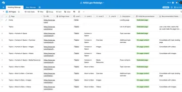
I'll then import the entire table into an Airtable base to prepare for a more focused assessment. I’ll call the base “Sitemap,” and this table, “Existing Sitemap.” My table usually looks something like this (you can view this base and make a copy here, if you're interested):

Here are some notes on the setting up these fields:
| Field name | Field type | Content |
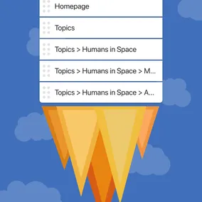
| Page | Formula | IF({Level 1},{Level 1}) & "" & IF({Level 2}, " > " & {Level 2}) & "" & IF({Level 3}, " > " & {Level 3}) & "" & IF({Level 4}, " > " & {Level 4}) & IF({Level 5}, " > " & {Level 5}) My goal with this column is to create an easily scannable name format. By referencing the content of the “Level” columns, I’m creating a more readable URL structure. |
| URL | URL | Page URL |
| Level 1 | Single select | First level below the root directory (e.g. “About” for /about). I use a single select because these cells will be repeated throughout the sitemap, and Airtable allows for bulk edits and ordering from the option editing menu for that column. This format also allows me to group rows together by site section in Airtable, which can be handy when focusing on certain sections of content in workshops. |
| Level 2, Level 3, etc. | Single select or Single line text | Columns for additional directory levels depending on the depth of the site IA. |
| Page Views | Number | While pageviews are a blunt way of assessing page relevance, they are a starting point for determining which pages are more valuable to visitors than others. Additional analytics such as entry and bounce rate can provide helpful context. |
| Description | Single line text | Brief notes about the content of the page for future reference, and for others who may be referencing the audit. Here I’ll note colloquial names for the page (e.g. “Projects index” for a page called “Work”). |
| Initial Recommendation | Single select | After glancing through a page, I’ll make a judgment about what to do with it. This isn’t meant to be a definitive decision, but rather a starting point for discussing what will become of its content. The options I use are: Dedicated page (green): Content is important and/or long enough to merit its own page. On-page content (green): Content should be kept, but does not merit its own page. TBD (yellow): Content may be kept, though its future form isn't yet clear. External link (blue): Link to content managed elsewhere. Remove (gray): Content is no longer relevant or important enough to keep in the redesign. |
| Recommendation Notes | Long text | Explanatory notes about why I’ve made the recommendation I have. These are mini heuristic evaluations about page content and design based on specific requirements for the website and goals for the project. Often they include questions to discuss with stakeholder teams. Some example notes: “Instead of spreading across multiple pages, consolidate ‘about’ info to a single page.” “Description of these departments is ambiguous. How do the two groups relate? Why are there two? Is that unique to the organization?” “Reuse this type of content throughout the site in marketing content for prospective customers. Could also be a dedicated page with more context, featured more prominently on a brand promise page.” |
| Content Owner | Single select | The person responsible for managing the content. We work with our primary contacts to determine these individuals. |
| [Client name] Recommendation | Single select | Includes the same options as “Initial Recommendation.” This is what stakeholders use when performing their own individual assessments, described below. |
| [Client name] Recommendation Notes | Long text | A place for stakeholders to share their perspectives on the content. |
| New Location | Link to record | Later in the process, as we begin to define the new sitemap, this column will be used to link existing pages to pages in the new sitemap. This only applies to pages whose content we plan to keep. |
As I import pages to the table and begin making recommendations, the table starts to look like this:
When auditing in depth, I look for a number of things:
- Intended audience. Who is this written for? What question(s) does it answer? Content must serve a clear purpose for one or more audiences.
- Duplicative content that could be consolidated. Sometimes it makes sense to include similar content in multiple places, but this risks confusion and inconsistency over time.
- Content on a single page that should be spread across multiple pages. Sometimes it makes sense to distribute similar types of content instead of consolidating them, e.g. with minimally-viewed video or image indexes.
- The ways in which a design system is breaking down. Why are certain patterns being misused or overused? What are people trying to use the website for that it isn’t accommodating?
- Empty or overstuffed pages. Pages should be comfortable to scan and read, with enough information to help someone develop an informed perspective on the topic without inundating them with detail. Studies have probably been done on this; mostly I go by feel.
- Content in PDFs and other documents that would be better suited as web page content.
This type of table prepares us to quickly navigate through, assess, and comment on webpages. Pages in the table are easily searchable, and because we have dedicated columns for directory levels, we can easily group pages by their section in the IA. This is useful for collapsing sections that you aren’t actively focused on and allows you to create dedicated views filtered for specific stakeholder groups (e.g. department-specific content). This minimizes effort for people who won’t be familiar with the table, only showing them the pages they’re responsible for.
Once you complete your audit, it’s time to invite stakeholders to do their audit using the same table. These people should be subject-matter experts ultimately responsible for maintaining the pages. Since people tend to be defensive when it comes to their content, it’s important to give them criteria for thinking critically about the purpose and format of the content from the audience’s perspective. Who is this intended for? What questions does it answer? Is there a better way to present this information? Should it be located elsewhere? Does it absolutely need to exist? Discuss these criteria with stakeholders before you send them on their way to ensure that they share the same goals for the redesign. Approaches like Becky’s Create, Remove, Update, Delete are helpful for guiding page-level recommendations.
There are bound to be discrepancies between your and the clients’ page recommendations. One of the purposes of this table is to surface these disagreements early on in a project and discuss them in the light of the website’s content strategy. We’ll create a list of instances where our recommendations differ — mainly where a client wants to keep content that we recommend removing — to discuss in focused conversations. Content may have merit that we didn’t recognize at first glance, but if not, this is when we decide what can be left behind.
Diagramming: Climbing up the Ladder
Auditing a website reveals the raw material we have to work with, and the content itself hints at clients’ tendencies and capabilities when it comes to their content. In-depth auditing helps me get familiar with the problems they’re trying to solve: what’s been tried before, what’s working, and what isn’t. But I don’t want to make broad decisions about an IA while down in the weeds. To avoid replicating the website’s status quo and instead think broadly about what the content and IA should be, we need to go up the ladder of abstraction, to use Victor’s words.
Once I have a sense of what an IA is trying to be — from the site audit, stakeholder interviews, content strategy definition, user research, and my own judgment — I’ll take a first pass at creating new conceptual categories. Tools like Whimsical and Miro are useful for quickly diagramming rough IA concepts. When working at this level, I’m not concerned about page layouts or the format of the content, instead focusing on the general purpose for each section, sub-sections and pages, using the results of the audit as a reference. I’m making assumptions about how content should be distributed, what deserves its own page or section, and what things should be called.

This diagram will get worked and re-worked in focused discussions with each stakeholder group. What's important is that the same board is being used in each stakeholder discussion, so that each party can see how the overall information architecture is evolving.
Elaborating: Stepping Down a Few Rungs
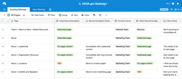
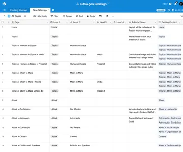
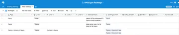
With a well-workshopped IA diagram in hand, I return to a lower level of abstraction to begin documenting the new IA on a page-by-page basis. In the Airtable base I’ll create a second table, “New Sitemap,” with essentially the same fields as those in the “Existing Sitemap” table, though with a few differences:
- Instead of a “New Location” field, the New Sitemap table will have an “Existing Content” field. This is where I link pages from the existing website table to pages in the new site structure.
- There are no “Recommendation” fields, as the table itself is a complete recommendation for the new sitemap (though one still open to revision).
The new table ends up looking like this, to start (here's the link again, if you'd like to look at the table itself):
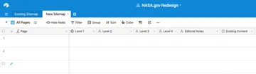
Details for setting up the New Sitemap table:
| Field name | Field type | Content |
| Page | Formula (same as above) | Uses the same formula as the “Existing Sitemap” table. |
| Level 1, Level 2, etc. | Short text | Individual fields for each level in the site hierarchy. |
| Editorial Notes | Long text | Editorial considerations for pages as needed. This can include notes about what content may be included on the page or general intentions for the page. |
| Existing Content | Link to Records | Links to relevant records (pages) from the “Existing Sitemap” table. This field becomes a helpful reference for content editors as they consolidate and create new pages for the website. |
This is time-consuming, manual, intensive work. But it is the surest way I can think of to build an IA structure against actual content, to surface exceptions and outliers that don’t quite fit instead of discovering them later on, once content production is underway. This kind of documentation is where the work of IA and content strategy merge.
Although the new sitemap is based on concepts deliberated during IA working sessions, it still involves considerable judgment on the part of content strategists and information architects and so requires in-depth review and testing. We often use Treejack to test dense navigation structures and terms with representative users. This is an ideal stage to do so, having thought through the new structure in some detail. And ideally you will be able to run two tests: one with the existing navigation to establish baseline results, and a second to test the new structure.
Producing: Returning to Ground Level
Because the new sitemap documents the navigation structure down to individual pages, many of which reference existing content and include editorial notes, we’ve found it useful to take this table a step further and turn it into a content creation calendar for our clients to use. By adding content creator and deadline fields, the table becomes the structural documentation and the production timeline for a website launch.
Notes on these additional fields:
| Field name | Field type | Content |
| Editor / Creator | Single select | Person(s) responsible for creating and editing content for the new page. This field can be used to create custom views for individuals to show them only the pages they are responsible for. |
| Deadline | Date | Especially helpful when creating calendar views in Airtable. |
| Approved | Checkbox | Indicates whether content has been reviewed and approved by the appropriate parties. |
| New URL | URL | A link to the newly-produced page. |
If our clients are using Airtable for the first time, we will be sure to show them how we’ve structured the base, how the various column types work, and how to edit it. We want them to feel comfortable using the tool, especially since it is often the primary source of documentation for their new IA. We’ll show them how to create a calendar view of their content deadlines, or how to group records by content editors. At the end of the engagement, they have a single base that includes comprehensive documentation of their existing and new website structures and, hopefully, clear direction for actually creating their new content.
This is an admittedly conservative approach to creating a new IA, because it pays very close attention to existing content and structure to determine what to keep and what to leave behind. I rarely start from a blank slate, even if a client is adamant that they want something completely different than what they currently have. Oftentimes, some good things are happening on a client’s website, even if it isn’t immediately evident, and I seek to build on these.
That said, when approaching a redesign this way, it’s important not to be overly influenced by the current state of a website as you immerse yourself in it. Comparative research, design critique with people outside of the project, and usability testing are all ways to counter this tendency. Our work should be conceptually sound and practically sound—considered from at the conceptual level, from the top of the ladder, and at the page level. To do this, find the tools and process that allow you to travel freely from one vantage point to another.