Colds. Remedies. Web Designs.
Peyton Crump, Former Design Director
Article Category:
Posted on
So I've had a nagging cold for two weeks now, and I'm one grumpy Crumpy. I might write up my persona as: thirty-three year old web designer, tired and a bit on the cynical side, coming to pharmacy site hoping to find a good cold/flu product via some effective design. I'm overly touchy (because of a 2-week cold) and I'm overly analytical (because I'm writing a blog post).
I recently visited 4 sites:
Here were my generally subjective evaluation questions:
- How do I respond to the overall visual approach (layout, colors, typography, hierarchy)?
- How appropriate does the home page feature area feel? Does it inform or annoy?
- Does the main product page make it easy to get a comparative overview of what's available?
- Are the tools for narrowing my remedy search effective, focused, and fast?
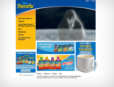
TheraFlu.com:
- Overall visual - Not bad. Not knock-my-socks off, but homey feeling. It works. Good colors. Not too sure about the swoosh and the sidebar nav that expands to great lengths.
- Home feature - A commercial on autoplay. Eh, it's markety and not super useful, but I relate to that lady that feels crappy.
- Product page - The old rollover product menu. A bit cumbersome and not laid out well. I can't click on the product box to get details.
- Remedy tool - The tool is a popup, seriously? Not bad filtering options though. I would love to see some details for highlighted products within the tool.
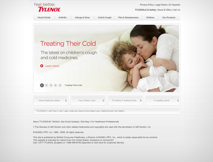
Tylenol.com:
- Overall visual - Nice and soft. Stands out from the other sites. Allows colorful products, photographs, headlines, and links to really pop off the page.
- Home feature - Doesn't make noise, which is a plus. Generally helpful info, well-selected photography.
- Product page - Feels like the products should be the focus and the cold and flu help info should be secondary.
- Remedy tool - No real tool, but I can generally filter via the content structure and functionality. Not bad.
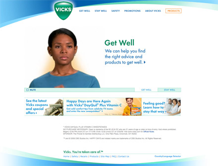
Vicks.com:
- Overall visual - Still not a fan of extreme swooshes. Feels like Vicks though I guess. Strong colors. Feels cluttered.
- Home feature - The spacey coughing lady drives me nuts. Cutesy, and I'm definitely not wanting cutesy. The flu finder is cool.
- Product page - No meaningful display of the products, browsing below by product group seems one-dimensional. Doesn't encourage multi-symptom product identification very well.
- Remedy tool - Pretty slow loading. The sliders are cool. The lady who responds to my sliders, not so much (Flash time not well spent in my opinion).
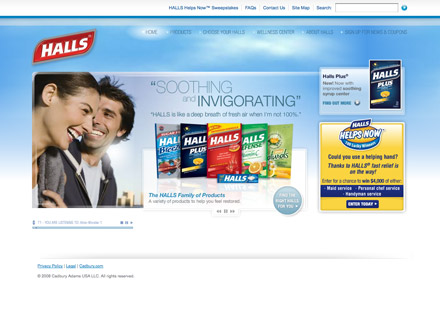
GetHalls.com:
- Overall visual - Nice look, appropriate colors. Primary nav a bit too subtle.
- Home feature - Smiling happy people and fanciful music ... both annoying. Causes me to ignore the product features and want off the page.
- Product page - Yes, a straight-forward gallery page that I can quickly scan. I like it.
- Remedy tool - Not bad. Simple and fast, even gives me a few options that are non-symptom related.
So, simply a few comparative thoughts and some attention to sites that should be seeing real traffic increases in the coming months. I find it rather useful to do some semi-focused comparative analysis (outside of my project work) on occasion. It generates ideas, sharpens my instincts, and helps trigger aha moments later when I'm evaluating approaches for my next project.