Change Web Designers Can Believe In
Mindy Wagner, Former Design Director
Article Category:
Posted on
Much has been written about President Obama's strategic use of the internet to market his campaign and mobilize an army of over 7 million supporters who might otherwise have sat on the sidelines. Our own Ryan Moede summed it up in this post by saying, "The Obama campaign was an impressive orchestration of on-message brand discipline, social media marketing, networking, user-generated content and direct marketing that built a fiercely passionate movement."
President Obama's campaign clearly "got it" when it came to leveraging the web community, and his designers cranked out beautiful sites for Change.gov and BarackObama.com, so I was looking forward to the WhiteHouse.gov redesign. I couldn't help but imagine how tense the team must have been, ready to launch their new site at precisely the right moment during a day of unprecedented pomp and circumstance. No pressure.... At exactly 12 p.m. on January 20th, http://www.whitehouse.gov/ switched over to a new design. I hope they had champagne on hand to celebrate the smooth transition.
A Look Back
The Wayback Machine's first record of the WhiteHouse.gov site is from December 1996 during Clinton's presidency. It started out as a stark and lifeless thing. It has gone through a few iterations, though not nearly as many as one would imagine. Below are a few screenshots from the past. Look how far we've come!
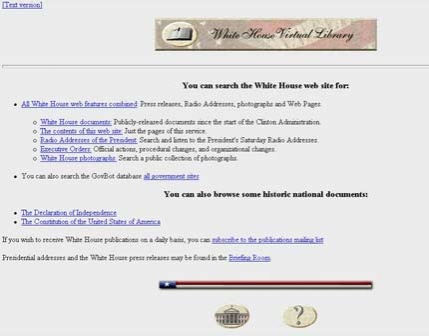
A '97 version with nothing but a few links and a patriotic divider.

A '99 version, complete with animated waving flags.
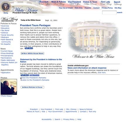
George W's second approach, made more information-heavy after September 11th.
I've skipped a few rounds, so if you would like to see all of the archived site designs available from Wayback Machine check out http://web.archive.org/web/*/http://whitehouse.gov
As you can see, design was never much of a consideration on this site. Most of the previous layouts were sparse and utilitarian. I know it's all about the content, but does it hurt to have just a little bit of beauty mixed in?
Pre-Inauguration
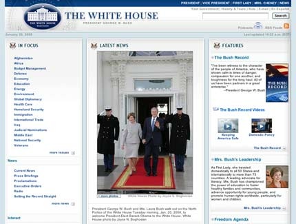
Like it's predecessors the pre-inauguration site lacked polish. But more importantly it lacked focus and clarity. All of the headers for content sections and blog posts were the same size and color. There was no clear primary navigation, but a plethora of links scrolling down the left sidebar and across the top. No accent colors were used, so everything "important" showed up in bold blue.
Post-Inauguration
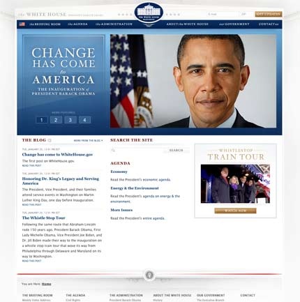
The redesigned WhiteHouse.gov site uses many of the same gradients, backgrounds, subtle shadows and text treatments that made Change.gov so eye-catching. It's great to see that the consistent branding used during the campaign has not been abandoned. Instead the designers toned down the vibrant colors and icons, replacing them with more whitespace and softer flourishes to create a site that feels serious and trustworthy without losing its modern edge. And all aesthetics aside, things like the addition of maroon for headlines, an identifiable primary nav, and a more organized linkfest in the footer should all make this site less confusing to visitors.
For me, the new site shines because of the small touches that were lovingly addressed. A quick look at the White House logo used in the headers of both sites illustrates the difference in attention to detail. The old logo has an unrealistic "shiny button" effect applied to it. The new treatment features very subtle shadows, an eagle seating it in the navigation bar, and a row of gray stars flanking either side. It looks elegant and carries more significance.

The changes to WhiteHouse.gov go well beyond the facelift, of course. There are beautiful slideshows (site note — they're quirky on Firefox for Mac), fun facts, and invitations to participate. Promises have been made to solicit feedback on the website. And while it's still early, it does looks like President Obama will continue to reach out online with tools like the blog (with 6 RSS feeds), weekly video addresses, and an email newsletter. Maybe in the next few weeks they'll add a Twitter feed and a way to link up with all those Facebook groups out there!

The Icing On The Cake
Yep, the design rocks. The new social media tools are going to help with that whole transparency thing. It follows currrent web standards and has well-commented markup. And you want to know what else? According to W3C it validates to XHTML 1.0 Transitional. (Although I hear they're still using WebTrends. I feel for the poor sap who has to interpret those reports.)
What do you think about the new redesign? Love it? Hate it? Share your thoughts!
