Building Soli: An Intern Journey to Delivering an MVP


Sadie Finn, Project Manager,
Anabel Russo, Junior Visual Designer,
Anya Parekh, Former Application Developer Intern,
Avery Antal, Former UX Strategist Intern,
Darby Krugel, Former UX Researcher Intern,
Robert Koch, Former UI Developer Intern, and
Tammy Ding, Former Product Designer Intern
Article Categories:
Posted on
Do you need to touch grass? We did, too. So, we built ourselves a solution.
At the beginning of our summer internship, our cross-functional team of seven was tasked to research, design, and build a product in just nine weeks. We started by brainstorming solutions to problems we face often in our daily lives, and one was common to all of us — getting out and exploring our surroundings. Whether that was because we felt too stuck in our routines, or because we didn’t know what to do, getting out just felt hard. So we decided to build a solution that would make it easy.
Soli, the Touch Grass App
Meet Soli — an app designed to inspire solo explorers like us to stop waiting and start experiencing the world around us. It’s not as impersonal as Yelp, but not as social or performative as Instagram. Soli helps users find and share guides, which are collections of activities curated by real people.
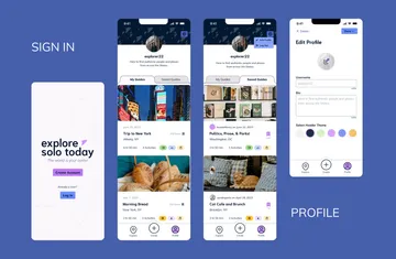
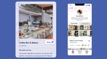
Creating a Soli profile allows you to browse through guides to discover new things to do based on your location, the time you have available, and the types of activities you’re interested in. For example, if I wanted to take a lunch break from Viget HQ, I could search Soli for guides in Falls Church that take less than an hour and include the tags “Eat” and “Relax.” If I found more than one good option, I could bookmark the extras to check out on future lunch breaks.
You can also create a guide to share a solo experience of your own. Give your guide a title and an enticing cover photo, then add details about each activity. Summarize your experience with tags, and post it for everyone to discover.
Lessons from User Research
So, how did we achieve this beautiful end result? We started with research. What would people need in an app to help them plan and do fun things? To answer this question, we conducted six user interviews and gleaned from them four main themes:
Users are interested in solo exploration
Users look for authentic and trustworthy recommendations
Users want tools that are simple and easy to use
Users can be hesitant to post online recommendations
Two recommendations from the interviews significantly impacted how Soli took shape:
Include location information for each activity
In the very early days of Soli, we imagined the app with a built-in map to display where activities in guides are located, but scrapped this idea due to time constraints. During the user interviews, however, participants stressed the importance of precise location information for each activity. With a bit of creative thinking, we solved the problem by linking out to each activity’s location on Google Maps.
Allow users to view the profile of a guide’s creator
We also found that people care about who is giving them recommendations and want to know more about each guide’s creator. Are they like me? Will I like to do the things they like to do? To give users some insight into whose recommendation they might be taking, we created the profile page to display each creator’s bio and all their posted guides.
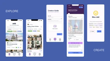
Building Soli: Explore and Create
With our research findings in hand, the next step was to construct two user flows: Explore and Create. We designed the Explore flow to make planning more efficient for users coming to Soli to discover new activities. It includes easily scrollable sneak peeks of guides, more detailed guide pages with a full list of activities, and an indicator that shows how many people have saved a guide, to help validate its usefulness and popularity.
We designed the Create flow for users to share their own experiences with photos and descriptive captions. One of the most impactful parts of the Create flow is the caption prompts, which encourage users to reflect on their authentic personal experiences in creative ways.
Designing with Personality
The next step in bringing our vision to life was actually designing the screens. We started by developing a brand direction informed by our UX research and a visual design audit of apps in a similar space. The brand needed to be compelling, to inspire people to get out of the house and go! We wanted Soli to be authentic and not overly curated; independent, but not lonely; and structured, but not rigid. These pillars led to the creation of our final brand vision: “rediscover your autonomy.” We created Soli to look personal, whimsical, and playful, and to feel inspiring, liberating, and authentic. This brand strategy reminds independent explorers of their inherent creativity and resourcefulness.
Here’s how we applied that visual strategy to the final screens in Soli:
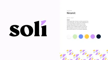
We took care to balance our UI style guide
Our UI style guide contains the building blocks of our screens and is built to elicit excitement and convey a sense of reliability, allowing users to feel both inspired and comfortable in their explorations. Our font and color choices prioritize accessibility, while also giving the user an inclusive, personal, and playful feeling while using Soli.

We incorporated motion and added fun through graphics
Right from the start, users are welcomed into Soli with an animation that brings our logo to life. Micro-animations like the wiggle of the arrow give personality and energy to the brand, while hinting to themes of independence and travel. Graphic touches give guides a hand-crafted and distinctly human feel.
A Peek Under the Hood: Development
So how did we bring these designs into the real world? The technologies used on the back-end include a Postgres database, the Ruby on Rails framework, which connects the database and the application pages, and an Amazon S3 bucket to store all the image attachments. On the front-end, we used Embedded Ruby to combine Ruby and HTML. We also used Tailwind CSS for styling, along with Vite to build the project, and Stimulus as our JavaScript framework.
While UX strategy and design were taking shape, we created a data model and worked to de-risk some high priority features that we knew we’d need for Soli. For example, we built a Spotify clone that helped us test out implementing active storage with images and search.
Then, based on what we had learned from side projects, we adopted a sprint-style approach to implementation: working first on Create, then Explore, then Profile, and lastly, the login pages. We deployed the site using fly.io to kickstart the QA process and added in extra features, like giving users the ability to save guides, filter by duration on the Explore page, and customize their profiles.
On the front-end, we focused first on using Embedded Ruby and HTML to build out the components from Figma. We used a lot of different utility classes in Tailwind for styling, and finished off by developing some front-end features, like using JavaScript to allow users to search for guides using multiple parameters at the same time.
Usability Testing and Adjustments
In the seventh week of our nine-week project, we conducted four usability tests with a clickable prototype to understand how users interact with Soli and expose any points of confusion. We identified some quick wins, like changing the default text in the search bar to prompt the user for a location, but there was one major recommendation that required involvement from the whole team:
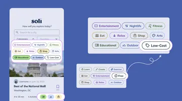
Edit tag names and icons
Our tests revealed a lot of confusion about the tags used to categorize the guides. This confusion persisted whether users could see the full names of the tags or only the icons. To make sure these tags were easily understandable by our users, we recommended changing both the names and the icons that caused the most confusion.
This recommendation, combined with changes to the tag use cases, caused us to go back to the drawing board to tweak the tag names and icons. For example, we changed the tag name “Free” to “Low-Cost,” and switched the piggy bank icon–which some people associated with gaining money–to a sale tag icon. We also added new tags like “Nightlife” and “Arts.” These adjustments clarified the meaning of the tags, and made them representative of a wider range of possible activities.
We also noticed during usability tests that participants would try to click on tags that weren't clickable. The interactivity of tags across the app was inconsistent–and it was impacting user experience. To aid our users in understanding the functions of tags, we adjusted the use of strokes and fills to develop unique tag styles, showing when tags are clickable and when they’re not.
Learning How to Talk and Scope
In addition to all the hard skills we learned through this project, from Figma components to new programming languages, we also learned a lot about team collaboration and project constraints. Here are our two biggest takeaways:
Open communication is essential to cohesive collaboration. On a team of seven ambitious hard-workers, each with a different role, it is important to balance advocating for your work with flexibility in the process. Talking often with teammates about what everyone is doing can help to give the full team ample time and space to execute their responsibilities.
Prioritizing quality over quantity of features. It was definitely hard to pare down our full vision of Soli to what could realistically be accomplished in our timeline. By the end of the project, however, we all came to realize (through first-hand experience) that building the smallest version of a product first is an efficient approach to developing an MVP.
And that’s how we built Soli! Check out the final product, or dig into our code and design artifacts.