Building a Nested Responsive Grid with Sass & Compass
Trevor Davis, Former Front-End Development Technical Director
Article Categories:
Posted on
Whether you are a hater of the technique or not, Responsive Design is one of the most important things happening on the web right now. I am finally getting a chance to work on a project where we are taking a responsive approach to the site, and it’s been great, but I have definitely come across a few gotchas here and there.
The one issue that definitely took some thinking to figure out was how to deal with nested columns. What the heck do I mean by that? The following image should demonstrate what exactly I mean:
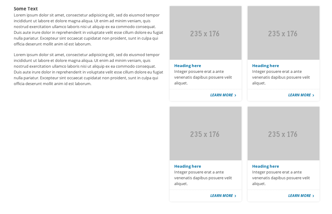
For the site I am building, we are using a 12 column grid. To build the layout pictured above, we are looking at two 6-column-width columns, and the second column would have 2 rows with two 3-column-width columns in it. Kinda confusing in words, but here it is in markup:
<div class="row">
    <div class="span6">
        Left Column
    </div>

    <div class="span6">
        Right Column

        <ul class="row">
            <li class="span3">Sub Column</li>
            <li class="span3">Sub Column</li>
        </ul>

        <ul class="row">
            <li class="span3">Sub Column</li>
            <li class="span3">Sub Column</li>
        </ul>
    </div>
</div>
If we take fluid grids out of the picture, that would all work fine. But, since we are using percentages, that would look like crap, and here’s why.
.span6 {
    width: 49%;
}
.span3 {
    width: 23.5%;
}
Here are the pixel equivalents if our design were 1000px wide:
span6: 1000 * 0.49 = 490
span3: 1000 * 0.235 = 235
span3 inside of a span6: 490 * 0.235 = 115.15
So clearly that approach won’t work.
How does Twitter Bootstrap handle it?
Nesting with fluid grids is a bit different: the number of nested columns doesn't need to match the parent. Instead, your columns are reset at each level because each row takes up 100% of the parent column.
Ok, so they are recommending that the markup should look like this:
<div class="row">
    <div class="span6">
        Left Column
    </div>

    <div class="span6">
        Right Column

        <ul class="row">
            <li class="span6">Sub Column</li>
            <li class="span6">Sub Column</li>
        </ul>

        <ul class="row">
            <li class="span6">Sub Column</li>
            <li class="span6">Sub Column</li>
        </ul>
    </div>
</div>
Weird, but ok. Let’s look at how our columns calculate out in pixels.
span6: 1000 * 0.49 = 490
span3: 1000 * 0.235 = 235
span6 inside of a span6: 490 * 0.49 = 240.1
Hmmmm, close, but that value is a bit different from what the design is calling for. Here’s where we could argue about sites not having to be pixel perfect to the design and blah blah blah. But, this is potentially a larger problem because we need to have images big enough to fill those sub-columns.
My Solution
My solution involves “resetting” the values of each sub-column’s width inside of every column. Sure, that sounds like a lot of work, but Sass and Compass can help with that.
Variables and Mixins
$cols: 12;
$gutter: 2%;
$one_col: (100% - ($gutter * ($cols - 1))) / $cols;
@mixin cols($num) {
    width: ($one_col * $num) + ($gutter * ($num - 1));
}
@mixin sub_cols($num_child, $num_parent) {
    $parent_size: ($one_col * $num_parent) + ($gutter * ($num_parent - 1));
    $child_size: ($one_col * $num_child) + ($gutter * ($num_child - 1));
    margin-left: ($gutter / $parent_size) * 100%;
    width: ($child_size / $parent_size) * 100%;
}
$cols and $gutter are variables that you would want to adjust to match whatever grid your designer is using. The rest are things you shouldn’t have to change.
Generate the grid
Next, we need to utilize these mixins and generate our grid.
.row {
    #{enumerate('.span', 1, $cols, '')} {
        float: left;
        margin-left: $gutter;
    }
    @for $i from 1 through $cols {
        .span#{$i} {
            @include cols($i);
            @for $j from 1 through ($i - 1) {
                .span#{$j} {
                    @include sub_cols($j, $i);
                }
            }
        }
    }
    > :first-child,
    .row > :first-child {
        margin-left: 0;
    }
}
A sample of our output would look something like this:
.row .span6 {
 width: 49%;
}
.row .span6 .span1 {
 margin-left: 4.0816326531%;
 width: 13.2653061224%;
}
.row .span6 .span2 {
 margin-left: 4.0816326531%;
 width: 30.612244898%;
}
.row .span6 .span3 {
 margin-left: 4.0816326531%;
 width: 47.9591836735%;
}
.row .span6 .span4 {
 margin-left: 4.0816326531%;
 width: 65.306122449%;
}
.row .span6 .span5 {
 margin-left: 4.0816326531%;
 width: 82.6530612245%;
}
So, if we take our new width for a 3 sub-column inside of a 6, 47.9591836735%, and do some math, this is what we get:
span6: 1000 * 0.49 = 490
span3: 1000 * 0.235 = 235
span3 inside of a span6: 490 * 0.479591836735 = 235
Hot.
I’ve got a repo up on github with all this stuff in it, along with some demos. I also put together a fiddle if you just want to mess around with it.
One More Thing
I had to increase the number of decimal places to get more precise percentages. You can do that by throwing this into your config file:
Sass::Script::Number.precision = 10
A Caveat
This only solves the problem two levels deep. If you tried to go another level down, you would encounter the same problem, but two levels was deep enough for me.
So how have you all solved this problem before?