Breaking Down the Process: TapMetrics.com
Brian Talbot, Former Viget
Article Category:
Posted on
Having the opportunity to refine an idea or concept into a solid and successful product is one of the things I love most about my profession. Here at Viget, we often do just that, on a foundational level, with our start-up clients. Working with the founders of TapMetrics was no exception.
TapMetrics is a tool that consolidates iPhone application sales data, user feedback, software metrics, and other information to allow both business development folks and developers to manage a portfolio of applications. The fellas at TapMetrics, working within a limited timeline and budget, decided to focus our team's efforts on refining their tool's existing information architecture and alpha interface. With that in mind, Kevin and I worked toward an end goal of delivering fairly high fidelity wirefames for some of the tool's core views. The plan was to let TapMetrics' business owners and their team of keen developers take the details from these and run with them, then refine the design after implementation.
Getting Started
Diving into TapMetrics was a fun process. We started with a great brainstorming and research session with Nolan and Chris. Our conversation centered around their hopes, as business owners, for TapMetrics as well as the praise, gripes, and wishes their alpha testers had voiced while using the tool. A good majority of the feedback concerned the following:
- All available information for a particular iPhone application should be centralized and presented in a unified way.
- An application's analytics, messages and alerts should be communicated effectively and appropriately, based on their context.
- The process of managing, importing and exporting an application's information should be straightforward and as streamlined as possible.
- iPhone application information should be leveraged for insight into application management and strategy over time.
From there, we wrapped our heads around all of the data TapMetrics can gather and leverage from the iTunes Store and took a peek into the application's current interface with some general usability heuristics and the above list in mind.
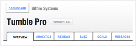
After taking stock of things, we created wireframes that represented an account owner's Dashboard View and an Individual iPhone Application View. In these wireframes we addressed the following:
Managing Applications
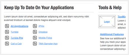
We wanted application owners to have access to all their business and technical information in one place. Our design for the application hub brings it all together, with a front-page focus on what's currently happening with an owner's application:
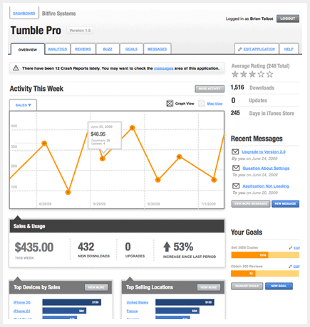
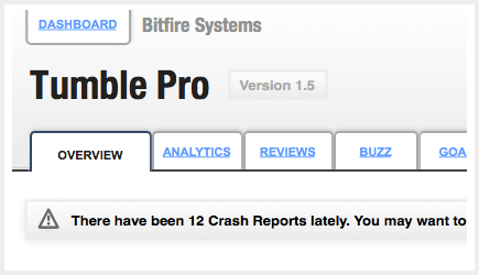
For each application, we organized all the data TapMetrics makes available (analytics, reviews, buzz, messages and others) into separate sections. In addition to these data-centric sections, owners have access to the administration settings of an appplication and an extensive help section:
A Dashing Dashboard
To keep application stakeholders in the know about all of the applications they own and manage through TapMetrics, we decided an up-to-the minute dashboard showing vital and trending information would do the trick. The word dashboard gets thrown around a lot these days, and while a "dashboard" in itself is not a cure-all for the usability of a product, the act of prioritizing information and communicating associations between data can go a long way toward taking the pulse of an application. We focused on placing time-sensitive, meaningful, summarized information in the dashboard, to communicate that pulse to owners right away:
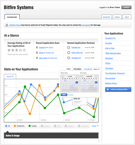
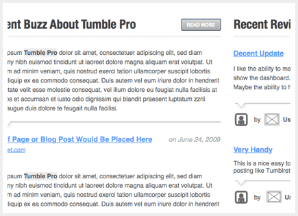
Along with statistical data about applications, TapMetrics also provides some great insight into the traction they have with consumers through iTunes Store reviews and with the general public through "Buzz" (references to applications) across a set of owner-selected sites. Because this information can have a huge impact on an application's success, we wanted to make sure the most recent social activity "bubbled up" to the top of the site:
Visual Displays of Quantitative Information
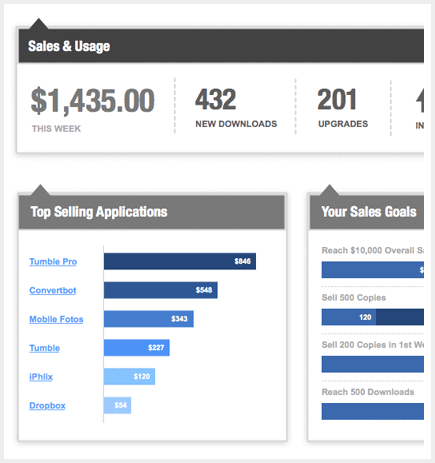
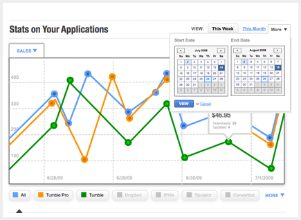
TapMetrics lets owners dive into a wealth of analytics, including location, sales, download, and device information. We wanted to encourage this diving, so we created some additional parameters to help owners understand trends across time and space. New controls for selection of pre-set or custom timeframes will allow owners to zoom in on a specific moment in time, such as an update release. Owners can also toggle between a graph and map display for different trend contexts. To get a larger picture within the dashboard view, owners can line up different applications' analytics side-by-side to compare:
Communication
It's imperative that product owners are aware of any questions, issues or feedback their consumers may have. TapMetrics' ability to gather consumer messages and send broadcast announcements is really useful. We wanted to make sure that utility was front and center, so we placed recent messages and alerts in prominent, organized places. This layout will help owners address consumer feedback as efficiently as possible:
Thinking Ahead
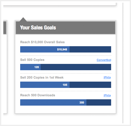
Since TapMetrics is a young product, we wanted to think about possible future directions even as we completed this set of short-term design suggestions. With all the rich data an application owner can access and monitor, allowing an owner to set goals for progress over time makes complete sense as an added feature. Goals could be set around sales, as well as consumer ratings, reviews, buzz, crashes and technical statistics. These goals could be set for a single applications, or across all applications, for total sales, customer service and reputation:
I really enjoyed working with the team at TapMetrics to take their young, promising product and make it even more effective as a one-stop-shop for iPhone application owners. I hope Chris and Nolan get a lot out of the concepts we designed, and continue to build upon them to improve the already solid and useful web application. I can't wait to see what they have up their sleeves next.