Behind the Scenes: DwellAgent
Tom Osborne, Former VP, Design
Article Category:
Posted on
Design Dilemma
It's time to design. You have nothing to go by. No name. No identifying mark. No color palettes or type styles to get things going. All you know is that you have to design a web application. Where do you begin?
This is exactly the situation we found ourselves in when John Lynch and Edward Johnston came to us wanting to create something to make it easier for real estate agents to manage listings and market their services.
Time was limited and there was much ground to cover. So we started with some quick naming and identity exercises alongside site maps, user flows, and wireframes. Simultaneously, we tested the waters with some stylistic concepts we call mood boards before approaching compositional design. Here are the results of that work:
What should we call it?
Working closely with our client, we quickly settled on a name through word association exercises and then experimented with some identifying marks. A door knocker was selected to represent a friendly way of saying "welcome" or "hey, we're here".
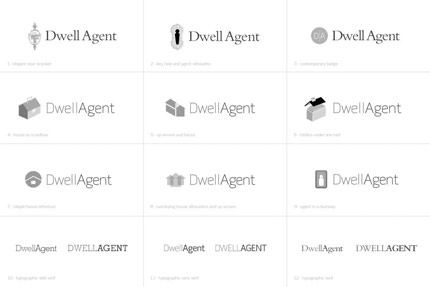
Logo Concepts
What will it consist of?
Meanwhile, we worked out the features of the application by wiring up a listing page.
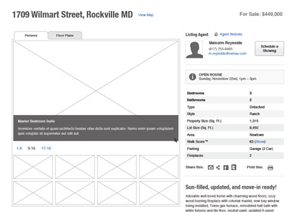
Listing Wireframe
Are there pricing options?
Pricing would prove to be important so we worked with the client to provide a strategy that would include a "try for free" option in addition to premium options.
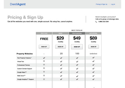
Pricing Wireframe
What will it look like and how will it feel?
We approached the mood boards as if we'd be designing the very first thing a new user would see: the home page. By exploring some possible home page visual concepts with mood boards, we could get immediate feedback from the client that we'd apply to the application's design. At this point the features were set, the architecture of the site was almost firm, and development was underway; it was time to start applying a look and feel for DwellAgent through color, type, and other style choices. "Simple", "elegant", and "sophisticated" were the three main attributes we took into the mood board design and these are the results:
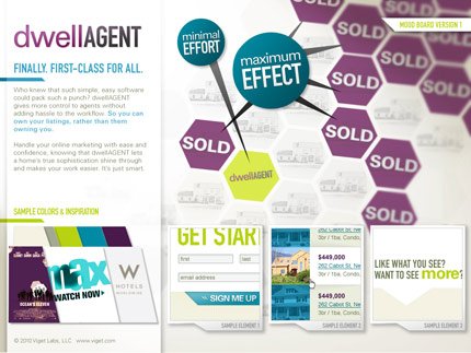
Mood Board 1: Selling Focus
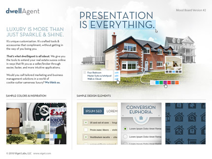
Mood Board 2: Real Estate Focus
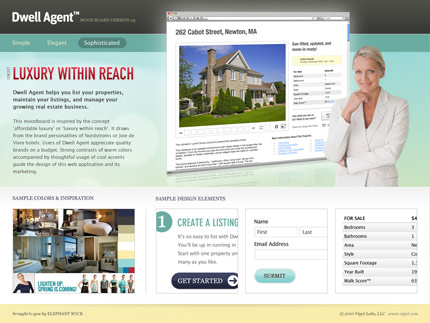
Mood Board 3: Software Focus
Practially speaking, what does that look like?
From the mood board presentation we learned:
- Purple: YES!, florescent green: NOOOOOO!
- "Minimal Effort, Maximum Effect" is a great concept and headline
- The "Presentation is Everything" graphics are nice way of emphasizing properties and real estate over anything else
- The "Luxury Within Reach" approach targets the right audience but let's focus less on the software
Feedback from all three mood boards informed the next phase, beginning the web application design. Now that we had a finalized logo, wireframes, a color palette, and typography ideas, we were ready to roll.

The App
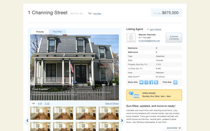
Listing Page
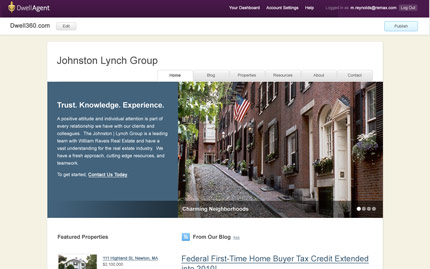
Agent Website (preview from within the application)
Where do I start?
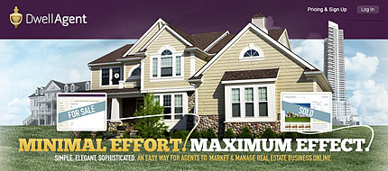
The last thing we designed was the home page, which is where the mood boards really came into play. You should be able to see where ideas from all three coalesced into the final design.
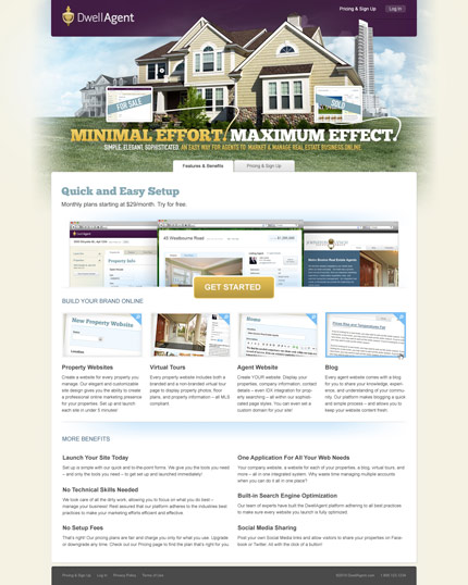
Home Page
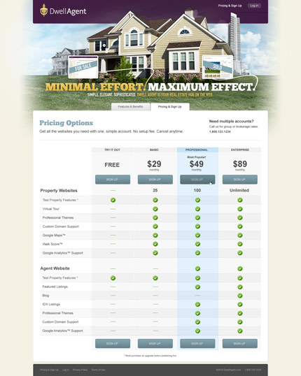
Pricing Page
That's it. A simple, elegant, and sophisticated place for real estate agents to create listings with minimal effort and maximum effect. Try it yourself for free.
See the final results in action at DwellAgent.com.
NOTE: Updates have been made to the live website that are not reflected here.
