Behind the Design: The New Viget
Tom Osborne, Former VP, Design
Article Category:
Posted on
Just last week we launched a new web site after a four-year run with the previous version. Brian Williams, CEO and co-founder of Viget, wrote about it on our new Flourish blog (formerly known as the Four Labs blog). There were plenty of starts and stops along the way; but, things really started to take hold about 18 months ago when we quietly refreshed our logo.
We set some basic goals for the logo redesign, namely:
- Simplify
- Grow up a little (less playful, more sophisticated)
- Stay true to our roots.
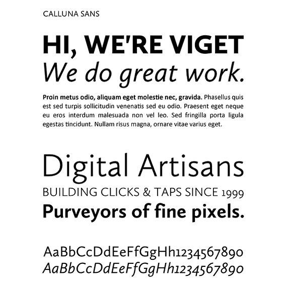
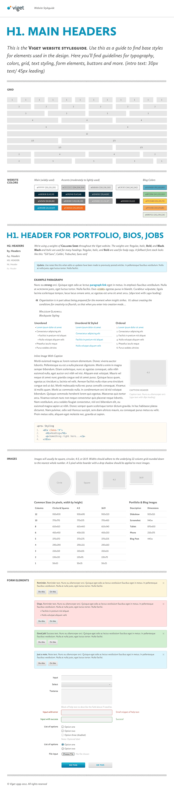
These goals carried over to our site redesign; but, there was a fair amount of work in between the two design efforts. We first did some type explorations and business card applications to settle on some basic colors, concepts, and brand identity. Eventually, we settled on Calluna Sans as our type of choice for its elegance, simplicity, and versatility. We also darkened and neutralized our color palette with a strong use of navy blue and liberal use of white.
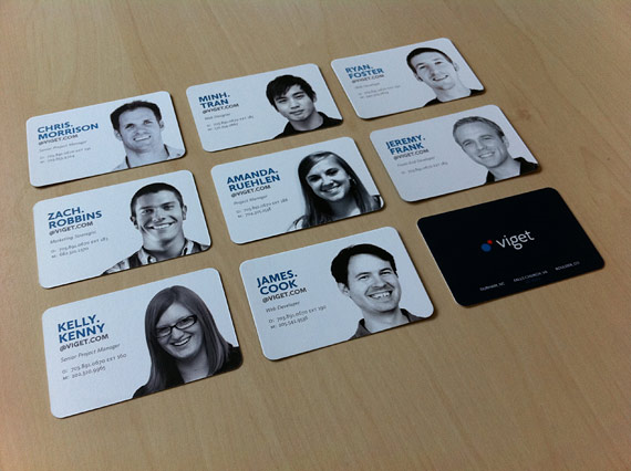
We've always felt our people and our work are our greatest strengths so, when it came to the business cards, we felt we wanted to include our profile photos on the cards. The goal here was to keep things classy while paying tribute to our exuberant past.
Early Explorations
Old and New Viget Logo

Explorations
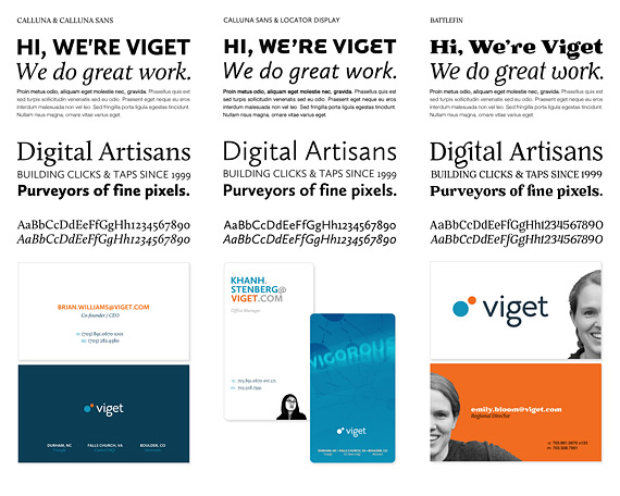
Typeface Selection
Business Card Explorations
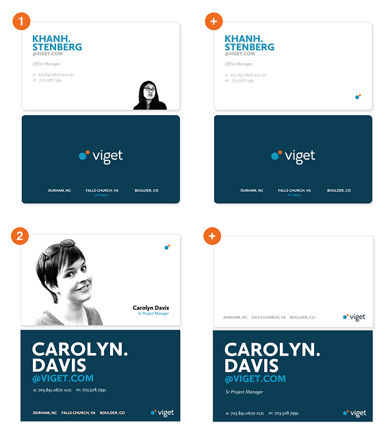
Business Card Application
The Site Design
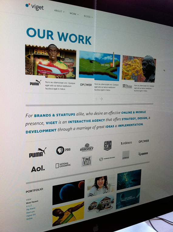
The thinking on the business cards began to play into our site redesign strategy. More than anything, we wanted a better way to showcase the amazing work we've been doing. While we've had a ton of great feedback on the previous site over the past four years, it never really did a good job of showing off our work.
But, it wasn't just the work, the main goals of the new site were to emphasize:
- Our work - the portfolio
- Our people - skills, talent, and personality
- Our thoughts – the blogs.
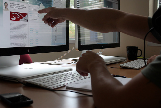
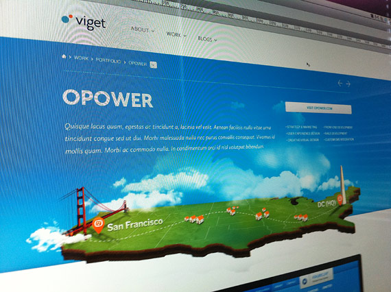
With momentum from the business cards, we started with our profile pages and then moved over to portfolio pages. We needed two things with the portfolios: 1) a way to get images up quickly without needing to tell much of a written story; and 2) a way to dive deeper into the storytelling of the process.
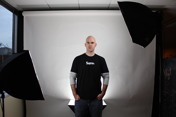
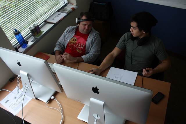
Lighting Set-up for Profile Photos
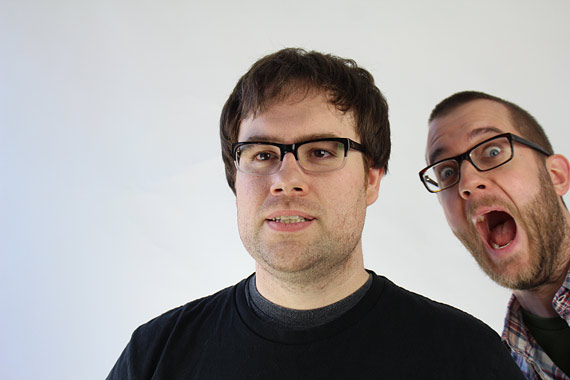
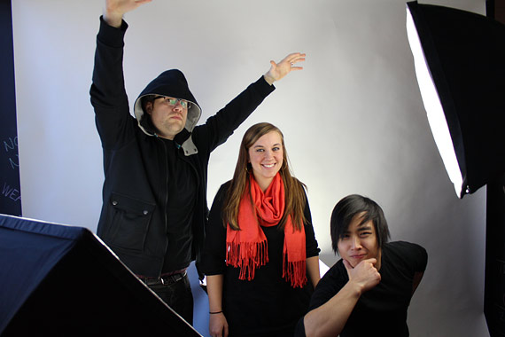
Having Fun

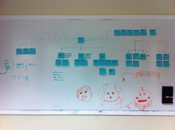
Planning
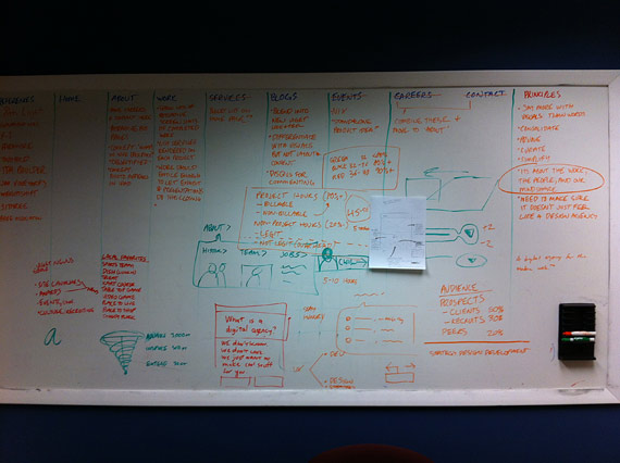
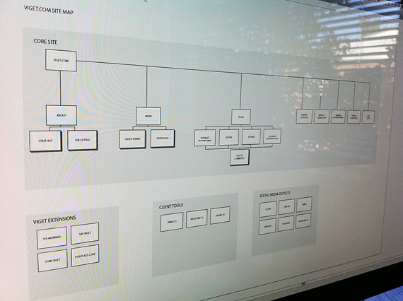
Site-mapping
Sketches

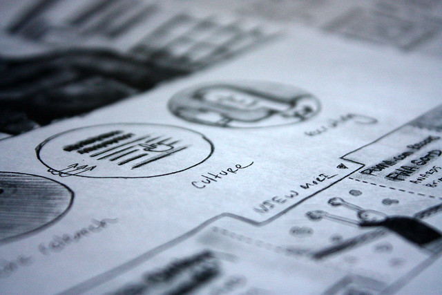
Brainstorming
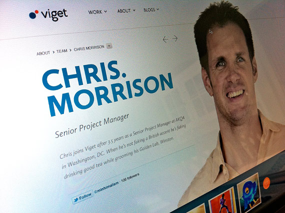
Profile Page
Work Page
Case Story Page
Element Style Guide
The Blogs
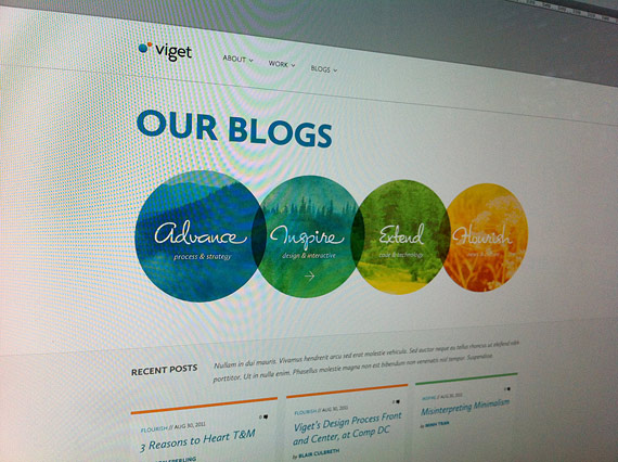
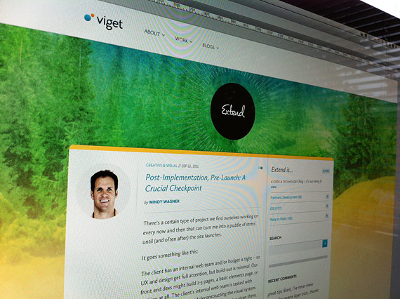
Lastly, we couldn't forget our blogs. They've been an important part of who we are for the last several years and a great forum to practice our writing and articulation. It was immediately clear that we had to find a way to pay tribute to the design of our Inspire blog which had become so popular both for its design and its content. But, how do you do that while also attempting to bring the other blogs more closely aligned with the presence of the leading blog? To do that, we worked hard to retain the nature theme and the watercolor styling of the Inspire blog.
We then looked at the blogs this way:
- Advance: It's our strategy and marketing blog. It's like looking from the peaks into the mountains. Let's consider it our 3,000 ft. view of things.
- Inspire: Our design and interaction blog. It's where we get closer to nature – kind of like being in the mountains looking into the forests. This is our 300 ft. view.
- Extend: Our code and technology blog. It's where we really start to dig in. It's like being in the forest looking at the branches and trunks of the trees – effectively our 30 ft. view of things.
- Flourish: Our news and culture blog. This one's a little different – it's all about us. We like to think that it's where you're in the meadow where all things begin to grow – our 3 ft. view.
Whereas previously our blogs maintained their own unique styling, the new design unifies most of the design elements and user experience. Each blog, however, has a differentiating background and highlight color from blue to orange, our corporate colors.
Blogs Page
Extend Blog
Advance Blog

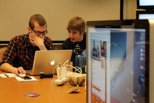
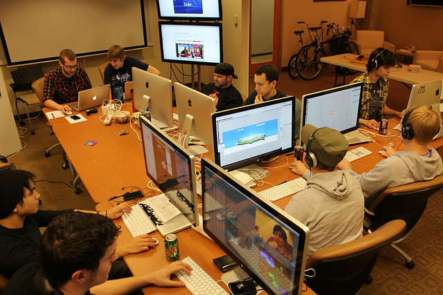
The bulk of this work lasted about 8 months in total. Not all of that time was focused and dedicated – we do have clients and they are our priority. The last two months were when we really started to get serious about getting the job done, including a day the week before launch where roughly a dozen of us helped tie up loose ends.
Getting Serious
That's our story about the design. We hope you like the new Viget.