Beginner’s Guide to Web Animation: Part 2, Javascript & SVG
Chloe Hwang, Former Front-end Developer
Article Categories:
Posted on
Step-by-step guide on the very basics of animating for the web.
As we saw in Part 1, CSS is the way to go for simple animations that can be defined ahead of time. Now let’s take a look at how we can get more complex using Javascript and SVG.
Javascript #
There are two main reasons why you’d want to use Javascript in animations:
- To create dynamic, responsive animations, meaning they happen based on some user interaction.
- To create advanced animations that can’t be done easily with CSS, such as long, narrative sequences or bouncing effects.
Typically, the first reason will involve some CSS animations and the second will involve third-party Javascript libraries like jQuery. Let’s take a look at each and any overlaps in between.
Dynamic Animation #
From a frontend perspective, Javascript is most useful for listening to user interaction — things like clicks, scrolls, and keypresses. Often times, we want an element to animate in response to one of these events.
There are many different types of UI animation, but in general, you can think of them as falling into two categories:
- Animation with a defined end state, like a menu showing and hiding on click.
- Animation with a fluid end state, like a page read indicator where the progress bar continually grows or shrinks based on how far you’ve scrolled.
Dynamic - Defined end state
Why does a defined end state sound familiar? As we learned in Part 1, that’s exactly what we need for CSS transitions and keyframe animations! This is the part where CSS and Javascript collide. We will use CSS for the animation and Javascript to add/remove classes.
Let’s try out a classic example — making a menu open and close on click. On click of the hamburger button, we want the menu to slide in from the right. First, we need to define the starting state and end state in CSS:
You can see the end state is defined by the class .opened. Now using Javascript, we listen for the button click and add/remove this class as needed.
There are many benefits to this approach. First, your code is cleanly separated by allowing Javascript to handle state and CSS to handle animation. Second, you get all the performance benefits and browser optimizations that come with animating in CSS, even though you’re also using Javascript. Nice!
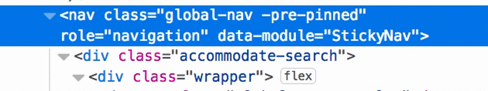
Another classic example of this technique is the sticky navigation bar. I recently implemented this on pogo.org — you can see the navigation appears when scrolling up the page and disappears when scrolling down. Again, I use Javascript to monitor user scrolls and change classes based on their direction. If you take a look in your browser’s console, you’ll see the classes updating in real-time!
| **⭐️ Note:** Try to only add classes to the lowest level element (i.e. an element that doesn’t have any child elements). This is because every time a class is added, the browser has to recalculate styles — a very memory-intensive and costly procedure. If an element has children, the browser will recalculate styles for all of them as well. In Part 3, I will explain in-depth about how the browser actually renders components and what that means for performance. |
Dynamic - Fluid end state
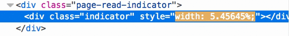
Sometimes, there are situations where you just don’t know what the end state of an animation will be. Take the example of a page read indicator — a progress bar that shows how far along you are on a page. As we see below, the indicator’s width continually changes based on your scroll movement:
There is no way to know ahead of time what the width of .indicator should be — it depends on the user! Thus, there is no fixed value that we can define as an end state in CSS. Instead, we need to use Javascript to directly change the width as needed. Each time a user scrolls, Javascript grabs the new scroll position and calculates progress made against the full height of the article. That number is then turned into a percentage and set as the indicator’s new width. In Javascript, there are two ways to directly set a style:
indicator.style.setProperty('width', progressPercentage)

indicator.style.width = progressPercentage
In the console, you can see how quickly Javascript is updating the width:
This technique can make really engaging effects like pages animating on scroll or realistic motion hovers.
|
⭐️ Note:
One huge caveat of this approach is that it’s generally frowned upon to directly set styles without using |
Advanced Animations #
If you’re looking to create really expressive animation like long narrations, character animations, or advanced effects, you definitely want to try a third-party Javascript library. These animations require you to chain multiple sequences in a row (e.g. a ball must go up and down multiple times to create a bouncing effect). Although CSS keyframes let us transition between multiple states, it’s usually not robust enough for highly narrative animations.
Some very popular, widely used, and well-supported libraries are:
- GreenSock
- Anime.js
- jQuery
- Three.js
- Particle.js
- ScrollReveal
- Popmotion
At best, libraries allow you to create complicated animations and get consistent, cross-browser results without much fuss or hassle. At worst, they add unnecessary bloat and slow down your site — jQuery alone will add 87kb of extra code! Again, try to get as far as you can with CSS and vanilla Javascript before turning to a hefty library. I’ve personally never had to use one during my time as frontend developer.
SVG #
SVG stands for Scalable Vector Graphics. It is an image format, just like JPEG or PNG. But unlike JPEGs or PNGs, an SVG can be manipulated using CSS and Javascript. This is because it is a text-based image — if you open up an SVG file in a code editor, you’ll actually see something like this:
<svg viewBox="0 0 1200 1200">
    <path d="M320 111A272 272 0 0 0 66 350c-4 34-2 94 6 141 11 68 36 125 80 182 17 22 33 40 62 69 40 40 55 54 152 138 107 92 163 143 219 196l15 14 15-14c56-53 113-104 219-196 95-82 121-106 158-143a439 439 0 0 0 144-316c2-57-4-98-20-139a269 269 0 0 0-192-164c-74-17-146-5-210 32a333 333 0 0 0-114 116l-10-14c-11-18-24-34-39-50-64-65-144-97-231-91z"/>
</svg>
Notice the <path> element that has a d attribute followed by a string of letters and numbers. Each <path> represents a single continuous line, and the letters and numbers correspond to different coordinates of that line. In this example, the <path>'s coordinates form a heart. An SVG can have many different <path>s, enabling complex graphics. This is what makes SVGs so useful for animation — you can pinpoint a specific <path> and animate it using CSS and Javascript, allowing you to change the image itself.
The main benefits of using SVG for animation are:
- Easily animating parts of an image to make it come alive. Useful for graphics, logos, narrative onboarding flows.
- Easily manipulating shapes. Useful for data visualization, bending straight lines.
- Creating animations that maintain image quality on any size device.
CSS #
When choosing between CSS and Javascript for SVG animation, the same rules apply — get as far as you can with CSS first before incorporating Javascript. Both CSS transitions and keyframe animations work on SVG.
The “gotcha” is that CSS can only animate a few properties on SVGs, like transform, fill, and a handful of SVG-specific properties. The brightside is that there’s still a lot you can do with just these properties. One such technique is called SVG line animation, which gives the neat effect of an image drawing itself. Let’s try this out with our heart.
In the CSS, you can see that we set up the starting and end states on hover of path. You’ll notice a lot of properties starting with “stroke” — this refers to the line represented by <path>. We then add a CSS transition to achieve the final effect, drawing the line using stroke-dashoffset and filling in the heart with a slight delay of 0.9s, to ensure it happens after the line.
This technique can be put to all sorts of uses like button hovers, animating logos, and even text outlines. If you’d like to learn more, check out this CSS Tricks article.
|
⭐️ Note:
Again, CSS transitions and keyframes can’t animate a number of SVG-specific properties (namely, properties that affect dimension and position). Furthermore, browser support is still spotty, especially for Internet Explorer. If you’re thinking of doing complex SVG animations, you’ll want to check out a Javascript library. |
Javascript #
The main reason to use Javascript for SVG animation is to do things CSS can’t, like:
- Animate dimension and position.
- Access all native SVG properties, such as
viewBox,width,height,x, andy. - Change the actual shape of an element (meaning the path’s coordinates).
In these situations, Javascript libraries are definitely the way to go — they make it easy to do some really complicated things that’d be hard to write yourself. They also help smooth out browser inconsistencies and optimize for good performance, making it well worth the overhead.
Some libraries to check out are:
- SnapSVG
- Vivus
- Bonsai
- Velocity
- Raphael
- GreenSock
Libraries can also be used together, like this awesome example built with SnapSVG, GreenSock, and jQuery.
|
⭐️ Note:
If you’re like me and don’t know how to use Illustrator/Sketch/etc to create SVGs, try sites like flaticon.com that let you download graphics in SVG format for free. You can also convert images to SVGs or generate simple SVG shapes yourself. |