Animation Performance 101: Browser Under the Hood
Chloe Hwang, Former Front-end Developer
Article Categories:
Posted on
Your ultimate guide to animation performance — starting from the ground up.
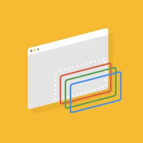
Web animation may be one of the few areas in life where everyone can agree — we want it silky, smooth, and seamless. Take this animation for example:

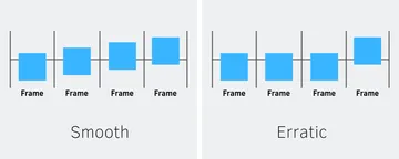
The one on the left feels stilted as it stutters across the screen, while the one on the right feels pleasant as it simply glides. Anyone can instinctively tell which looks better; this makes it imperative to focus on performance.
Good performance means hitting the ultimate goal of 60 frames per second (FPS). That’s because most devices these days refresh their screen at a rate of 60 times a second. The browser needs to match this rate and paint a new frame on each refresh. Otherwise, the animation will look like it’s not changing and move erratically:
To avoid this, we need to understand what the browser is doing under the hood and how that should inform our code. Specifically, we’ll look at:
Part 1
- How the browser renders elements, from blank to paint
- What you should and should not animate
- How to optimize Javascript
- How to measure animation performance
Browser Under the Hood #
To hit 60fps, we need to avoid making the browser do a lot of work — too much work and the browser can’t finish painting in time before the next refresh. Let’s inspect this painting process to see where work can be minimized.
How the Browser Renders Elements #
To render an element to the screen, the browser goes through these steps:
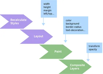
- Recalculates Styles: Match the element to the appropriate CSS selectors (e.g.
.heading > span,.title) and calculate which styles should be applied. - Layout: Generate dimensions and position — essentially its width, height, and where it should go on the page.
- Paint: Fill in every visible pixel — things like background, borders, shadows, and text. Elements are typically painted in layers.
- Composite Layers: Take the layers created by Paint, combine them in the correct order, and output onto the screen.
The blue square boxes on the diagram above indicate which CSS properties trigger which step of the rendering process. For example, setting width or height on an element triggers Layout. This is important to know because the rendering process is a waterfall — each step triggers everything after it. If the browser does Layout, it must also do Paint and Composite Layers. If it does Paint, it must do Composite Layers but can avoid Layout. The higher you start on the waterfall, the more work it takes. For a comprehensive list of CSS triggers, check out this guide.
Layout and Paint are the most expensive operations, not only because they’re higher up, but because they can force the browser to re-render other elements. For example, changing width on a parent container affects the size of children elements, making it necessary to go through the waterfall for each child. This shows how animating Layout/Paint can be bad for performance — it creates a lot of work the browser may not be able to finish before the next screen refresh.
Now that we understand the rendering process, let’s see how the browser executes this work.
How the Browser Executes Work #
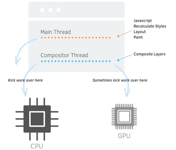
The browser has two threads — the main thread and compositor thread. The main thread is where the bulk of the work happens, including Javascript, Recalculate Styles, Layout, and Paint. All the most intensive tasks are run there, leading it to routinely stall for tens to even hundreds of milliseconds at a time. Pretty scary. The compositor thread is responsible for Composite Layers and other rendering operations.
Both threads send over their work to the Central Processing Unit (CPU). This is the computer’s motherboard and it’s responsible for processing almost everything. In the past, all work was sent to the CPU; but nowadays, modern browsers are able to offload some of it onto the Graphics Processing Unit (GPU). This can be a big performance boost since you remove work from the busy CPU.
Only certain types of work get kicked to the GPU. To qualify, the operation must not trigger main thread work like Layout and Javascript. This means it can be handled by the compositor thread alone. Thus, the browser can apply a compositing optimization, which results in the creation of a new compositor layer. The layer is then uploaded to and rendered by the GPU. This process is known as hardware-acceleration.
Hardware-acceleration has huge implications for animation. When an element is on its own compositor layer, it does not touch or affect the rest of the page, so it can be moved around cheaply without triggering the waterfall on neighboring elements. The GPU is also designed specifically for graphics rendering, so any animation processed there will look extra precise and smooth.

The only catch here is that most elements don’t get hardware-accelerated onto the GPU. The browser decides what does and does not qualify, as we’ll see below.
What You Should and Should Not Animate #
From this understanding of the browser, we know how to improve animation performance. To reduce the browser’s workload, we should:
- Avoid triggering the top of the rendering waterfall.
- Avoid the main thread.
- Take advantage of the compositor thread and GPU.
Let’s put it all together — the most performant way to animate is with CSS keyframe animations or transitions on transform and opacity only. This meets our criteria by following these guidelines:
Only Animate Composite Layers Properties #
By only changing CSS properties that trigger Composite Layers, you bypass most of the rendering waterfall and any work that needs to run on the main thread. This boils down to two properties — transform and opacity. It may sound limiting, but a lot can be done with transform alone!
Avoid animating Layout and Paint: Paint is especially bad for low-end devices and mobile phones because of their weaker CPUs. This doesn’t mean you should never animate these properties; just be mindful and avoid whenever possible, especially if it affects a large part of the page.
Use CSS over Javascript #
Avoid animating with Javascript because it always runs on the main thread, making it more likely to drop frames if the thread is bogged down with other tasks. CSS-based animations are better because they can take advantage of the GPU, as we’ll see below.
Leverage Hardware-Acceleration #
The browser automatically hardware-accelerates any element with a CSS transition or keyframe animation on transform or opacity. This is because such operations don’t trigger main thread work and can be handled by the compositor alone.
Let’s see this in action using a Chrome dev tool called Layer Borders. This shows you all the layers on a page by outlining them in orange. We know an element is hardware-accelerated when it’s put onto its own compositor layer.

The orange border is clearly there but you may notice something strange — the border is only present as the element is moving and disappears once the animation is done. This is a small but critical nuance: elements only get a new layer at the moment of animation. Then it is reabsorbed by an outer layer.
After it’s reabsorbed, the browser may be forced to Recalculate Styles on neighboring elements because the animated element is no longer on a distinct, separate layer. This can create additional Layout and Paint work that’s dumped onto the main thread, negating the performance benefit of using the compositor and GPU.
We can see this in action using Chrome’s Paint Flashing tool, which flashes green whenever a part of the page is repainted. After the animation ends and the layer is removed, the entire page flashes green:

This is what we were trying to avoid! In order to keep the element from being reabsorbed, we need to apply will-change:
div {
  will-change: transform;  /* set it to the property that's changing */
}
This tells the browser to keep the element on its own separate layer because we plan to animate it soon. Now, the element maintains its orange border after the animation is done and the page no longer flashes green:

will-change is also useful for times when you have to animate Paint properties, because the layer can be repainted without affecting other elements.
⚠️ However, there is a big caveat — will-change is a powerful tool that should only be used sparingly. It is absolutely not recommended to put every element onto its own layer. That’s because it takes memory and resources to manage each layer, which may outweigh the benefits of leveraging the GPU.
Only use will-change on elements that’ll change often. Otherwise, using CSS keyframes and transitions can provide many performance benefits, along with avoiding Layout, Paint, and excess Javascript.
|
⭐️ Note:
There are other ways to hardware-accelerate besides CSS animation. For example, elements with |
Next Time… #
Even though CSS is preferred, there are times when animating with Javascript is unavoidable. In Part 2, we’ll take a look at how to optimize Javascript and avoid common performance bottlenecks.