Adding Delight to Your Design with CSS3 and Webkit Keyframe Animation
Jason Garber, Former Senior Web Developer
Article Category:
Posted on
It should come as no surprise that we at Viget love having fun with design. We doubly enjoy working with clients who let us have an appropriate amount of fun with the design of their website or web product. On a recent project, Blair and I had the opportunity to do just that.
Watching The Clock
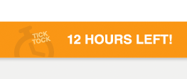
Blair designed this clock to reinforce that the user should act quickly to take advantage of the call-to-action. As soon as I saw the design, I knew I wanted to animate the "tick" and the "tock." It was immediately apparent to the both of us that doing so would be incredibly fun and would reinforce the goals of the call-to-action.
Before we get into the technical details, let's take a second to look at the final product. Since this is a Webkit-specific feature, give it a look in a recent version of Safari, Chrome, or (wait for it) Webkit.
Time Out
In Dan Cederholm's excellent book, "Handcrafted CSS", he describes what he calls "progressive enrichment"—the notion that we should use advanced CSS properties that work in forward-thinking browsers to enrich the user experience. These enrichments aren't core design features or interactions. Instead, they are simply icing on the cake. Thus, I feel comfortable adding Webkit-specific animations to a design element that already looks great when left on its own.
In an article on the Surfin' Safari blog way back in 2009, Dean Jackson announced the addition of CSS animations to Webkit. While most of his examples (save this one) are silly, they do clearly illustrate the power of CSS-based animation. Dean's post was widely touted at the time and will serve as the building block of our example here.
Clock-Making
First, we must mark up our clock:
<span class="clock"> <span>Tick</span> <span>Tock</span> </span>
Next, in our stylesheet, we define our two animations, "tick" and "tock."
@-webkit-keyframes tick { 0% { opacity: 1; } 50% { opacity: 0; -webkit-transform: translateY(-10px); } 80% { opacity: 0; -webkit-transform: translateY(0); } 100% { opacity: 1; } } @-webkit-keyframes tock { 0% { opacity: 1; } 30% { opacity: 1; } 70% { opacity: 0; -webkit-transform: translateY(-10px); } 80% { opacity: 0; -webkit-transform: translateY(0); } 100% { opacity: 1; } } What we're doing in these two definitions is animating the element's opacity and using the CSS3 transform property and translateY transformation function to shift the element ten pixels up. So, as you can see in the final product, the elements fade out and move up over the duration of the animation.
From experimenting with these animation definitions, I've learned that you must define the beginning and end points using either 0% and 100% or the keywords from and to. Leaving out either will prevent the animation from executing. Also keep in mind that these animation definitions are entirely removed from any sort of duration. The keyframes, then, occur at different time points depending on whether your animation is one second or ten seconds.
Lastly, we want to make a reference to our animations:
span.clock span:first-child { -webkit-animation: tick 3s infinite; } span.clock span:last-child { -webkit-animation: tock 3s infinite; } The syntax here is pretty straightforward. First we specify the animation name, followed by duration, followed by a repeat value. I had initially tried specifying an animation-delay, but it proved to be too difficult to sync up the animations. I'm also using the :last-child pseudo-class as a selector. Might as well take advantage of Webkit's advanced selector engine!
The W3C's CSS Animation Module Level 3 spec page (currently an Editor's Draft) contains a wealth of information on defining and calling CSS animations. While keyframe animation is currently only supported in Webkit-based browsers (Safari and Chrome), the creators are working within the W3C's process to openly develop the spec and allow other vendors to implement the feature. This is still pretty bleeding edge stuff, but for a minimal amount of effort, you can add small touches that will delight visitors to your website or web product.
Update: Elliott astutely pointed out that I never mentioned how I rotated the "tick" and "tock" elements. Here's how:
span.clock { -moz-transform: rotate(-10deg); -webkit-transform: rotate(-10deg); transform: rotate(-10deg); } Rich Bradshaw wrote an excellent series of tutorials on how to use the different transform functions and animation. It's a must-read.