Add Colors To Your Palette With Color Mixing
Tom Osborne, Former VP, Design
Article Categories:
Posted on
Updates
A few people have asked for alternatives to ColorSchemer Studio for color mixing. I highly recommend Eric Meyer's Color Blender as a free way to do simple color mixing. If you're looking for something a little fancier, give Try Colors a whirl.
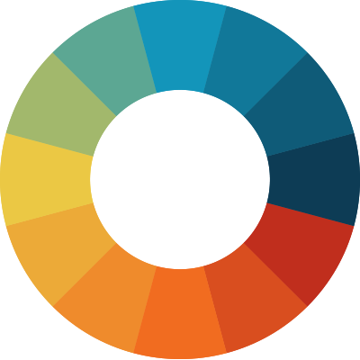
I’ve been wondering lately what it would look like to extend the Viget color palette beyond our signature blue and orange – particularly when I see a chart or graph in a Viget-branded presentation template. The colors typically lack harmony and sometimes it’s hard to distinguish one data point from another. If we had a few more colors to choose from, there would be more consistency and perhaps more visual contrast in our graphic visualizations.
I decided to take on the palette-extending challenge. I quickly discovered that while there’s some science to it (found in basic color theory), there’s also an art to manipulating the rules to discover just the right color combination.
Quick note: I use a tool called ColorSchemer Studio for simple color wheels and color mixing but you can use any color wheel or mixing tool for this exercise.
The Viget logo consists of two key colors: blue and orange. We’ve extended the palette slightly over the years, so there are now three colors—two shades of blue and an orange. This is our starting point.

We can begin to map the colors on a color wheel. This is where we use science as our base but improvise with art. Let’s plug in one of Viget’s known hex colors, lighter blue (#1496BB), to see what our color wheel reveals.
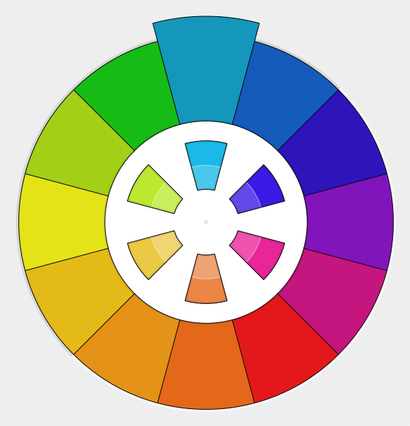
Nice! A full range of colors and an orange that’s darn close in value to our existing orange appears as the complement color opposite our lighter blue. This is great overall but —ouch— the colors are much brighter than what I’m looking for. In particular, the pinks and purples on the right side of the wheel seem are a bit too foreign to the brand identity to be comfortable with. But this at least gives me a sense of where we can go with it. Let’s go ahead and establish our light blue and orange at our poles.
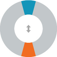
The next step is to bring the dark blue from our original brand colors back into play. Let’s replace the purple with our dark blue and position it on the right side of our wheel where we saw the dark cools cluster.
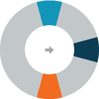
Next, I know I want a yellow on the left but the yellow from our first attempt is a little too bright for my taste. I’d like to see more of a gold. This is where I go back to the color wheel and see if I can find something better. Aha! Without changing any values I find a slight variant with just enough orange and brightness.
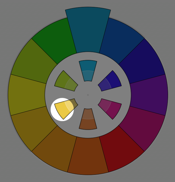
Placing it opposite the dark blue where our bright warms cluster should result in something like a lifebuoy:
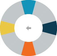
I know the next problem is going to be squeezing out the purples and pinks. I also know that if we try to blend the dark blue and the orange we’re likely going to get a nasty brown. So let’s start by placing a red adjacent to our dark blue. We’ll squeeze there and stretch out everywhere else.
Here’s where I do something a little different—I break from the original color wheel and establish an alternate color wheel with my dark blue (#0d3d56). This is to find a color that’s also on the darker scale to help with the blend. Unfortunately, the reds are a little too dark, so I look for something warmer and brighter.
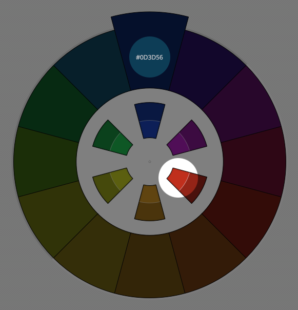
Which gives us this:
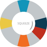
Note that we've squeezed out our purples by pulling the dark blue and red closer together.
Now it’s simply a matter of using a color mixing tool to blend the in-betweens. One thing to be careful of is that the further your colors are apart, the duller the blends will be. For example, two complementary colors, like blue and orange, will create brown. You can increase the saturation of your blends manually, which I sometimes do. In our current example, I’m OK with a little dulling. My colors are close enough in hue that it should work to my advantage since I’m intentionally looking for a duller palette than the original wheel I created.
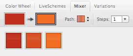
To complete the wheel simply blend together each of our points to get nice transitions between each point. Let’s start with the red to orange and go clockwise around the wheel:

For comparison, here’s the original color wheel (left) and the new wheel (right). Hopefully, you can see that the new wheel creates a nice range of colors without the gaudy vibrancy of the original.
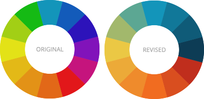
Finally, I make sure I have sets of 3, 6, and 12 for color priority.

Now we can do fun stuff like add colors to charts and graphs.
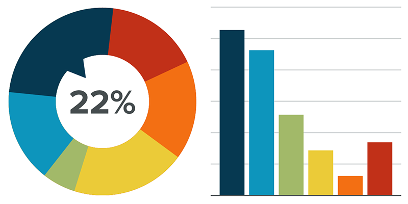
This was a fun (and pragmatic) exercise that has given our Viget-branded palette a full range of color options. If you’re feeling similarly limited by a narrow brand palette, I encourage you to try this mix of theory and improvisation, and see what you get!