A Case for CSS Columns vs. CSS Grid with Tailwind

Melissa Piper, Former UI Developer
Article Categories:
Posted on
With so many layout techniques available using CSS, Columns are often overlooked. This article walks through a scenario where CSS Columns offered a simple yet effective layout solution — even better than Grid.
As part of a client project where I was tasked with building a series of redesigned flexible components, I was presented with a design for a new list. This list would:
- Contain text items sorted into columns, where the individual list items could be plain text or text links
- Responsively adapt the number of columns — and the number of items per column — dependent on the width of the parent container
- Range from two to six columns
- Have columns visually separated by a light gray, single-pixel column rule

At first glance, this looked like a straightforward UI task, but the more I worked with this list, the more I realized that the task had some hidden challenges.
First Attempt using CSS Grid #
My initial thought for the list layout was to use CSS Grid. At Viget, we use Tailwind CSS, so with the assistance of Tailwind grid and gap classes, laying out the initial list was quick. For testing purposes, I generated a list containing 14 text items, enough to fill six columns at wider device widths. However, since Grid does not easily accommodate column rules, I attempted to add dividers by adding a right border to each list item, then setting a right margin of -1px to the ul itself to remove the hanging column rule. This technically worked, but as I tested the layout at varying screen widths, I discovered a hidden issue: the column rule heights were not consistent.
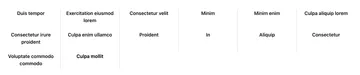
Since the column rules were created by adding borders to each list item, the column rule could only extend vertically as long as there were list items present. When the number of items per column were not evenly distributed, the issue of some column rules being shorter than others became apparent. This, of course, was not visually appealing, so I looked into other ways of adding column rules between grid columns.
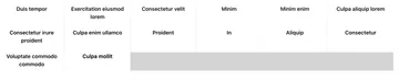
One popular suggestion was to change the background color of the unordered list to the color that’s being used for the column rules (in my case, light gray), add a background color to each list item to match the background color of the page (white), then add a 1px column gap to create the gray column rules. Unfortunately, this created a chunk of gray emptiness at the bottom of my list. Since there wouldn’t always be enough list items to fill the grid evenly, the gray ul background was visible at the end of the grid. With no way to target empty space in a CSS Grid, I realized this approach wasn’t going to work, and I accepted that I may need to find an alternate method.
Enter CSS Columns #
Although I previously worked with CSS Columns, I was never a fan of how they worked. I often experienced issues with the list items breaking improperly across columns, and I found the responsiveness of columns to be lacking when compared to CSS Grid. With Grid, columns can fit responsively without the need for media queries. In contrast, the number of columns in CSS Columns can change responsively either by implementing a series of media queries, or by setting a column width that allows the browser to generate as many columns as will fit within a container. However, CSS Columns provide a built-in solution for adding column rules, so I decided to give columns another chance.
To style my list with columns, I set the width of my columns on the parent element, ul. I was also able to set my column rule styles here, but if you’re using Tailwind CSS like I was, be aware that there is no column-rule class out-of-the-box. To accomplish this, an arbitrary style can be added inline, or a plugin can be installed to generate Tailwind column classes.
<ul class="text-center [&>li]:px-4 xl:[&>li]:px-8 columns-[10rem] [column rule:1px_solid_rgb(212,212,212)]">
    [...]
</ul>
One benefit of using Tailwind is the gap class, which is great for handling column and row gaps between items in grid and flexbox containers. While implementing CSS Columns, I learned that gap can also be used in conjunction with columns, and is an easy way to define spacing between columns.
<ul class="text-center gap-x-8 [&>li]:px-4 xl:[&>li]:px-8 columns-[10rem] [column-rule:1px_solid_rgb(212,212,212)]">
    [...]
</ul>
The final issue with styling with CSS Columns, as I mentioned earlier, is the way in which list items break across columns. By default, the browser distributes content within columns as evenly as possible, which often results in individual list items being broken between two columns. However, there are styles available to tell the browser how to handle these breaks, or preventing the break from occurring altogether, and they are all available directly as Tailwind classes. In my case, break-inside-avoid was exactly what I was looking for, as it prevents any column breaks within the element. I applied this to each list item within my list.
<ul class="text-center gap-x-8 [&>li]:px-4 xl:[&>li]:px-8 [&>li]:break-inside-avoid columns-[10rem]
   [column-rule:1px_solid_rgb(212,212,212)]">
    [...]
</ul>
Success! The list was now divided into columns with equal-height column rules.

Final code:
<div class="px-16 py-32 sm:px-32">
  <div class="mx-auto max-w-[80rem]">
    <ul class="text-center gap-x-8 [&>li]:px-4 xl:[&>li]:px-8 [&>li]:break-inside-avoid columns-[10rem]
      [column-rule:1px_solid_rgb(212,212,212)]">
      <li>
        <span class="text-md font-semibold antialiased">Duis tempor</span>
      </li>
      <li>
        <span class="text-md font-semibold antialiased">Exercitation eiusmod lorem</span>
      </li>
      <li>
        <span class="text-md font-semibold antialiased">Consectetur velit</span>
      </li>
      [...]
    </ul>
  </div>
</div>TIP: I originally utilized the space-y class as a clean way to add row spacing between items in Tailwind, but be aware that it creates a bug in Safari where column content is not always top-aligned. I ultimately had to remove space-y and add top/bottom padding to each list item to fix the bug.
Bonus: Add Container Queries for Improved Responsiveness #
Although CSS columns are responsive, in my case the columns needed to be responsive dependent on the width of the parent container, not the width of the screen. I found it difficult to build with the use case from the design in mind, where the list would display six columns at full screen width, but would be divided into four columns when the parent container was only 50% of the screen width. In these instances, I ran into issues where the columns appeared crowded, overflowing text into the column rules. Even though it’s not fully-supported yet, I decided that this was the perfect time to experiment with container queries.
Container queries allow content inside of a containing element to be responsive dependent on the parent container width, instead of the screen width (as with media queries). At certain container widths, I also needed the column widths to be wider than other container widths, so container queries presented the perfect way to execute this functionality. Since they are not yet fully supported by all browsers, container queries must be added to Tailwind via the Container Queries plugin, which is developed and maintained by the creators of Tailwind.
Once the plugin was successfully installed, I was able to wrap a container element around my list with class @container, which became the parent that container queries would act upon.
<div class="px-16 py-32 sm:px-32">
  <div class="mx-auto max-w-[80rem]">
	<div class="@container">
	   <ul>
	       [...]
        </ul>
	</div>
  </div>
</div>
From there, I was able to specify my container breakpoints, and the widths that columns should occupy at those breakpoints. In my case, the column widths provided out-of-the-box weren’t suitable, so I added my own in tailwind.config.jsby extending the default columns theme.
tailwind.config.json:
theme: {
    extend: {
        columns: {
             	'6xs': '10rem',
             	'7xs': '8rem',
             	'8xs': '6rem',
        },
    },
},
I also kept a default column width of columns-8xs, which provides a fallback width for browsers that do not currently support container queries. In the default case, columns will still be responsive, but will always have the same width regardless of container or viewport width.
Using the configured container variants from the plugin, my final final code is as follows:
<div class="px-16 py-32 sm:px-32">
  <div class="mx-auto max-w-[80rem]">
    <div class="@container">
      <ul class="text-center gap-x-32 [&>li]:px-4 [&>li]:py-12 [&>li]:break-inside-avoid columns-8xs @xs:columns-7xs
       @sm:columns-6xs @3xl:columns-7xs @7xl:columns-6xs [column-rule:1px_solid_rgb(212,212,212)]">
        <li>
          <span class="text-md font-semibold antialiased">Duis tempor</span>
        </li>
        <li>
          <span class="text-md font-semibold antialiased">Exercitation eiusmod lorem</span>
        </li>
        <li>
          <span class="text-md font-semibold antialiased">Consectetur velit</span>
        </li>
        [...]
      </ul>
    </div>
  </div>
</div>
Now, columns are visually appealing, and fit regardless of container or screen size:
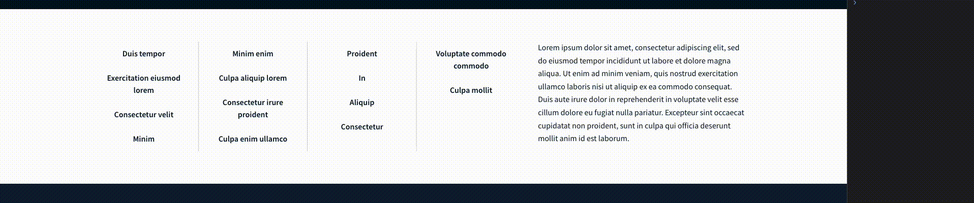
The choice between CSS Columns and CSS Grid ultimately depends on the specific requirements of your project. If you need a simple, text-based layout with automatic column balancing, CSS Columns can be a quick and effective solution. However, if you require more control, flexibility, and advanced features like complex grid structures, CSS Grid is the superior choice. In the end, understanding the strengths and trade-offs of CSS Columns and CSS Grid empowers you to make informed decisions based on your specific project requirements.