7 Simple Photoshop Typography Tips You’re Already Doing, Right?

Just because you can do something in Photoshop doesn't mean you should do it, especially if you're designing web sites in Photoshop. This is most definitely true of how you handle typography in Photoshop. It's always frustrating to painstakingly craft your type, just to find out it's impossible or impractical to use it the way you envisioned in the finished product. Here's a list of little things you can do to ensure that the design you create in Photoshop will and can be perfectly translated into a built-out site. They're mostly common sense, but I know I've been guilty of just about all of them at some point, so hopefully this is a helpful refresher.
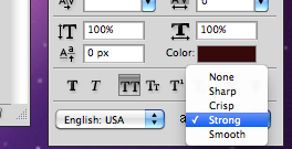
Set the anti-aliasing method to "strong". Sure, "smooth" is beautiful and delicate, but that's rarely how it's going to look when it moves into the browser. The most accurate setting is almost always going to be "strong", so if you want an accurate idea of how heavy a typeface will look, stick to strong.
Use whole numbers for font size and leading. It's easy to scale some type up or down, and then forget that the fonts are now set to 26.78px and the leading is 28.4px. But once it gets to build-out time that perfectly sized type is going to have to be tweaked. Make sure you're using whole numbers to avoid your type being rounded up or down in the buildout.
Do NOT adjust the kerning down to the letter. If the text is part of a graphic or will be used as an image, of course, go crazy. Make it perfect. But body text, copy that could be changed, anything that a client has control over, just let it go. You can set the kerning for an overall area of text with letter-spacing in CSS, but you can't get down-to-the-letter control.
Yes, there is lettering.js so you can do some specific kerning of things like headlines. But again, if the copy could be changed down the line, don't worry about it.
Be consistent with your spacing and sizing across the site. If your body text is 12px with 14px leading on one page, it should probably be 12px with 14px leading on the other pages too. Likewise, if a headline has 30px of whitespace underneath it, don't make that whitespace 50px on one page. Consistency in the design means no unpleasant surprises in the buildout.
Be cautious of how many web fonts are used. I know, you're excited about web fonts. I am too, you guys! But every weight of a font that is used generally means downloading that entire weight. If you are only using Proxima Nova Bold as a caption on one page of a site, users still have to download 50k of Proxima Nova Bold. Make sure you're being mindful of how many different webfonts you use, and that you're getting the most out of the ones you DO use.
Use the proper bold and italic versions of fonts, don't just hit "faux italic" or "faux bold" in the character toolbox. The former uses the typeface properly and gives you an accurate idea of how the type will look on a site; the latter bastardizes the type and my Typography 1 professor will come down on you with the fury of a thousand ampersands if you do it. Just sayin', you're gonna get an automatic letter grade deducted from your site; your GPA's gonna suffer.
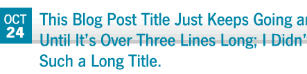
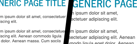
Plan for more or less than an ideal amount of content. In the design phase, it's easy to design around a headline or a small paragraph and make the area just so, especially if you aren't working with real, working content. But that area needs to have some flexibility to it because when the real content does get it put in, it's invariably drastically different from what you were expecting. Make sure that the design won't break just because a blog title is two lines long.
Of course there are exceptions to each and every one of these rules; none of these are absolutely true 100% of the time. Just think of them as general guidelines. What about you? Have any little Photoshop tips that make a big difference?