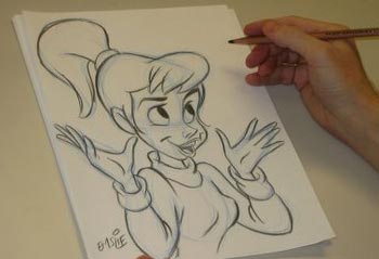
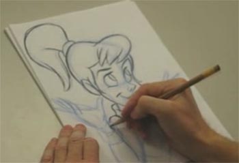
The Sketching Process: Learning From a Cartoonist

When we design user interfaces, we go through a process of whiteboarding and wireframing before we design a full, visual composition. Essentially, we sketch out our work just like a painter or cartoonist or any other artist would. We get the basic ideas down on paper and then refine over and over again. With interface design though, it's hard to clearly see the process in action because it happens over weeks or months. That's why I thought it was really cool to watch these videos from Pete Emslie sketching out a cartoon in real-time. I took away a few important lessons from watching this that I'll be applying to my own UI planning process.
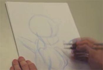
Lesson #1: Sketch the outlines first in the lowest possible fidelity. Getting started is always the hardest part (at least it is for me). So right away, create a really high-level flow for the site. Group together a handful of sections or sub-flows (try not to have specific pages). This allows you to get going really quickly and ensures you're thinking first about how the whole application will come together - not specific features.
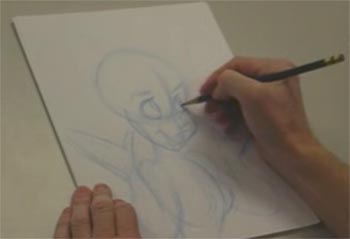
Lesson #2: Refine the important stuff next, save the unimportant stuff for last. As soon as the outline was done, Pete moved right into refining the facial features. These are the most important part of his great sketch - they're the first thing someone will look at. If her eyes are messed up, people will notice. If her pinky is crooked, it's not a huge deal. That's just like your website. If your core features are great, people won't care if your About Us page isn't complete (or even if you have one).
Lesson #3: Never stop moving the pencil. Each time Pete goes back to his paper to refine the drawing, he makes only a slight refinement. He doesn't try to jump straight from a rough outline to a really detailed, full-color drawing. If you find yourself stuck when designing your interface, it's probably because you're trying to get too detailed, too quickly. Take a step back and think higher-level. Abstract a page if you need to - you can come back later to refine it .
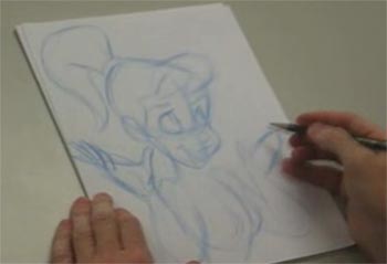
Lesson #4: It's easier to erase thin, light lines than it is dark, heavy ones. Pete only commits to darker lines after he's confident that all of his sketch lines are ok. The relation to web design here is obvious. Changing something on a wireframe is easy. Changing something in your code - hard.