3 Super Useful Color Tools for UI Design
Tom Osborne, Former VP, Design
Article Categories:
Posted on
Learn about 3 useful color tools to assist your user interface design needs.
Updates
Since writing this post, I've discovered a new color tool that I've really been enjoying for color naming. The tool is Coolors and it outputs meaningful color names the way I like. So far I'm finding the color names as good (if not better) as the other tools mentioned in this article. You'll also find that the tool provides plenty more features. Enjoy!
In 2014, I wrote a series of articles to showcase various ways I go about using color in my design work. The series garnered some interest, particularly the Color Contrast and Visual Loudness posts. Fast forward to 2018, my methodologies are still largely the same. What has changed, however, are some of the tools that I’m using. I thought it might be useful to highlight a few that have been giving me the most value as of late.
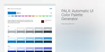
Color Ranges with Palx
In my Shades of Gray, Tints, Tones, and Shades, and Color Mixing posts, I talked about how I like to create a wide range of colors to start with. One thing I really love to do is to create a range of grays (or neutrals). This is particularly useful when establishing colors for text. Additionally, I love to add a hint of a color to warm or cool the gray so that I’m creating something a little more unique than the same boring gray for every project.
One tool I’ve been using a lot lately to help speed up my process is Brent Jackson’s “Automatic UI Color Palette Generator” named Palx. To use the tool, all you have to do is provide a base color and it will generate a full-spectrum of colors based on the base. It’s handy as a quick way to generate unique grays (the first set in the list). From there I can begin to establish my lightest and darkest accessible grays for the benefit of optimal legible and readable text. (Side note: Brent Jackson has created another useful reference for this exercise called How light can you go?)
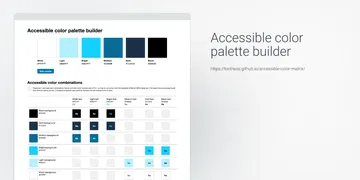
Contrasting Text Pairs with Accessible Color Palette Builder
Speaking of text coloring, my post on Color Contrast talked about how to measure and evaluate your text for optimizing accessibility. Since I wrote that post, I’ve discovered a new tool that can quickly do the color contrast evaluation for you. You provide a range of up to six colors and it will provide a matrix of color combinations to tell you which sets pass 4.5:1 (or AA) contrast ratios for Section 508 standards compliance.
If you’ve used Palx to find a range of grays, you can now begin to play with which of those grays are optimized for color contrast using the Accessible Color Palette Builder. I do wish I could add just a few more colors to this tool, but it’s not unreasonable to run a couple of tests to cover a broader set of colors. One nice feature is that you can save the URL to reference specific sets of colors you’ve made. This means that you can reference back to as many tests as needed to cover your range of colors.
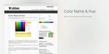
Better Color Names with Color Name & Hue
Lastly, I previously wrote about the benefit of naming your colors so that when you have various colors of the same hue (like blues or grays) that you can more specifically reference which color your talking about. This can be useful conversationally where providing specific hex colors provides little value to someone who doesn’t understand hex or otherwise can’t quickly plug the value in to visualize the color. For instance, #00C7EA and #200066 can be far less comprehensible than ‘sky blue’ or ‘navy blue’.
I like color names that easily describe the colors. (It’s worth noting that this is one area where my tool set hasn’t really changed and I really wish it had. A dream (er, ulterior motive) would be for you to read this article and point me to better options.) My main wish for this kind of tool is to have more commonly understood color names and therefore less obscure ones. (It’s also worth noting that I know that specific web color names exist. My problem with them is that they are too specific and still too limited. I prefer approximate names simply for the exercise of offering something descriptive to very specific hex values.)
Color naming—insert a hex value to receive a color description—is an activity I do often. The best tool I’ve found for this is still Color Name & Hue. Simply, insert a hex and it will provide you with both a color name and hue—so you can use the color name to better describe the hue (e.g. color name: Navy, hue: Blue — aka Navy Blue). Most of the time, this tool provides an understandable color name, but sometimes it’s still too obscure. When that happens, I’ll seek a second option with Name That Color (which coincidentally inspired Color Name & Hue). Between the two I can usually find something close enough to be descriptive or at least give me ideas to improvise with.
Pro-tip: Have you been following along? If so, you can now use the color naming exercise to go back to your accessible color combination tool and add better color names to bring things full circle.
Summary
So there you go. Three useful tools for creating ranges of colors and grays, checking them for optimal color contrast, and assigning them meaningful names. Go paint some rainbows.
Links:
- Palx for tonal grays (and color tints and shades).
- Accessible Color Palette Builder for contrasting color pairing.
- Color Name & Hue and Coolors for more meaningful color naming
If you have similar tools you like, by all means please comment with references and links of your own.