Practical Uses of CSS3
Trevor Davis, Former Front-End Development Technical Director
Article Category:
Posted on
We are certainly at an interesting point in time with the web. There are new techniques being created every day, and as developers, we have the privilege of deciding how and when to use them. I'm the new guy at Viget (only been here a few weeks), and every company is different, so it is interesting adapting to Viget's standards. Some companies utilize progressive enhancement more than others, and I love that we utilize it when we can.
One big item for me is how much we use CSS3. Yes I know, it is not fully supported across all browsers. If you still want everything to look exactly the same across all browsers, you should probably just close this article and not read about CSS for another 10 years. A user is not going to pull up your site in two different browsers to compare the experience, so they won't even know what they are missing. Just because something is not fully supported, that does not mean that we can't use it to an extent. In this article I'll show you some practical uses for CSS3.
Note: If you are viewing this page in an inferior browser (ahem: Internet Explorer), you will see the degraded versions of the examples. So go download a new browser: Firefox, Safari, Chrome
Border Radius
This is probably the most used CSS3 property. If you want rounded corners, and they aren't essential to your design (which they rarely should be), then this is the way to go. If a user's browser doesn't support it, then you get square corners, no big deal.
One simple use of border radius is for form elements. Here is an example of your standard text input with a button with some simple styling:
Definitely nothing special and some people may not even realize that the submit button is actually a button. Sure, you could swap it out with an image, but that solution can be a pain if you have a site with a lot of different buttons. So let's just add a little CSS3 and make the input and button a little more attractive.
The Code
Who would have thought simple rounded corners make the form so much more appealing?
.radius {
	border-radius: 3px;
	-moz-border-radius: 3px;
	-webkit-border-radius: 3px;
}
So this code is just saying to give each corner a 3px radius. Just like properties like margin and padding, you can pass in multiple values to account for each corner.
Example
.radius2 {
	border-radius: 3px 6px 8px 10px;
	-moz-border-radius: 3px 6px 8px 10px;
	-webkit-border-radius: 3px 6px 8px 10px;
}
It is unfortunate that we have to add the -moz-border-radius and -webkit-border-radius properties, but like a lot of the other CSS3 properties, browser makers are adding proprietary properties until the official properties are finalized.
One really confusing thing to note here is that the syntax for rounding a single corner is different for Firefox than the W3c spec:
- border-top-left-radius
-moz-border-radius-topleft / -webkit-border-top-left-radius - border-top-right-radius
-moz-border-radius-topright / -webkit-border-top-right-radius - border-bottom-right-radius
-moz-border-radius-bottomright / -webkit-border-bottom-right-radius - border-bottom-left-radius
-moz-border-radius-bottomleft / -webkit-border-bottom-left-radius
RGBa
Using an RGBa color value is the same as using an RGB color, except that you can pass in a value to specify the amount of transparency (the "a" in RGBa stands for alpha).
RGBa is awesome because unlike opacity, only the background is given transparency. You can get a nice effect by applying RGBa to a caption overlayed on top of a photo.
The Code
The code necessary to use RGBa is very simple:
.caption { background: rgba(255, 255, 255, .5); }
But, if you are using a browser that does not support RGBa, there will be no background color at all. So, you should specify a normal background color first:
.caption {
	background: rgb(235, 243, 240);
	background: rgba(255, 255, 255, .5);
}
Example
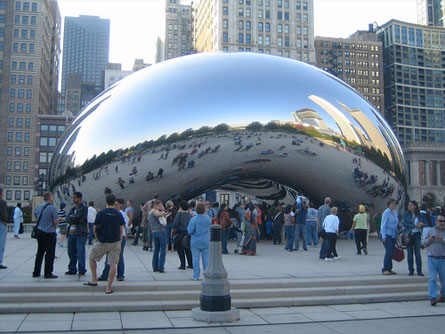 "The Bean" - Chicago
Just so you can see the difference between RGBa and opacity, let's use the same example but use opacity instead of RGBa.
"The Bean" - Chicago
It may be a little hard to notice, but the actual text in this example is semi-transparent as well.
.caption {
	background: #fff;
	filter: alpha(opacity = 30);
	opacity: 0.3;
}
Multiple Background Images
How many times have you had to nest multiple elements just because you couldn't add multiple background images to a single element? I can't even count the number of times. So let's pretend that you wanted to create a box like the following image, but it could have varying amounts of height.

To create a box like this, you would need to split our larger image into the following pieces:
Top:
Bottom:
Repeating Background:
Since we have multiple images, we would need three elements to attach them to. So that stinks, we are adding extra elements just for presentational purpose. This is a perfect example where we can utilize multiple backgrounds on a single element, and if a browser didn't support it, then it would just get a solid background color.
The Code
Here is the code we would need to attach multiple background images to a single element:
.multi-bg {
	background: url(/image/css3-multi-top.png) no-repeat,
	url(/image/css3-multi-bottom.png) no-repeat 0 100%,
	url(/image/css3-multi-repeat.png) repeat-y;
	background-color: #516ac4;
}
The images are layered onto the element with the first image being the top-most image. You add the images in a comma separated list, and I would recommend setting the background-color as another property so that browsers that don't support multiple background images at least get the solid color.
Example
Note: Mozilla browsers don't even support this property yet, check it out in a Webkit browser.
Box Shadow
Drop shadows are such a pain to add to elements, especially when there can be a varying amount of height or width. Adding drop shadows is now as easy as adding a few lines of code, instead of messing around with multiple images and multiple elements.
The Code
.box-shadow {
	box-shadow: 6px 6px 4px #cecece;
	-moz-box-shadow: 6px 6px 4px #cecece;
	-webkit-box-shadow: 6px 6px 4px #cecece;
}
The first value is the horizonal offset, and the second is the vertical offset. The third vaue is the blur radius. The higher the number, the less sharp and larger the shadow becomes. The final value is the color of the shadow. Note: RGBa colors are allowed too.
Example
If a browser does not support box shadow, then there is just no drop shadow. No big deal in my opinion.
Text Shadow
Text shadow is actually a CSS2 property, but it's finally starting to be supported, so that's why I'm mentioning it. It has the exact same syntax as box shadow, and if a browser doesn't support it, then you get no shadow.
The Code
.text-shadow {
	text-shadow: 1px 2px 3px #1a1a1a;
}
Example
Lorem ipsum dolor sit amet, consectetur adipiscing elit. Sed vitae risus ac nisl imperdiet semper.
Multi Column Layout
I actually don't think multi column layout is that useful, except for shorter columns of text, but it is pretty cool.
The Code
.columns {
	-moz-column-count: 3;
	-moz-column-gap: 1em;
	-moz-column-rule: 1px solid black;
	-moz-column-width: 200px;
	-webkit-column-count: 3;
	-webkit-column-gap: 1em;
	-webkit-column-rule: 1px solid black;
	-webkit-column-width: 200px;
}
You actually wouldn't use all of these properties together, but these are the supported properties for multiple colummn layout. As of right now, these properties are only supported by Mozilla and Webkit browsers, so the -moz and -webkit prefixes are needed. If a user is not using a Mozilla or Webkit browser, they would just see a single column of text.
The column count property takes an integer value that specifies the number of columns. The column gap specifies the width of the gap that should be between the columns. The column rule describes the rule between the columns, and the format of this property is just like the border property. The column width property accepts a width as a value that describes how wide each column should be. Typically you would use column count or column width to set the number of columns.
Example
In this example, we will use column count instead of column width:
.columns {
	-moz-column-count: 3;
	-moz-column-gap: 20px;
	-moz-column-rule: 1px dotted #666;
	-webkit-column-count: 3;
	-webkit-column-gap: 20px;
	-webkit-column-rule: 1px dotted #666;
}
The reason that I think this type of layout is only good for shorter passages of text is because if the columns were taller than the height of the viewport, I don't think it would be a great user experience.
Border Image
This was honestly one of the most confusing properties that I had ever read about. But once you take your time to understand it, it's very useful.
The Code
.border-img {
	background-color: #516ac4;
	border: 10px solid;
	border-image: url(/image/css3-border-img.png) 10 10 10 10 repeat repeat;
	-moz-border-image: url(/image/css3-border-img.png) 10 10 10 10 repeat repeat;
	-webkit-border-image: url(/image/css3-border-img.png) 10 10 10 10 repeat repeat;
}
We are going to recreate the same example that we used for the multiple background images, using a single image. Here is the image we will use:
The value specified in the border property is how wide we want our image to be bordered around the element. The first value in the border-image property is the actual image we are using for the border, and the next four values are setting up the coordinates so it knows which piece of the image to use where. Just like many other CSS properties, the first coordinate is the top value and works its way around clockwise. The final values in the property tells the code to repeat the portion of the image on all sides to fill in the gaps.
In the next image, you can see our small image, enlarged, and with guides setup to match the coordinates in the CSS.
Example
It's pretty cool that we can create this box with just one tiny image, thus reducing our number of HTTP requests.
Conclusion
These are just a few examples of practical uses of the new features in CSS3 that I think you can start using today. I'm sure there are many other examples, so get in the holiday spirit and share in the comments.