
Lately, I’ve been thinking a lot about what makes a design feel “luxurious.” Now, this isn’t to say the product itself is a luxury item (it doesn’t have to be perfume bottles or crystal watches), but that the experience of a digital artifact feels elevated and intentional.
Basically, it feels fancy. Polished. Well-crafted. Tasteful. Luxurious, if you will.
As with all things, trends are always shifting. Trends in luxury are no exception. Once upon a time, sardines were a luxury, then a budget meal, and once again, they are shifting back to a fancy dinner party offering. All-caps-wide-kerning-Montserrat used to be the it-girl of elevated typefaces for brands. Nowadays I hardly see it.
So now, when we designers are asked to make something *fancy*, what comes to mind?
Defining Luxury
To understand the digital, we must first turn to the physical and understand the traditional definitions of luxury.
If we were to turn to our dictionaries, the relevant definitions can be summarized as: exclusive, expensive, and something that signals high status.
In an economic sense, luxury goods and necessity goods stand on opposite ends, as we choose one over the other when money is tight. This is true in the digital sense as well: which design elements are part of the MVP, and which are nice-to-haves if we have resource constraints?
We can also dig into related words. Something that is premium has a high value or a value in excess of what is normally expected. Something that is fancy is not plain, is of particular excellence or high grade, is executed with technical skill and style, and is impressive.
So, in order to distill down what makes a digital experience fit into this category, we can start by first defining: what is the norm, and by extension, what is exclusive?
Looking Back: Norms of the 2010s and Flat Minimalism
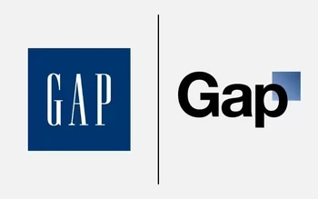
When I think about design from the last decade, I see flat design behind my eyelids. Corporate Memphis waves at me in the background. My design friends and I laugh at the failed rebrands of Gap and Tropicana, and the (then debated) success of Chobani.
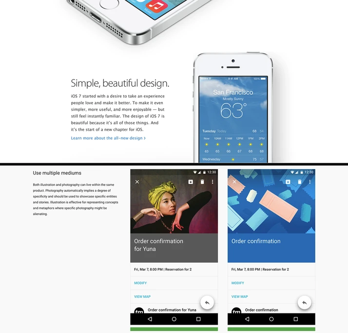
If we look at some of the trailblazers of big tech at the time, we can note two things: Apple’s release of flat design in 2013, and Google Material’s release in 2014. Revolutionary then but commonplace now. I think back to all the times I’ve been asked to make a design look like Apple’s website. If you copied the aesthetic, it meant you were part of the upper echelons of the tech world.
Before, powerhouse brands (especially in tech) tried to be ubiquitous—think massive design systems that scale, with enough minimalism to adapt easily. Part of the rationale was scaling quickly, especially if you were in the startup race. It allowed you to grow at an exponential rate without stressing out your designers each time. A design system like this would cover most of your bases if you were to expand or branch out. To me, at first it also signaled a deliberation on the part of the designer. They decided what added to the experience, and what distracted from it. When done right, each choice felt curated. Intentional. Tasteful.
That minimalism was uniquely tech—a way to brag about how big these systems could be, how they could do the most with the least, how the branding is inoffensive so anyone could potentially see themselves in it, and could in turn disperse it. Having a consistent presence was difficult, and whole teams were dedicated to managing design systems at some companies to overcome that difficulty.
Minimalism was the name of the game, at least visually, but on a grand scale. Precision in design was a signal of craft. Design was both bold and restrained, making space for the core product to speak for itself.
And if everyone is using your tech and everyone is copying your designs, everyone knows about you. That’s brand awareness.
But if this is true, can we still call this luxurious? Eventually, no. Times shift, and there are enough copycats to make something once novel commonplace. If we go back to Apple again, with the release of the iPhone, Apple was squarely in the luxury goods category, and possessing an iPhone was a status symbol. Today, it’s sometimes thought of as an “accessible luxury” or just a plain necessity. But it is by no means exclusive any longer. And if I were to make a website look like Apple’s now, I don’t think clients would feel quite as wowed.
Choices that were once bold are now everywhere. So what’s next?
Exclusivity in a World of Exponential Media
There are many things that have changed since the 2010s, including, of course, the rise of multipurpose AI for everyone. AI accelerates and makes some things even easier to get. AI is perhaps the anti-exclusive in some ways. AI aggregates the average of multiple data points and makes it easier to get this data. It’s forcing integration into nearly all of our tech. It’s homogeneity to produce an output that is more or less as expected.
That being said, if AI is common, the “slop” we now experience daily, then what do we think the current state of luxury is?
I would argue it’s things like human craftsmanship and bespoke designs for each page, rather than large-scale systems.
Is Humanity the New Luxury? The Humans Have Taste
Extra free time and “analog” time is more expensive. This goes both for the creator and the customer.
It’s weird that human work, which was once the most accessible of all, is now the more expensive option. We can see this reflected in design, where products seeking to elevate their experience require more human touches, more creative risk that is on-brand but not cookie-cutter, and the time for “polish” in every interaction. Something with “taste” applied by the human in the designer’s seat.
From a visual perspective, we can see a new set of signals being sent out: serif fonts with organic curves signal quality, replacing geometric sans-serif ones. Stark minimalism is giving way to messiness, flourish, and extra details. Additionally, history is exclusive. In a day and age when trends and objects come and go, when being around for a decade is quite the feat, brands that can draw on their actual history–or at least hint at history through retro-inspired design–are doing so more and more. (That’s the view from where I sit, though I am curious to know what others think of this.)
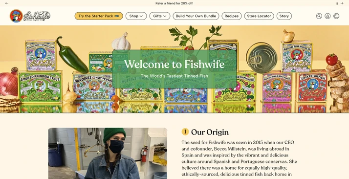
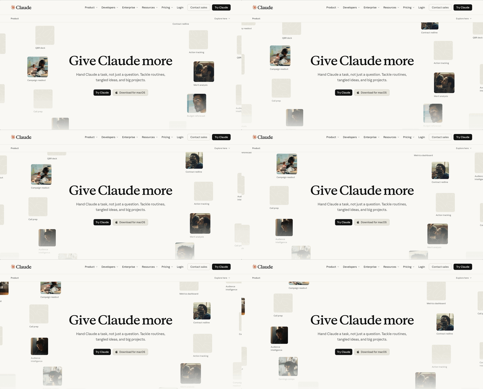
Note that something not luxury is not necessarily bad. Visually, not everything needs to look exclusive. A solid user experience that is instead delightful or utilitarian instead of luxe may still cost more time and require more thought on the designer’s part. Furthermore, some features are not worth the cost of customization.
I work with a lot of B2B software, where extra animations and bespoke designs for each page are counterproductive. If a common table works, then it works. A 100-row table in Garamond sounds like a nightmare. I don’t always need to reinvent the wheel. People-power may be better spent elsewhere.
In a sense, AI was supposed to help us to raise the bar for almost everything. If AI can automate the grunt work, then theoretically contributors should have more time for that luxury tailoring. Whether or not this is happening in practice has yet to be proven in my opinion, at least for design.
I’m not sure I like where all of this is heading generally, but it does give us a little more to reflect on in the day-to-day—if you narrow down your target audience and consider where they fall on the necessity-to-luxury scale, it’ll be easier to see where you should put your effort to support the product.
So is humanity the new luxury? Maybe. Maybe not. Or maybe just at this point in time.
Footnotes
[1] Gap logos via The Branding Journal
[2] 2013 snapshot of Apple's website via the Wayback Machine
[3] Google Material (M1)
[4] Fishwife's Story Page
[5] You can read more about this in The paradox of affordable luxury and canned fish by Mei Liao
[6] Product page for Claude