Infographics Galore, 11 STUNNING Examples of Design-Enhanced Data
Jim Basio, Former Viget
Article Category:
Posted on
(*Dedicated to graphicsgirl's recent tweet)
Like many others, I have recently gotten more and more immersed into the wonderful world that is infographics or information graphics. I have spent countless hours looking in amazement at various infographics used in all kinds of different media. Not only do infographics provide valuable information, they are also absolutely stunning pieces of design.
Infographics or information graphics are visual representations of information, data or knowledge. These graphics are used where complex information needs to be explained quickly and clearly, such as in signs, maps, journalism, technical writing, and education.
*from Wikipedia
With that said, I put together just a small collection of personal favorites. This is not meant to be an extensive listing but just a small morsel to whet your appetite and draw inspiration from great infographics. Enjoy! Oh, by all means, feel free to contribute!
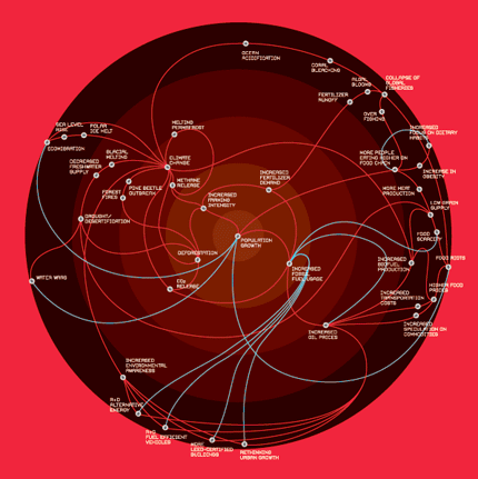
Always With Honor
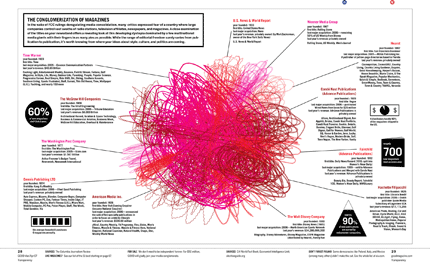
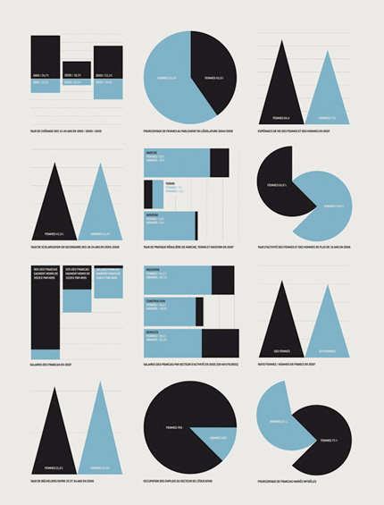
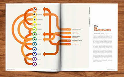
GOOD Magazine
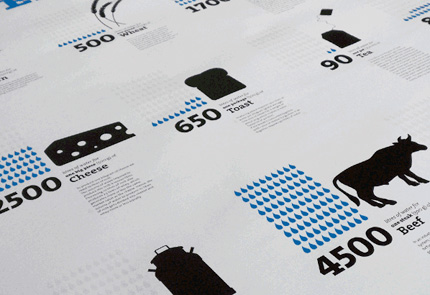
The Virtual Water Project
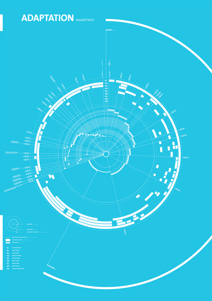
Adaption
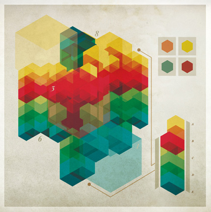
Valentin Adam
Nonsense Info Graphics
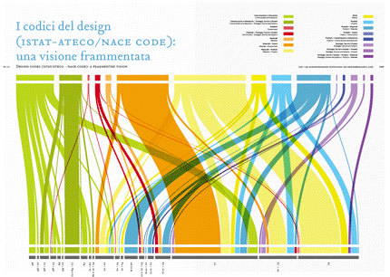
DRM - Design Research Maps
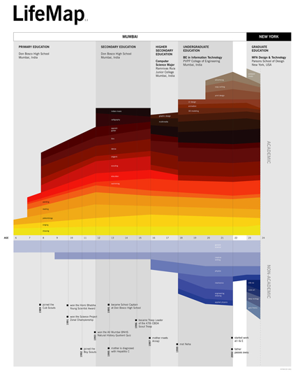
LifeMap
Tyler Lang
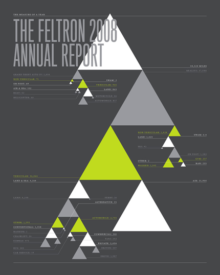
Nicholas Felton
An excellent example of just how useful infographics can be is the fantastic animation by Jonathan Jarvis, The Crisis of Credit Visualized. Everyone I have sent the animation to agrees on how they now have a much better understanding of the topic.
The Crisis of Credit Visualized from Jonathan Jarvis on Vimeo.