Handing Off PSDs That Won’t Make Your Co-Workers Hate You
Once upon a time, I worked as a humble barista in a cafe. For those who have not had the privilege of working in the glamorous world of the foodservice industry, let me explain a little about one of the processes. There was a closing shift and an opening shift. Closers were responsible for cleaning up at night, shutting down all the machines, washing the floors and tables, taking pastries out of the freezer and putting them in the refrigerator so they could defrost overnight, basically making the cafe immaculate and ready to be opened in the morning. Openers did everything to get the cafe back up and running the next morning; they had only an hour before the store opened to set out the pastries, turn all the machines on, make the morning coffee, etc.
I was an impeccable closer. Consequentially, the times when I was the opener, nothing infuriated me more than a shoddy closing job. I only had a limited window of time to get everything on, out, and running, and some lazy closer had left last night's dishes out, bagels were still frozen, countertops were filthy. My job that morning had just immediately become doubly difficult, behind schedule, chaotic, (and gross), all because last night's closer didn't care about the mess they were leaving for me.
I'm going somewhere with this, I promise. Almost there.
As a designer I create a comp in Photoshop and when I'm "closing" on my part of the project, I'm handing my PSD off to one of our front-end developers. They then take it, get it up and running and into a real website. Just like back in the cafe, I want to have an immaculate PSD to give to them, so that they can work easily and efficiently, and not curse my name. (The same thought applies to other designers who might have to handle my PSD to make updates to a design.) A PSD that I'm giving someone else to work on should be easy to understand and make perfect sense to someone else.
So what's the best way to organize a PSD when it's handed off for development?
Of course there are the basics that everyone hopefully already knows to do, just to keep your PSD from looking like a window into insanity:
- Name your layers!
- Delete the layers you ended up not using!
- Group your layers! And group them logically while you're at it; have a group for the header, sidebar, footer, etc.
- Arrange your layer groups according to the flow of the document! Generally have the header group at the top, footer group at the bottom, and everything in the middle… you get the idea.
- Use a grid! Use guidelines to show the grid; get rid of the stray guides that don't have anything to do anymore with the finalized grid.
But what about beyond that? Not everything's so cut and dry.
Interactions & Page States
What's the best way to indicate hover states, lightboxes, all that fun stuff in your comp? Most designers seem to create the default off state for a button, then duplicate the button and have its hover state in the layer right above the off state. I try to color those layers, so at the very least I can tell the front-end developer, "wherever you see a red folder, look out! Hovers afoot!"
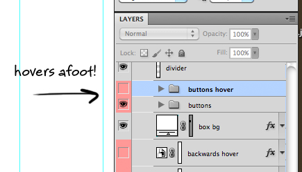
But when you have folders within folders within folders, is that always going to be clear enough? What about page states that are more complicated than just turning one group on and another off?
Layer comps are a suggestion that's been bandied about here lately. Nothing extensive, just a layer comp with all the hovers on, a layer comp for a lightbox, and similar big interactions.
Smart Objects
Smart objects are invaluable for a designer (just ask Mindy), especially when dealing with repeatable content over several comps for a project. But for build-out, smart objects can become cumbersome to repeatedly pop in and out of. I don't have a great solution for this one, because smart objects are a huge timesaver when designing. Do you drag the original, un-smart version back into the comp? Do you annotate your comp to minimize the need to jump into a smart object?
Layer blending modes
I love my blending modes. Multiply, Screen, and Overlay have done so much for me over the years. But when a front-end developer starts to pull a comp apart, blending modes do not behave properly. Let's look at this mess of a footer background I handed off:
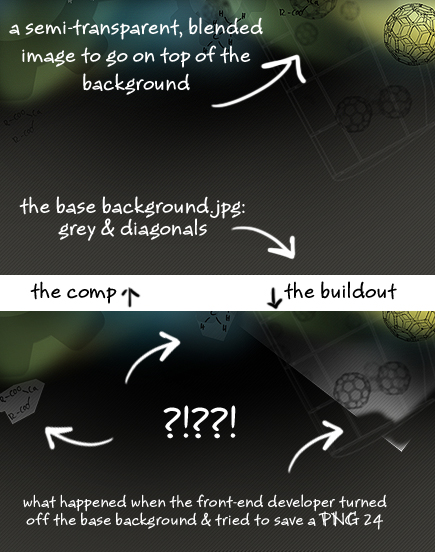
As a designer who's been in love with Multiply since Photoshop 5.5, it's a tough habit to break to NOT use blending modes on elements that will be transparent or will need to be overlaid on something when built-out. But it's a huge pain to fix, and this incident definitely helped drive the lesson home for me.
Merging Layers
What's the right balance? When you merge nothing, you could be looking at 10-20 layers just to make up some tiny element. But when you merge everything to the point that you're practically handing off a .jpg of the comp, that definitely makes it more difficult to build out.
Everyone has different ways of working and different methods that make the most sense to them. For some, as long as layers are named and grouped, the comp's golden, so I don't know if there's a completely right or completely wrong way to handle some of these issues. What do you do? What are you most definitely AGAINST doing?
And further more...
The Photoshop Etiquette Manifesto for Web Designers - great break-down of the basics
Preparing Photoshop Files For Web Developers