My New Best Friend: CSS Generated Content
Trevor Davis, Former Front-End Development Technical Director
Article Category:
Posted on
I’ve become obsessed with generated content lately. In an effort to use fewer and fewer images, I’ve started to use generated content more since more browsers support it (IE8+, FF3+, Safari 4+, Chrome 4+). The following are a couple of examples I have built for a project to streamline my pages.
Triangles in CSS?

This is a really zoomed in view of the design; the tricky part was the little triangle shadow on the right hand side. Instead of adding an additional element and using an image, I just used generated content and a little bit of CSS trickery. All I needed to create was a triangle with CSS, which is pretty easy to implement using borders.
.item .status:after {
    border-bottom: 3px solid #740100;
    border-right: 3px solid transparent;
    content: "";
    display: block;
    height: 0;
    position: absolute;
    right: -3px;
    top: 0;
    width: 0;
}
Be Creative with Characters
Smiley
The design called for a smiley or frown face to denote whether the item was in stock. Luckily, there are characters we can use here instead of images.
.status:before {
    color: #797979;
    content: "☺";
    font-size: 21px;
    font-style: normal;
    left: 0;
    position: absolute;
    top: 8px;
    text-align: center;
    width: 21px;
}

.not-available:before {
    content: "☹";
}
Arrows
No background image needed here; there is an arrow character we can use. Sure, it's not exactly the same, but it's close enough that I can justify using a character instead of an image.
.btn-add-comment:before {
    content: "↓";
    font-size: 16px;
    font-weight: bold;
    height: 8px;
    left: 14px;
    line-height: 8px;
    position: absolute;
    top: 9px;
}
Tricky Shadows
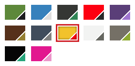
This one was tough. This is a swatch selector where you can click between the different colors that the product is available in. We wanted to accomplish all of this without images, which was pretty easy except for the shadow. The multiple color swatches would cover up any inner shadow that you put on any of its parents. So I needed another element that is a sibling of the swatches to lay overtop of them.
.swatches .current:after {
    -moz-box-shadow: inset 0 0 5px rgba(0, 0, 0, 0.75);
    -webkit-box-shadow: inset 0 0px 5px rgba(0, 0, 0, 0.75);
    box-shadow: inset 0 0 5px rgba(0, 0, 0, 0.75);
    content: "";
    display: block;
    height: 27px;
    left: 2px;
    position: absolute;
    top: 2px;
    width: 38px;
}
Conclusion
These are just a few uses of generated content that I have come across lately, but I'm always on the lookout for ways I can use it. Have you found any creative uses?